BLOG Category: StudentAmbassadorProgram


Sarah Lucas – The Weird and The Wonderful
Carsten Holler: Art or Commodity?
Cold War Steve: The Satirical Art of Now
Painting Snow
The Art of Early Modern Map-Making
The Politics of American Art in the Mid-20th Century
Playing with the Boundaries: Isamu Noguchi’s Playscapes
Chris Burden: Exposing the museum’s system of power
Looking Back to Move Forward in the Time of a Pandemic
Alchemy as Science: The Surrealist Works of Leonora Carrington
Postcolonial symbolism in the work of Hew Locke
Egon Schiele: Depictions of the female nude as empowering or egotistical?
Windows to the World: Windows in Art
Artemisia Gentileschi: The Long Road to Recognition
Sol LeWitt - Why is this art!?
When museums went online: a guided tour of world galleries’ online online.
Embodying Post-war Angst: Kazuo Shiraga’s Choreographies
Exclusive Modernism: Baroness Elsa von Freytag-Loringhoven and Marcel Duchamp.
The Classical Male Nude and its Damaging Legacy
The male gaze made marble: The Aphrodite of Knidos by the Ancient Greek Praxiteles
The Art of Change: Women on Waves Activist Art Org
The Underwater Museum
The Emotive Landscapes of Wu Guanzhong
The Agnes Martin Experience
Student Ambassadors Program Overview

Sarah Lucas – The Weird and The Wonderful

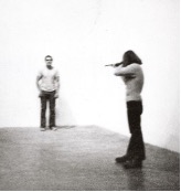
‘Pervery and pleasure in a sea of custard’ is how one critic described Sarah Lucas’s 2015 Venice Biennale exhibition. Possibly an exaggeration, but not necessarily inaccurate, Lucas particularly considers themes of sex, gender, and the body. The ‘sea of custard’ points to her critical humor and edible mediums embedded in sculptures, photographs, and installations.

Lucas and the YBAs

Lucas, one of the infamous Young British Artists (YBA), established herself through exhibitions with her fellow YBAs. She was part of the iconic 1988 group Freeze exhibition, organized by Damien Hirst, which included Michael Landy, Angus Fairhurst, and fellow contemporary artists from Goldsmiths College of Art. During the rise of the YBAs, Lucas and Tracey Emin were both exploring the ‘ready-made’ and set up The Shop, a studio-come-shop that became a place where they could best market their works.

Since the 1990s, Lucas has continued creating witty contemplations of sexuality and gender and is now celebrated for her feminist art. In the wake of Linda Nochlin’s crucial essay, ‘Why Have There Been No Great Women Artists?’, Lucas was one of the earliest young, women artists to achieve greatness in the commercial art world of the 1980s.

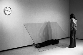
Lucas’s bawdiness and witty remarks exemplify the YBAs’ mentality of shock-value and a rejection of the artistic canon. Her provocative photographs, created during the heyday of the YBAs, embody her humorous, yet direct, style.

Hostility and humor

Sarah Lucas, Self Portrait with Knickers, 1994. More images

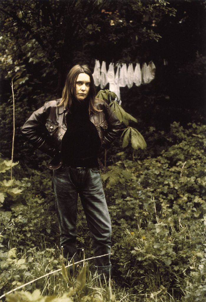
In Self Portrait with Knickers (1994), Lucas is the main subject and confronts the viewer directly, possessing a confrontational, possibly hostile, yet typically masculine pose, to challenge them. Lucas adapts the classical woman subject, such as The Rokeby Venus (1647) who knowingly shies away from observers, and subverts the viewer’s expectation by being both the artist and the subject.

Furthermore, the addition of knickers in the background adds bawdy humor to the image. Lucas has the ability to convey feminine sexuality being explored in a light-hearted way, free from the pressurizing forces of a male artist.

The ‘male gaze’, a term first coined by Laura Mulvey to conceptualize the media’s representation of women in film, relates to the idea of how women are viewed typically, in all aspects of their lives, through a masculinized gaze and male-orchestrated expectations. The ‘male gaze’ can also refer to the representation of women as solely sexualized objects.

Lucas references the concept of the ‘male gaze’ through the medium of photography. As the photographer, Lucas initiates the act of viewing the subject, but the relationship becomes more complex as she is also the subject and returning the viewer’s gaze. Thus, she is both the viewer and the viewed.

Also, her artworks often incorporate the theme of smoking, which is usually a sign of phallic masculinity. Lucas’s Cigarette Tits [Idealized Smokers Chest II] (1999) embodies her use of suggestive humor in feminist contexts. By using cigarettes to mimic the female form and feminine sexuality instead of male anatomy, Lucas provokes the viewer to reconsider how women are presented and represented, not solely in art but also in the mainstream media. She presents inanimate objects in a sexualized fashion, adopting the ‘male gaze’. Lucas shifts the ideals of the ‘male gaze’ from the female body on to inanimate objects, calling attention to its prevalence and extremity, while also subverting it with humor.

Subversion of the inanimate

Lucas, like many feminist artists, utilizes the feminine body to empower and provoke thought. Her sculptures in particular make use of food items, which she adheres to human forms and sculpts in ways to consider how different genders are presented. They evoke contemplation of stereotypes and the sexualization of female bodies. These common food items also relay fundamental ideas of consumption, exchange, and bare necessities.

Sarah Lucas, Au Naturel, 1994. More images

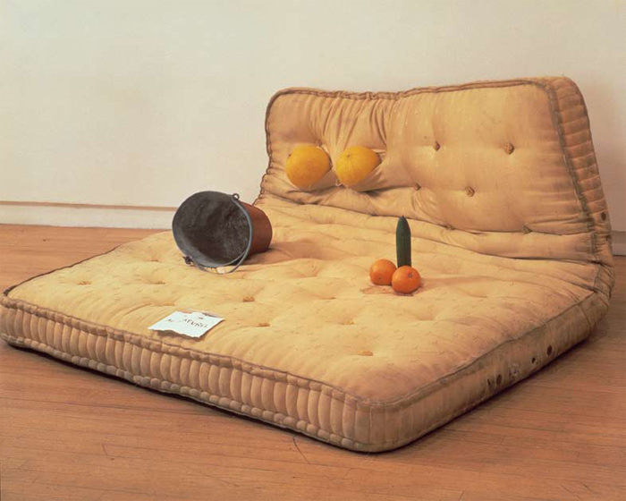
In Au Naturel (1994), Lucas utilizes produce displayed in a phallic manner to render the body as mere reproductive parts. She asks questions of human necessity by the body’s bare representation and the use of food objects relating to consumption, while the bed has both sexual connotations and relates to rest. Lucas reduces the body to its main functions, yet still includes the division of male and female genders, which presents conflict. Is Lucas associating gender with the human necessities she also presents? Or, given the fact she has moulded produce in recognizably gendered ways, does she give more emphasis to the idea that gender is a societal construct? However, Au Naturel presents sexual politics in an originally light manner of innuendoes and simple composition, but Lucas raises questions about highly complex ideas of human bodies being used as a source of exchange and solely sexualized objects, particularly aligning to the mainstream media today.

Judy Chicago, The Dinner Party, 1979. More images

Lucas’s use of food can be seen as a reference to Judy Chicago’s iconic The Dinner Party (1979). In The Dinner Party, the ceramic plates mimic female genitalia, which shocked audiences and caused controversy when it was first exhibited. Chicago’s transmutation of the typical, womanly, and domestic dinner party into a powerful statement on feminine sexuality can be directly related to Lucas’s subversion of inanimate objects to consider sexual politics through a ‘male gaze’.

It is clear that Lucas’s art may not have arrived into the feminist art canon as a completely new idea, given the precedent of subversion to explore female sexuality in both literature and art. However, due to her bawdy attitude, she presents an enjoyable and witty commentary, dismantling some of the pressures and traditional ideas of female sexuality that have been perpetuated throughout much of art history.

Further topics and resources to explore on The Art Story:

Written by Caitlin Sahin, part of the third cohort of student ambassadors for The Art Story.

I am currently in my first year at the Courtauld Institute of Art, studying History of Art. I am most interested in Modernism to Contemporary Art and particularly like abstract art. At the moment, I am attempting to learn more about performance and sculptural art.

Student Ambassadors Program Overview

Carsten Holler: Art or Commodity?

Five tubular metal slides spiralling from the upper floors of Tate Modern to the ground level Turbine Hall, on the surface Carsten Holler’s 2006 installation Test Site looks like a crude play on the waterslides children hurtle down at swimming pools. Yet, like most work of the contemporary period, such conclusion ignores the rich criticism that rests beneath its playful exterior. A powerful commentary on the spectacle and sensation of sliding, Holler’s Test Site offers an investigation into the unification of art and play and poses important questions concerning the spectacularization of art in our post-Fordist, experience economy.

A series of spiralling metal slides installed within Tate Modern’s gallery space, Carsten Holler’s Test Site, in its simplest form functions to transport visitors from alternating levels in the Turbine Hall. The top curve of the slide is clear to render the sliders visible to those looking on, and shadows are projected on to the walls opposite to momentarily record the speed at which visitors slide down them. On closer inspection, though, Holler is artfully eliciting a shift in the protocols of human behavior in the gallery space and asking the viewer to consider the impact of these playful interruptions to our everyday life.

Carsten Holler, Test Site (2006), Tate.

Introducing frameworks conventionally reserved for play, Holler challenges our perception of art spaces most immediately by taking a participatory approach. That is, Holler shifts the gallery from a space of viewing to a space of doing by giving the viewers the option to not only slide from one space to another, but to make the active decision to slide. More than this, Holler asks us to reflect on the affective qualities of these frameworks and their lasting outcomes. Speaking to Tate he explained: ‘The state of mind that you enter when sliding, of simultaneous delight, madness and “voluptuous panic”, can’t simply disappear without trace afterwards.’ What Holler suggests here is that the faculties of the slide can create a sense of “inner spectacle” that shifts our perception of our immediate environment and has the potential to renew our understanding of the outside world.

Carsten Holler, Close up image of Test Site (2006), Tate.

Yet, Holler does not reject viewing altogether. Those that choose not to slide become an important component of the event. By viewing the work, they function as spectators, not just viewing for themselves the spectacle of those sliding, but contributing to the “inner spectacle” of the slider. In this sense, the work becomes relational, drawing attention to the space, the people within it, and the relations between them.

“A sculpture that you can travel inside,” Holler’s Test Site is part of a much larger enterprise: namely, the mobilization of the slide as a fast, safe, inexpensive, and energy-efficient alternative to current modes of transport. As the name suggests, Holler is here utilizing the public context of the museum space as a site to investigate the possible effects of sliding; how it might alter the way we perceive and engage with our surrounding environments; and the possibility of the slide becoming part of the architectural fabric of our everyday lives. What Holler sees in Test Site, then, is a kind of prototype or test to assess the value of the introduction of slides into the city, a context enabling the shadows on the walls to become the virtual projection of slides into the cityscape.

‘A little nonsense now and then is relished by the wisest men.’

Willy Wonka

Trained as a scientist with a doctorate in biology, Holler exercises an investigative approach, which stems, in large part, from his scientific education, but also from a book he read in 1993 upon his exit from the world of science. A text by R Gordon Wasson, a former JP Morgan investment bank employee, Soma: Divine Mushroom of Immortality (1972), deals with the study of hallucinogenic properties of mushrooms and their anthropological history. Seeing hallucinogens as comparable to early childhood or dreams in respect of producing a “different kind of rational,” Wasson’s theory becomes a potent context for many of Holler’s works, and perhaps explains his use of slides as an unconventional but valid alternative to travel.

Holler has now been dubbed the “Willy Wonka of contemporary art” and, across his career, has created a series of hallucinogenic and playful installations including Ball House (1999), a room filled with balls for the viewers to play in; Upside-Down Mushroom Room (2000), an installation featuring large-scale revolving mushrooms hanging from the ceiling of an upside down room; and Upside-Down Goggles (2009-11), a participatory experiment into visual distortion through goggles.

Carsten Holler, Upside-Down Mushroom Room (2009-11). More images.

All Work and No Play?

But is Holler’s claim for the slide as a physically and mentally transportive tool enough to sidestep its function as entertainment? With the growth of our neoliberal, post-Fordist economy, many have recognized art as reflecting the economic attributes of our society, and Holler’s Test Site is no exception. Relational, spectacular, and efficient, Holler’s work seemingly mirrors the shift in production from object-based commodities to experiences, and underscores the rise of workflows dependent on information and communicative technologies.

More than this, speaking in her seminal text Artificial Hells, Claire Bishop problematizes participatory art as a whole for its reductive use of the active/passive binary. Drawing on Jacques Rancière, Bishop claims that attempts to “reactivate” the viewer play into troubling understandings of the working class as only able to engage with art physically (as opposed to, like the middle class, cognitively), thus perpetuating a “prejudice by which working-class activity is restricted to manual labour”. The implication is not that participatory art should be shunned, but instead looked at critically for its aesthetic rather than ethical attributes.

In this way, Carsten Holler’s Test Site is a multifaceted work which poses lots of unanswered questions, many of which extend well beyond, we can assume, his intentions, and are yet to be resolved: is this progressive or regressive? Is this work aesthetic or commercial? What we can be certain of, though, is that this is a multidimensional work bringing to light the ways we engage with the art space and context, and one which critically engages with the debates of our time. 

The Art Story related content: Relational Aesthetics, Installation art, Playing with the Boundaries: Isamu Noguchi’s Playscapes

Written by Hattie Stubbs, part of the third cohort of Student Ambassadors for The Art Story. I am a final year undergraduate student at the University of Exeter. Currently studying Art History and Visual Culture, my interests are Contemporary Art from the 1960s onwards, with a particular focus on social practice art and performance. I am also passionate about representations of sexuality, technology and the body in art, and how queer theory enlightens our understanding of these practices. On graduating, I hope to obtain a master’s degree in Art History and/or Curation and pursue a career in co-curatorship, working alongside artists to create engaging and educational workshops and events.

Student Ambassadors Program Overview

Cold War Steve: The Satirical Art of Now

Cold War Steve (CWS), also known as Christopher Spencer, is a British collage artist and satirist who uses the medium of photomontage to highlight and comment on current politics. Having grown up in the midlands town of Birmingham and worked as a probation officer, he turned to creating art montages on his phone on the bus to work each day. He takes his unusual nom de plume one can guess partly as a reference to the political nature of his work, as well as from British actor Steve McFadden, who plays Phil Mitchell on the popular soap opera Eastenders, which often features in his artwork.

Cold War Steve, Benny’s Babbies (2020), digital photomontage (mixed media), Birmingham Museum and Art Gallery, UK.

I first came across his work when I went to the Birmingham Museum and Art Gallery, where his most recent exhibition, entitled Benny’s Babbies, is on display. It is a celebration of his home city and is his most complex photomontage to date. It takes an 18th-century rendering of St Martin’s Church in Birmingham as one of the main features to act as the site of celebration for some of the city’s famous figures, including the metal band Black Sabbath, comedian Joe Lycett and presenter Emma Willis. The contrast between the historic cathedral, the modern Coca-Cola tower, and the diverse array of popular figures drew me in to understanding the heritage and rich culture of the multi-cultural Birmingham, my new home. While Benny’s Babbies is light-hearted in its depiction of celebration and presents its figures in a positive light, most of CWS’s art satirises contemporary politics to emphasize the surreal nature of our current times. He incorporates figures from both British politics and American politics in hilarious situations, which now act as a light in these dark times with the onset of covid-19. In this modern age of technology, he strays away from traditional art mediums such as oil painting and instead adopts the digital photomontage as his medium, allowing him to reach a global audience through Twitter and Instagram. As he produces his artworks digitally, the artist is able to react immediately to current events and publish art in a direct way, which sidesteps traditional galleries and museums and widens the reach of photomontage.

Hannah Höch, Cut with the Dada Kitchen Knife through the Last Weimar Beer-Belly Cultural Epoch in Germany (1919), photomontage, mixed media, 35 x 57 inches, Nationalgalerie, Staatliche Museen, Berlin.

It is interesting to compare CWS’s photomontages to early examples of photomontage, such as that by female Dada artist Hannah Höch. Like CWS’s works, her photomontages are composed of clippings from mass media, including images of politicians and popular figures, juxtaposed with text to create ironic and jarring juxtapositions. Höch’s Cut with the Dada Kitchen Knife through the Last Weimar Beer-Belly Cultural Epoch in Germany (1919) focuses on representing the chaos of the first world war through the inclusion of industrial machinery and political figures. Furthermore, the figures of Weimar society clustered around the word ‘anti-dada’, in contrast to the anti-establishment figures around the word ‘DADA’ acts as a comment on Weimar society. Like Höch, artist John Heartfield’s anti-capitalist photomontages emerged in a moment of war and revolution. As part of the Dada movement during the 1920s and 1930s in Germany, he used his background in advertising to conceptualize the notion of ‘photo as weapon’ in creating propagandistic photomontages.

Cold War Steve, Untitled (2020), digital photomontage.

Similarly, we can see the ways in which CWS has modernised the use of political commentary in his digital photomontage. As a reaction to a recent bill by the UK government that announced MPs had voted against providing free school meals for the UK’s poorest children during the school holidays, the artist satirises this decision. UK Prime Minister Boris Johnson is depicted seated in a grandiose chair, with a napkin tucked into his shirt, as he begins to feast on a selection of food in front of him. In the far right of the composition, MP Dominic Cummings is shown working on his laptop, with visible food stains at the corners of his mouth. The artist sharply separates this image of excess and gluttony with the glass window on the left, depicting footballer Marcus Rashford who has combatted child hunger across England by providing food banks with resources for hungry children during the holidays. He stares at Boris Johnson through the glass, looking dismayed at the Prime Minister as he is joined by a group of sad-looking children, who represent those the government has voted against feeding. 

This obvious jab at the UK government’s decision-making is clearly mirrored in Höch’s and Heartfield’s own use of photomontage as propaganda. Höch’s Dada masterpiece subverts the objectivity usually associated with photography and produces an image that is both attention-grabbing and radical for its time. In CWS’s art, more than 100 years later, we see similar artistic motivations in the presentation of political satire, but in a modern way. He appropriates a group of images to create one cohesive narrative (for those who understand the references), thus, allowing the viewer to make sense of the composition through image associations. However, CWS is uniquely persuasive in his ability to make the viewer instantly sympathise with his satirical interpretation of current politics. Furthermore, thanks to the medium of digital photomontage he is able to react immediately to current events and incorporate a wide range of images from the internet.


Artists and movements on The Art Story that connect to similar topics and are interesting to explore:
Dada
Hannah Höch
John Heartfield
Photomontage

I’m Isabella Hill and I’m part of the third cohort of students working on the Student Ambassador Project here at The Art Story! I’m an MA student studying Art History at the University of Birmingham, focusing my dissertation on the work of the Pre-Raphaelites, having written my undergraduate dissertation on the series Pygmalion and Galatea by Edward Burne-Jones.

Student Ambassadors Program Overview

Painting Snow

Earlier this year, on a visit to Oslo, I came across an exhibition in the Henie Onstad Kunstsenter, “Claude Monet and Bærum, 125 Years Anniversary”. Intrigued by the paintings, I wanted to know why Monet chose to leave his home in Giverny, midwinter, for Oslo at the coldest, darkest time of year…

Claude Monet’s motivation to visit Norway in 1895 was ostensibly twofold.

Firstly, he went to visit his stepson Jacques who had married a Norwegian. As patriarch of the family, Monet wanted to spend time with him to find out if he would ever return to Giverny, a question which was causing Jacques’ mother Alice some concern. Secondly, Scandinavian literature and music had been in vogue in Paris since the 1880s, with authors such as the Norwegians Henrik Ibsen and Bjørnstjerne Bjørnson, and the Swedish August Strindberg, being well known. Their writings could be found in Monet’s library in Giverny. By the 1890s, Edvard Grieg’s music was also popular in Paris. Thus, Monet would have been well aware of Scandinavian culture and was probably curious to visit this mysterious country.

But why did Monet choose to go in winter? While a Nordic Summer is highly recommended, travelling so far north at any other time of the year was surely unthinkable. (An 1892 edition of the widely disseminated guide, Baedecker’s Handbook, gives a detailed account of how to travel in Norway, how to deal with Norwegians, and how to dress for a Nordic summer: warm winter coat, light wool suit, wide brimmed hat, and blanket.)

The answer: Monet was interested in painting snow.

He was encouraged to make the trip by the Norwegian art historian Andreas Aubert, who had previously invited him to an exhibition in Oslo in 1890. Aubert believed that Monet’s visit would be a great boost to Norway’s artistic scene. Monet made up his mind in December 1894 and informed his gallery owner, Paul Durand-Ruel, to postpone his forthcoming Paris exhibition.

As far back as the 1860s, snow, sea, and water were natural elements of great interest to Monet. In 1880, his Débâcle des Glaces (The Break-Up of the Ice)was his first series to bring light, air, and temperature conditions into clear focus. His Haystacks (1890–91) and Rouen Cathedral (1894) are well-known for demonstrating his skilful studies of light. Less is spoken of his representation of changing air and temperature conditions. The Break-Up of the Iceseries presents a detailed study of melting ice along the Seine, but Monet’s trip to Norway would provide the ultimate experience of changing light and temperature. 

Monet departed for Kristiania, present day Oslo, on 28 January 1895. The journey was long, with multiple trains and ferries, and was delayed by harsh winter weather. This was the first of many challenges to come. At first, he was somewhat dumbfounded by the expansive sheets of white and wrote home to his wife Alice: “The country must be infinitely more beautiful without the snow”. 

On a sleigh trip to the area around Kristiana, he saw mountains and frozen waterfalls. This offered potential, but these sites remained largely inaccessible by train or sleigh. Given that Monet could not ski, his options were limited. There was no masking his frustration: “I may suddenly take the path back to France, having no taste for a country that I cannot paint”. 

But after a couple of weeks, Monet’s stepson Jacques took him to Sandvika—just an hour’s journey away—and here he finally found the motifs he wanted to paint. He stayed at Bjørnegaard guesthouse, owned by Jenny Bjørnson, who had been married to Bjørn Bjørnson, son of the poet Bjørnstjerne Bjørnson.Monet loved the place and was treated as a celebrity. He stayed for five weeks, painting 13 pictures of Mount Kolsaas, five pictures on the ice outside Sandvika, and four pictures of Løkke bridge in the center of Sandvika. He wrote: “I believe I have truly found it”. 

Yet he was still faced with troublesome weather conditions. The dramatic light changes were difficult to capture on several canvases at the same time, as he had done with more ease for his Haystacks and Rouen Cathedralseries, not to mention the infuriating effect of sudden mild weather and snowmelt. “The wondrous sight of snow on a fir tree,” he wrote, could disappear with “one hour of sun or a little wind”. He remained determined, however, sledding out to his painting locations, Jacques in tow with tools and canvases. As he wrote to Alice: “It will have to be very cold before I start to freeze”. 

Claude Monet’s Mount Kolsaas and Sandvika, Norway (both 1895)
Øystein Thorvaldsen/Henie Onstad Kunstsenter

As Monet became more comfortable in his surroundings, he also began to enjoy watching people ski and was excited by sleighing. He was a spectator at the Holmenkoll ski race in February. However, none of his Norway pictures show a single figure. Although excited by the jostling crowds at the race, his artistic focus remained on representing the changing light, air, and temperature of his surroundings. 

Japanese Influence

On 1 March, Monet wrote home: “I am at work on a view of Sandvika, which looks like a Japanese village, I am also doing a mountain that one can see from anywhere here and that makes me think of Fuji-Yama”. Japanese prints were well known to Monet, who owned several of Hokusai’s prints at home in Giverny, from his seriesThirty-Six Views of Mount Fuji (c1830–32).

Although Monet had never been to Fuji-Yama, let alone Japan, comparison underlines his belief that the Japanese lived close to nature, like the Norwegians. His scenes from Norway show clear parallels to the so-called Ukiyo-estyle of Japanese prints, which showed natural and coastal scenes in different tidal and light conditions. Looking at his paintings of Sandvika, nestled between the curve of snow, Mount Kolsaas rising in the background and rectangular, snowy roofs of thick-stroked white paint, there are certainly similarities with Japanese compositions such as Hiroshige’s Kanbora, Evening Snow (1833–34)

Monet, Sandvika, Norway
More Images
Hiroshige, Kanbora, Evening Snow 
More Images

Monet wanted to depict a snowy scene, and he got to the essence of its nature: light, air, and temperature. His loose, rapid strokes, departing from Hiroshige’s more restrained compositions, help viewers feel as if they really are standing in front of the scene. They are left with more of an impression of the supposed nature around them.


Hokusai, South Wind, Clear Sky, no. 33 in 
Thirty-Six Views of Mount Fuji (1830-33)
More Images
Monet, Mount Kolsaas, Sun Effect

Comparing Hokusai’s Mount Fuji with Monet’s own Mount Kolsaas, Monet brought to the canvas what he called the “stupefying effects” of the landscape’s “vast whiteness”, and his palette primarily consists of lead white. This was the first mountain he had ever painted, and he found it exhilarating. He built texture over the mountain with thick, wavy strokes and added touches of intense greens and blues to give off the shimmering effect of light on snow. His paintings of Mount Kolsaas show his ability to paint the changing air around him. We see it changing across the canvases from clear to foggy, to misty or even stormy, to partly obscure the mountain. He told an interviewer in Oslo: “I am pursuing the impossible. Other painters paint a bridge, a house, a boat… I want to paint the air in which the bridge, the house, and the boat are to be found—the beauty of the air around them, and that is nothing less than the impossible.”

Monet, Mount Kolsaas in Misty Weather 
Monet, Mount Kolsaas, Rose Reflection
More Images

Return to Giverny

Returning to Giverny on 3 or 4 April, Monet arranged an exhibition date with Durand-Ruel for 10 May. Fourteen pictures of Mount Kolsaas and several views of Sandvika were selected for display. None were sold. While the Rouen Cathedralseries took centre stage, Monet’s paintings of Norwegian snow reaffirmed his range and ability as well as his status as an artist with international interests. He spoke little of his Norway paintings; even today little has been written about them, although many late photographs of his studio show them hanging in the foreground for all to see. And, in 1889, Monet personally donated Sandvika, Norwayto a sale benefitting the children of the impressionist painter Alfred Sisley after his death. Sisley was a master of snow scenes, and Monet donated it as “one of our best”. He was clearly proud of his Norwegian snow scenes, especially the Sandvika paintings. Perhaps his adventure was what spurred him to paint snow in Switzerland after his wife’s death in 1913, a trip that inspired him to paint again, enabling him to complete his last task, painting the waterlilies in the Giverny. 

See the paintings in the Henie Onstad collection here

More useful links: Monet Impressionism


Written by Flora Igoe, part of the third cohort of student ambassadors for The Art Story.

Flora is a recent graduate of Trinity College, Dublin, with a B.A. in Italian and History of Art and Architecture.

Student Ambassadors Program Overview

The Art of Early Modern Map-Making

The first academy of art was established in Florence in 1563 and focused on the three “arts of design”: painting, sculpture, and architecture.  This designation has come to dominate our modern interpretation of what constitutes “art”.  However, before the late-sixteenth century, notions of art were more expansive.

Prior to, and during the Renaissance, art was more than an aesthetic entity viewed for its own sake.  In fact, art had a purpose.  It came in diverse forms and had diverse functions.  During the fifteenth and sixteenth centuries, art was closely linked to the idea of craft.  In fact, “art” comes from the Latin “ars”, meaning skilled work.  As a result, historians tend to use the broader concept of “visual culture” when considering Renaissance “art”.

The skilled craft of cartography, or map-making, transcended the creation of functional objects.  Early modern map-making was considered an art, contributing to the diverse visual culture of Renaissance Europe.  From the mid-fifteenth century, Italian humanists rediscovered the golden ages of Greek and Roman antiquity, leading to a revolution in art and philosophy.  At the same time, European states began to explore beyond the Mediterranean.  New maps were produced for this “age of discovery”, reflecting changing theological and philosophical thought, as Europeans had to come to terms with an expanding world.  Thus, Renaissance visual culture took on a new global dimension.

Gerard Mercator, World Map, 1569

Gerard Mercator was a calligrapher, engraver, and publisher from Flanders.  His 1569 World Map is one of the most famous maps ever created.  His unique projection of the earth still forms the basis of maps today.  It is immediately impressive due to its sheer size, made up of eighteen sheets of paper, measuring 202 by 124 cm.  While this was one of the most accurate maps produced to date, using the most recent accounts from European explorers, it was not a navigational tool used by sailors.   The size of the map made it impractical for such use, and although it was detailed, it was far from accurate and extremely difficult to use.

Mercator’s intention to map the whole world reflects the Renaissance mindset.  Europeans were opening their minds to a new global dimension and placing themselves within this changing world.  Mercator shows the extent of European discovery by 1569 and demonstrates the prevailing belief in European superiority by placing Europe at the centre of the map.  His map embodied European culture at the time, and such objects became a luxury.  Like paintings and sculptures, they were sought after and commissioned by the wealthiest in European society to reflect their power and worldview.

Abraham Ortelius, Theatrum Orbis Terrarum, 1570

Just a year after Mercator’s ground-breaking world map, Abraham Ortelius of Antwerp produced the first atlas.  The first edition was comprised of 53 sheets, and for each map there was a description of the economic, social, and cultural practices of the region and its inhabitants.  Once again, these atlases were luxury objects.  They were not used by sailors but bought by wealthy merchants and court officials.  In fact, these “map books” and similarly detailed wall maps were commissioned by buyers, just as a patron commissioned a painting from an artist.

Ortelius used accounts of contemporary voyages alongside texts of ancient authorities to piece together these maps.  His maps are a visual representation of the Renaissance mindset, which revolved around building on, and surpassing, the authorities of antiquity.  Just as Mercator’s map is a visual representation of the need to situate Europe within an expanding world, Ortelius uses his atlas to situate himself within history.  At the bottom of this image, Ortelius quotes Cicero: “Who can consider human affairs to be great, when he comprehends the eternity and vastness of the entire world”.  Alongside this, he includes inscriptions about the recent discoveries of the Portuguese explorer Ferdinand Magellan and Italian traveller and diarist Ludovico di Varthema.  Therefore, this map it a visual embodiment of the belief that Europeans were building on and surpassing the wisdom of ancient Greece and Rome.

Anthony Jenkinson, Wall Map of Russia, c.1567

This map was produced in c.1567, based on the observations and writings of Englishman Anthony Jenkinson.  He was an ambassador of Queen Elizabeth I and agent of the Muscovy company, sent to Russia in 1557 to find a route to China.  Jenkinson made it to Russia where he met with Tsar Ivan the Terrible, who allowed him to travel through his lands.  He made it to Persia and crossed the Caspian Sea before having to return when his route was blocked by conflicts.

This map closely resembles what we would consider a work of art.  It is the decorative elements of the map which dominate, and this was certainly not used for navigational purposes but for display.  It is far from accurate and lacks much geographical information at all.  Rather, this map tells the story of Jenkinson’s journey.  It depicts Ivan the Terrible on his throne, the warriors who escorted Jenkinson, and the caravans of merchants he came across. 

However, this map is more than a visual representation of Jenkinson’s journey.  It also tells the story of the era.  The inclusion of exotic elements such as camps of nomads, exotic animals, and pagan gods reflects the feeling of curiosity towards the east.  Furthermore, this map allows us to consider the complexity of Renaissance visual culture.  We are able to see the extensive amount of people involved in the production of this map through the cartouches, or inscriptions.  These mention Jenkinson (the traveller), along with the editor of his text, the engraver, and the painter of the map.  Furthermore, Henry Sidney, the patron, is mentioned.  Like a work of art, this map required a commission by a wealthy patron and the talents of many skilled craftsmen.  Therefore, Jenkinson’s map of Russia reflects how Renaissance visual culture was so much broader than the modern definition of art.

The production of early modern maps required complex layers of skill and patronage, just like the paintings and sculptures of Renaissance masters.  They were a part of the visual culture of the time, reflecting the attitudes and interests of early modern Europeans.  The Renaissance was about curiosity, discovery and surpassing the knowledge of antiquity.  The maps of Mercator, Ortelius, and Jenkinson directly reflect this and provide a convincing argument for the wider definition of art as visual culture in this period.

To find out more about Renaissance art and visual culture you can visit these pages:

This post was written by Lucy Green, part of the third cohort of Student Ambassadors for The Art Story.

I graduated with a history degree from the University of Birmingham in June 2020, specialising in seventeenth-century Anglo-Ottoman relations and the European ‘Age of Discovery’.  I have a strong passion for history and art and hope to complete a Master’s degree in museum studies to pursue a career in heritage.

I am particularly interested in seeing how art speaks to historical movements and themes.  I am fascinated by early modern maps and how their cultural significance was often more important than their practical use in navigation.

Student Ambassadors Program Overview

The Politics of American Art in the Mid-20th Century

20th-century American art exemplifies the repercussions of politics and propaganda which can be read into many art works. From Dorothea Lange’s social criticism in the form of intimate portraits, to Jackson Pollock’s paint splatters becoming symbols of American freedom, to Martha Rosler’s collages literally ‘bringing the war home’, these artists’ works all came to carry the heavy weight of political messages, regardless of whether or not that was their original intention.  

Dorothea Lange, Migrant Mother, 1936
https://commons.wikimedia.org/wiki/File:Lange 

Portraits of the Great Depression 

Throughout the Depression of the 1930s, Dorothea Lange captured American history through somber portraits of those suffering from staggering economic loss, showing the harsh realities many were facing. Lange’s Migrant Mother, described by the Museum of Modern Art as ‘the most recognizable image from the Great Depression’, epitomizes the uncertainty, strain, and responsibilities shared among individuals during this time. Lange’s photographs focused typically on a sole, individual subject, leading the viewer to form an intimate rapport and care for the person portrayed and, then, often sympathizing with the devastation of their social conditions. While today there is a detachment from the immediate repercussions of the Great Depression, Lange’s portraits are still incredibly emotive and exemplify the power of image. 

Between 1935 and 1944, the Farm Security Administration hired writers and photographers, including Lange, to document the situation farmers faced as a result of the Depression. Led by Roy Stryker, this cultural work was intended to help in reinvigorating President Franklin D Roosevelt’s New Deal. Perhaps not anticipated was Lange’s implicit criticism of the faults of capitalism and in turn the former US President Herbert Hoover’s laissez-faire attitude, which directly impacted the prolonged hardships faced by her subjects, who were on the lowest rungs of the capitalist hierarchy. 

Jackson Pollock, Autumn Rhythm: Number 30 1950  https://www.theartstory.org/artist/pollock-jackson/artworks/#pnt_5 

Art as a Cultural Weapon  

While lacking the explicit politics of Lange’s photography, Abstract Expressionism nonetheless became political. Rather than criticize US social conditions, instead it was used by many to highlight artistic and cultural freedom in America in the face of totalitarian repression in the Soviet Union. 

Jackson Pollock famously splattered paint on to the canvas, projecting visual traces of physical and psychological movements from within himself. His style and method rejected the restrictions of Realism and instead presented a spontaneous and freeing method of creating. Cultural leaders held up Pollock’s example of creative freedom to symbolize the ‘free world’ and to criticize the Social Realism associated with communism.  

The Abstract Expressionists were not aiming to create patriotic masterpieces, and yet the powers that be tried to turn them into that. Touring exhibitions such as The New American Painting, during the 1950s, were shown across Europe to reiterate to audiences the superiority of U.S. capitalist, anti-communist society. Similarly, the support of the Congress for Cultural Freedom (an anti-communist advocacy group), which was funded and run by the CIA, promoted Abstract Expressionism further with financial and organizational support for travelling exhibitions. 

Abstraction, unrestrained size, liberal paint application, and powerful emotions evoked by color were all used to emphasize the freedom found in American arts and culture, contrasting with the restraints of Soviet Realism, which became associated with strict perspective, limited scale, and accurate color schemes in order to achieve propagandistic realism. 

Martha Rosler, Roadside Ambush from the series House Beautiful: Bringing the War Home
c. 1967-72 More Images

The Television War

Like Lange, Martha Rosler presented compelling images of American realities, but her subjects were less localizzed and looked to the expansion of a global political consciousness. Her collages visualizzed the relationship between 1960s American households and the ongoing Vietnam War.

Rosler materialized the strangeness of the Vietnam War, often referred to as the ‘living-room war’. Her series House Beautiful: Bringing the War Home drew from the new television revolution of the 1960s, which coincided with nightly news coverage of the Vietnam War, the first war brought into the living rooms of millions of Americans every day.

Roadside Ambush is an extremely jarring image. The living-room scene, taken from a magazine, nods to the consumerist culture of the 1960s and the importance of keeping up with fashion and interior-design trends found in style magazines. In contrast to the idealized American home, Rosler collages a curled-up figure, taken from a photograph of a battlefield, on to the center of the scene, creating a sense of contrast and disjunction.

Rosler’s collages become political as she brings together two contrasting images of a typical American home and the Vietnam War, a commentary on how many Americans consumed both rather passively and responded to each with a kind of numbness. Advertisements showing trends in interior design were shown just as frequently as brutal images of warfare in Vietnam, eventually evoking a desensitization as the initial shock of seeing violence in Vietnam ebbed as the war continued. Through the medium of collage, Rosler reinitiates the initial shock and attention a viewer experiences in seeing violence by placing it in a normalized environment such as a living room, prompting the viewer to think more actively about what they are seeing.

Is All Art Political?

Lange’s and Rosler’s documentary art appears political due to the nature of their realistic and recognizable subjects, but Pollock’s seemingly random, apolitical paint splatters can still carry the hefty ideology of an entire country whether it wants to or not. Politics becomes available in art in many different ways, whether it is intended by the artist or inferred by the viewer. The role of the viewer becomes particularly significant when assessing the politics in art. While Lange’s and Rosler’s works begin with social and implicitly political subjects, it is the viewer who makes the connections, whether consciously or subconsciously, and recognizes how the images relate to a political situation. While not intentionally or even obviously political, the viewer can still read Pollock’s painting with a political bent when thinking more about his method of creation rather than the resultant image.

Written by Caitlin Sahin, part of the third cohort of student ambassadors for The Art Story.

I am currently in my first year at the Courtauld Institute of Art, studying History of Art! I am most interested in Modernism to Contemporary Art and particularly like abstract art. At the moment, I am attempting to learn more about performance and sculptural art.

Student Ambassadors Program Overview

Playing with the Boundaries: Isamu Noguchi’s Playscapes

Isamu Noguchi was a prolific American-Japanese sculptor/designer of the early- and mid-20th century. Challenging conventional distinctions between art and life, positive and negative spaces, sculpture and urban design, geometric and organic forms, he was a revolutionary whose interdisciplinary approach eased the strict binaries of Western art. In the context of this article, though, Noguchi was an artist whose inherent activism and utopic definitions of play-as-art were seemingly lost to the hostile regulations of the modern era.

Isamu Noguchi with Contoured Playground (1941) More Images

In 1934, sculptor Isamu Noguchi approached the New York City Parks Commissioner Robert Moses with the promise of a new radical design for a children’s recreation ground. A young sculptor with little to no architectural or landscaping experience, Noguchi relied solely on the commissioner’s priority to increase the number of playgrounds in the tri-state area. A playground sculpted from the surface of the earth and entirely free from equipment, his proposal Play Mountain (1933) was to be a fantastical civic playscape on which the categories of art and life could collide. In the context of Noguchi’s oeuvre, however, it was the first in a long line of playground designs drawn up by the artist to reform conventional definitions of play and, by consequence, art.

It was not until graduating from high school in Indiana that the now world-renowned modern sculptor and designer Isamu Noguchi formally took up art and began thinking about recreational spaces. Encouraged by his mother to enrol at the Leonardo Da Vinci School of Art, it was in 1924 that Noguchi began sculpting full-time. By 1927, the artist had secured a Guggenheim fellowship to study with Romanian artist Constantin Brâncuși in Paris. And just four years later in 1931, Noguchi returned home to New York to work on a series of public art projects similar to the sculptural public landscapes and geometric forms we associate with his artistic practice today.

It was during this mature period that Noguchi designed Play Mountain for the commissioner. Seeking to position a mountain within the city block, the work challenged normative playground designs by proposing a playscape devoid of walls and playground equipment. Children were encouraged to play by running along or sliding down the modulations the artist sculpted into the ground, and there were no clearly defined means by which the individual could engage with, or act within, the landscape. To use Noguchi’s own words, ‘instead of telling the child what to do (swing here, climb here),’ Play Mountain created a space ‘for endless exploration, of endless opportunity for changing play’.

Isamu Noguchi, Play Mountain, 1933.  Noguchi’s first playground design which was never brought to realisation. More Images

Towards a Reintegration of the Arts

What this work also envisioned was an expanded definition of sculpture and a total rethinking of the relationship between art and life. That is to say, Noguchi’s artwork functioned not only as a unique assortment of forms to be admired, as is the case with most sculpture of the period, but also as a communal segment of the city fabric. It wasspace where children could play imaginatively and without strict boundaries, and one in which they might acquire the experimental skills and formative relationships necessary for success in everyday life.

More than this, the work seemingly emblematised the artist’s ideological struggle for national hybridity. American to the Japanese and Japanese to the Americans, Noguchi often found himself in ‘cultural limbo’, whereby claims to citizenship were effectively obscured. This feeling was perhaps perpetuated by the proliferation of criticism surrounding his work, which centred on the artist’s multi-ethnic identity and often anti-Japanese, racist rhetoric. To cope with these feelings of alienation, though, Noguchi identified with both nationalities, undermining illegitimate claims to a ‘pure’ or somehow ‘authentic’ racial existence by revelling in his ability to negotiate between the two. This informed his much larger political ideology of an American democracy built on cultural and ethnic hybridity.

Free from the walls which confine or, metaphorically, categorize us, Play Mountain apparently taps into this hybridity by offering a compelling case for freedom of movement. The user can liberally move amongst, within, and outside of the space without fear of confinement. Furthermore, situated within the public sphere, the art is intrinsically democratic and offers a utopic environment everyone can participate in. The work epitomized, therefore, what Noguchi later describes as the ‘reintegration of the arts toward some purposeful and social end,’ and the artist’s inherent desire to reform art into social experience.

An Imagined Playground

Despite being innovative and unlike anything seen before in New York City’s history of playground design, Play Mountain was never brought to realisation. Dismissed by Moses on the grounds that it showed a complete disregard for health-and-safety regulations, the work signalled the beginning of the artist’s 40-year struggle against standardized urban design and public authority. And, while initially contingent on its fluidity of forms and boundless space, from as late as the 1960s Noguchi’s designs were under increased pressure to follow conventional forms of urban planning. I think here of the playground Playscape (1976) in Atlanta, which, aside from its bright colours and abstracts forms, included swings, slides and climbing frames—conventional of state-approved playground design. In fact, when executed, Noguchi’s play sculptures tended to emerge in private corporations, art museums, and on films—spaces not always accessible to the publics, which apparently give social value to Noguchi’s work.

Isamu Noguchi, Playscape, 1976. Piedmont Park, Atlanta. Angular brutalist playground featuring swings, slide, and climbing frames.
Noguchi’s site plan and elevations for Playscape at Piedmont Park, Atlanta. More Images

In this sense, it would be easy to say that Noguchi’s Play Mountain was a failure. Rejected by the state, the work now represents only a figment of our imagination and the symbolic visualization of Noguchi’s utopic world of play and hybridity. And yet, at the same time, to do so would be to erase the rich legacy of Play Mountain within art history. It has had a tremendous impact on artists such as Vito Acconci and Mary Miss, who have created numerous social spaces, including their own public playgrounds, and it raises important questions: What are the politics of public space? What obligation does the artist have to the cultural sphere? How useful is play in shaping both art and social life? How do government regulations limit creativity? What we must read from Play Mountain’s story, then, is not an inability to reach realization, but its capacity to steer important debates within art history, and the compelling means by which it prompted a social art and activism long before the relational works of, say, Rirkrit Tiravanija and the new-genre public art of Suzanne Lacy.

Written by Hattie Stubbs, part of the third cohort of Student Ambassadors for The Art Story. I am a final year undergraduate student at the University of Exeter. Currently studying Art History and Visual Culture, my interests are Contemporary Art from the 1960s onwards, with a particular focus on social practice art and performance. I am also passionate about representations of sexuality, technology and the body in art, and how queer theory enlightens our understanding of these practices. On graduating, I hope to obtain a master’s degree in Art History and/or Curation and pursue a career in co-curatorship, working alongside artists to create engaging and educational workshops and events.

Student Ambassadors Program Overview
Chris Burden

Chris Burden: Exposing the museum’s system of power

A pioneer of contemporary art since the 1960s, Chris Burden is one of the most acclaimed and outrageous artists in art history. Mostly known for his Performance Art, he dedicated his life to the exploration of the body’s limits to suffering. Although he was mostly drawn into producing art concerned with pain, Burden also explored other matters, including the value of art and the role of the institution that sustains it. Following other like-minded artists, these ideas generated a movement of Institutional Critique, in which artists still widely engage. 

Institutional Critique explores the systems that maintain art and its processes. Drawing attention to the industry that sustains their work, artists started questioning the neutrality of galleries and museums towards the art they displayed. Although museums are seen as educational spaces, the fact is that they often have unstated biases, connections to wealth and power, and other blind spots.

Chris Burden, Shoot, 1971
More Images

Burden earns himself a reputation 

After staging his controversial Shoot performance in 1971, Burden was the artist of the moment. In this daring performance, Burden asked a friend to shoot him with a rifle. The bullet was meant to just slightly scratch his arm, but the plan did not go as expected, and the bullet went a little deeper. He was undoubtedly known to be a risk-taker, but he was not suicidal. The artist explained, in his posthumous 2018 documentary, that his works were all carefully thought out, and he religiously followed a set of rules. But often, these rules were not shared with the viewers or the institution, which produced an enigmatic atmosphere around every artwork he performed.

Chris Burden, Doomed, 1975
More Images

Doomed: The setup

After earning a reputation, Burden was invited to perform at the Museum of Contemporary Art in Chicago in 1975. In a piece titled Doomed, Burden enacted a passive performance of his potential death. To perform Doomed, the artist asked the museum for two items: an institutional clock hanging in the gallery and a large sheet of glass positioned at 45 degrees to the wall. Burden had planned to lie on the floor under the glass sheet for an undetermined time, with the clock ticking away, marking the passage of time. The piece had its origins in an interview in which Burden was asked about the duration of a performance. Burden simply replied that time did not define the quality of the piece. He subsequently created a time-based performance that included not disclosing the nature of the performance to the museum and not telling the museum that it had total control over the performance length. Time is particularly important to this performance because Burden’s life is not timeless. By handing over the control of this performance to the institution, Burden implicates the museum in his possible death.

Doomed: The Performance

On the day of the performance, an unusual crowd gathered to watch this enigmatic piece. As the viewers walked into the exhibition space, they were confronted with a clock and Burden’s body lying flat under this giant sheet of glass. At the end of the day, when the museum was about to close, the institution was faced with interrupting the piece or letting it go on. The museum decided to let the performance continue for the night, and, to the surprise and worry of everyone, the next day Burden remained in the same position. 

Later in the day, the museum asked a doctor to come and give his feedback on what they should do. The doctor said that Burden could be close to death with urine poisoning, as he had drunk no water nor gone to the bathroom. With this medical advice, the museum staff decided to invade the performance space. Little did the museum staff know that their interruption was exactly the action needed to end the performance. 

After 45 hours and 10 minutes, the institution decided to leave a jug of water near Burden to see how he would react. The artist got up and left the room to get a hammer and an envelope. He used the hammer to smash the clock and inside the sealed envelope were written the intentions of the piece, explaining the three elements (the clock, the glass sheet and his body) and the role of the institution within the performance.

By making the institution an active participant in the artwork, Burden exposed the museum’s boundaries and asked us to rethink how the museum’s galleries are not just neutral receptacles for works of art. The museum must make choices and acknowledge them. Museums and galleries are often perceived as safe, not dangerous spaces, but Burden showed in a dramatic way that the choices a museum makes can have serious consequences. 

Doomed: The Aftermath

In Doomed, Burden truly exceeded his past performances and the expectations of the public. Taking advantage of the fact that the institution did not have any input into the performance, Burden implicated the museum in his actions without its knowledge. This performance was not only a confrontation of power but also a reflection of the bond of trust between the institution and the artists. While embracing the uncertainty of life and death to produce a supercharged piece, Burden handed over the power of his life, which showed how much Burden trusted the museum. Although Institutional Critique’s main intent was to point out issues within the institutions, the performance also suggested that artists did not necessarily want to abolish the museum. Instead, artworks like Doomed point out institutional naivete to inspire significant changes in the art world. The bond between artists and the institutions that sustain art is vital to promote improvements and create a better future for both. 

More on Burden:
Video: Overview of Burden’s works, including Doomed
Video: Chris Burden Documentary trailer (2016)

Written by Tania Teixeira, part of the third cohort of student ambassadors for The Art Story.

I am part of the 3rd cohort of the Student Ambassador Program. I’ve got a Bachelor of Fine Art from Cambridge School of Arts (UK), and I am currently enrolled in a Master of Art in Writing at the Royal College of Art (London). I find myself mainly interested in Contemporary Art since the 1960s, and I am passionate about mixing current political or cultural subjects with art criticism. I aspire to be an acclaimed art theorist/critic, and I believe art provides a deeper understanding of the world, and that it is capable of bringing about big changes.

Student Ambassadors Program Overview

Looking Back to Move Forward in the Time of a Pandemic

Robert Rauschenberg’s Modern Inferno

Opinions are divided as to whether lockdown conditions stimulate or inhibit creativity. We have been here before. In 1348, shortly after Dante Alighieri wrote his epic masterpiece the Commedia, the Black Death swept across Europe and killed half the population of Florence. Fear and uncertainty caused by that pandemic seemed to galvanize visual artists with a sense of greater purpose to illustrate Dante’s Commedia

Dante’s three-part epic poem portrays the journey souls take after death. Essentially a socio-economic commentary on Florentine life, with strong moral undertones and focus on the human condition, its themes can be adapted to any time. Today, in the face of Covid-19, the 700-year-old Commedia resonates strongly. Now is a perfect time to reflect on the work through its visual depictions. Although countless artists have illustrated the work since its medieval publication – Sandro Botticelli, Gustave Doré, and John Flaxman, to name a few – modern artists have shown how its relevance lives on to this day. Perhaps the most progressive modern rendering of Dante’s epic to date is seen through the work of artist Robert Rauschenberg (1925-2008).

Rauschenberg with three transfer drawings in his Front Street studio, New York, 1958
Photograph: Jasper Johns
Robert Rauschenberg Foundation

Rauschenberg’s series of 34 illustrations for Inferno, the first book of the epic, began in early 1958, and by December 1960 he exhibited them in New York’s Leo Castelli Gallery. Beginning the series aged 33, he was about the same age as Dante when he began his Commedia “– Midway in our life’s journey.” 

Domenico di Michelino, La Divina Commedia di Dante, 1465, Tempera on panel, Florence, Santa Maria del Fiore
WikiCommons

While the Black Death had not yet occurred in Dante’s time, he nevertheless experienced a restrictive ‘lockdown’, having been a member of Florence’s ‘White Guelfi’ political party, as opposed to the ‘Black Guelfi’ who were more closely bound to the Pope. Fierce rivalries often split these political powers, and when in 1302 the Black Guelphs, in alliance with Pope Boniface VIII, succeeded in expelling the Whites from Florence, Dante was exiled alongside his party members, relocating to Ravenna where he wrote his Commedia.     

In the fall of 1960, Rauschenberg retreated from his studio in New York City to Treasure Island, a small fishing village off the west coast of Florida. Here he could escape the tumultuous New York art scene and focus his creativity to complete his Inferno illustrations. At the time, Rauschenberg was becoming a well-known, albeit controversial, figure in the art world. He chose to illustrate Inferno with the hopes of being taken more seriously as an artist and as a means to practice his new solvent-transfer printing technique, which involved penciling the back of a printed image, often sourced from contemporary editions of Life magazine or Sports Illustrated, so that it registered in reverse on his page. The technique inevitably filled his compositions with contemporary iconography, creating images of a modern-day Inferno, which invite the viewer to question the morals of the human condition of today. 

Dante begins the Inferno as a pilgrim lost in a dark wood, a metaphor for the everyman straying from his path in life. Rauschenberg transports this symbol into the modern world by replacing trees with an industrial jungle of cranes and derricks in the lower section of the composition. He mirrors Dante’s gloomy and chaotic atmosphere of the dark wood through harsh etched lines surrounding the machines and staccato pencil strokes throughout. Reference to a modern world recurs throughout Ruaschenberg’s compositions, beyond transfers of industrial machinery. When in Canto XXX for example, Dante condemns Florentine bankers for being motivated by greed, Rauschenberg inserts a transfer of an American Express card, among the first credit cards, introduced in 1958. 

Robert Rauschenberg, Canto I: The Dark Wood of Error, 1958
Robert Rauschenberg Foundation

Although Rauschenberg’s retreat to Treasure Island was voluntary, not a result of enforced restrictions, that is not to say he was not living in an oppressed state. Like Dante, Rauschenberg lived in an age when homosexuality was both socially and politically condemned. From 1950 to 1953, senators Joseph McCarthy and Kenneth Wherry worked to remove homosexuals from government employment, subjecting them to suspicion and harassment. Having divorced Susan Weil in 1950, Rauschenberg eventually became intimately involved with artist Jasper Johns in 1953 and knew all too well the stigmas imposed by a homophobic culture. 

Rauschenberg’s creative rendering of Canto XV is perhaps a reaction to his oppressed state. In this Canto, Dante is midway through the Inferno when he encounters condemned sodomites.  

Robert Rauschenberg, Circle Seven, Round 3, The Violent Against God, Nature, and Art, 1959–60
Robert Rauschenberg Foundation

Dante is ambiguous in his writing on the Sodomites, reflecting the reticence surrounding the subject of homosexuality in his day. Rauschenberg mirrors this ambiguity in his illustration with an empty speech bubble beneath a red outline of his own traced foot. The tracing inserts Rauschenberg into the narrative just as Dante the Poet occasionally appears in the text, separate from Dante the Pilgrim, a personal touch that is seldom seen in Commedia illustrations.


Both the speech bubble and the footsteps leading down the composition are suggestive of the language of comic books, as are the indistinct figures throughout. It is worth noting that the comic book industry of 1950s America was subject to conservative censorship; the Comic’s Code of 1954 strictly forbade ‘sex perversion or any inference to the same’. The footsteps moving from top to bottom of the composition are taken from an advert for TRIG deodorant: ‘TRIG keeps a man so odor-free a bloodhound couldn’t find him!’ Furthermore, the transfer of a naked man directly below the traced foot, referencing Dante’s description of the naked blasphemous that lie ‘stretched supine upon the ground’ (XIV,19), is centrally placed and explicitly nude, a further emphasis on the homoerotic context. Another factor to consider is the alternating red-and-white stripe on the left of the composition, depicting the River of Boiling Blood that ‘ran so red’ in Inferno (XIV,73). Art historian and activist Jonathan Katz regards it as an obvious reference to Jasper JohnsFlag, and so a reference to Rauschenberg’s estranged lover. With all these allusions, Rauschenberg’s intention to address the repressed homosexuality in his society is convincing. 

Jasper Johns, Flag, 1954–55
Image on Wikipedia

Although we have only looked at a small fraction of Rauschenberg’s work on Inferno, it is enough to show how Dante’s words retain their relevance in the modern world. Rauschenberg’s work reinforces the idea that creativity has the ability to thrive under restrictive environments. Through fear and the unknown, even anger, it could be argued, creativity is channeled. Today, some feel burdened by lockdown, locked in, physically and metaphorically. Perhaps the secret of allowing creativity to flourish is to somehow escape the sense of restriction by getting stuck into something meaty like the Inferno and letting the creative juices flow.

Go ahead and take this time to view Rauschenberg’s full Inferno series here and use this Commedia resource to read along!


Written by Flora Igoe, Student Ambassador for The Art Story.
Flora is a recent graduate of Trinity College Dublin with a B.A. (Hons) degree in Italian and History of Art and Architecture. She is currently undertaking Ireland’s Institute of Professional Auctioneers and Valuer’s Fine and Decorative Arts Diploma. 

Student Ambassadors Program Overview

Alchemy as Science: The Surrealist Works of Leonora Carrington

Leonora Carrington, Self-Portrait (Inn of the Dawn Horse), 1938.
More Images

I think what most drew me to the work of Leonora Carrington was her determination to stand out from the male-dominated Surrealist circle in Europe. She rejected being defined by her association with Max Ernst and worked hard to become a respected artist in her own right. After the dissolution of her relationship with Ernst and a mental breakdown that lead to her institutionalisation, Carrington moved to Mexico City and became a part of the Mexican Surrealist circle in 1943. Her artworks after this year show a shift from displaying personal symbolic elements (e.g. her most-famous Self Portrait – Inn of the Dawn Horse, 1937-8) to constructing what Susan Alberth considers to be ‘alternate worlds, both fantastical and believable’. This shift, in my opinion, sparked some of her most wonderful and alluring works that combine Carrington’s fascination with religion and occult beliefs based upon the pre-Enlightenment scientific theories of alchemy. 

The most commonly known form of alchemy is the transmutation of base metals into gold but another strain of it is the pursuit of the creation of the Philosopher’s Stone, which can make the elixir of life, rendering the drinker immortal. Many alchemists realised if their experiments were successful, they would be in danger from others who might wish to take the gold or elixir for themselves. As a precaution, then, ‘the alchemists used to describe their theories, materials and operations in enigmatical language, effervescent with allegory, metaphor, allusion and analogy’.

Leonora Carrington, The House Opposite, 1945.
More Images

In 1943 after developing a deep bond with fellow Surrealist, Remedios Varo, Carrington created The House Opposite (1945). What initially drew my interest to this work is the way in which Carrington creates an intimate setting that becomes a locus of mysticism and alchemy through her many fantastical creatures and figures. The stirring of the cauldron in the far right of the composition acts as an example of Carrington’s own unique alchemical symbolism, alluding to the alchemical process of melting base metals in order to produce gold. The table in the centre acts like an altar for the female figure clad in red, making the kitchen a substitute for the laboratory in her alchemical ritual. Many figures in the centre and outskirts of the composition are moving, rushing, to bring food to the priestess. As an ensemble, they act as one cohesive unit in an organised chaos to aid in the enacting of the feminine ritual of food preparation. On the whole this work becomes not only a prime example of alchemical theory in practise, but also a form of transmutation of the role of the domestic female which exposes the spiritual work that domestic nurturing entails. 

Leonora Carrington, AB EO QUOD, 1956.
More Images

The priestess figure is one that recurs in Carrington’s body of work during her time in Mexico and acts as the catalyst for the alchemical ritual present in the compositions. A later artwork of Carrington’s with similar influences is her painting of 1956, AB EO QUOD. She implements the contrasting and complementary iconography of Mexican Catholicism and Greek mythology to depict alchemical transmutation in a domestic setting. The wine and bread on the table are representative of the Eucharist, a cleansing ritual in Catholic culture, as well as a transformative process that brings one closer to God. The religious tone is offset by the inclusion of a pomegranate, indicative of the Greek underworld and the goddess Persephone whose desire for pomegranate seeds led to her demise. Simultaneously, the Catholic ritual of mass is juxtaposed by the alchemical process apparent in the work, beginning with the white rose on the ceiling dripping onto the large white egg on the table, a symbol of the Philosopher’s Stone and metamorphosis. Furthermore, the fantastical creatures painted on the walls and the moths hatching and flying from their cocoons contribute to the themes of transformation and metamorphosis.

Carrington’s choice in giving priority to the role of the female alchemist and celebrating the spiritual work of domestic nurturing gives her a unique perspective among the predominantly male Surrealist group. To me, her art was its own Philosopher’s Stone, becoming her elixir of life as through her art she will continue to live on. 


Artists and movements on The Art Story that connect to similar topics and are interesting to explore:
Leonora Carrington
Max Ernst
Remedios Varo
Surrealism

I’m Isabella Hill and I’m part of the third cohort of students working on the Student Ambassador Project here at The Art Story! I’m an MA student studying Art History at the University of Birmingham, focusing my dissertation on the work of the Pre-Raphaelites, having written my undergraduate dissertation on the series Pygmalion and Galatea by Edward Burne-Jones.