Ask The Art Story AI

Summary of Kurt Schwitters
Directly affected by the depressed state of Germany following World War I, and the modernist ethos of the Dada movement, Kurt Schwitters began to collect garbage from the streets and incorporate it directly into his art work. The resulting collages were characterized by their especially harmonious, sentimental arrangements and their incorporation of printed media. He actively produced artistic journals, illustrated works, and advertisements, as well as founding his own Merz journal. He wrote poems and musical works that played with letters, lacing them together in unusual combinations, as he'd done in the collages, in the hope of encouraging his audience to find their own meanings. His multiple avant-garde efforts culminated in his large merzbau creations. These works, collaborations with other avant-garde artists, would start with one object to which others were added, causing the whole piece to change and evolve over time, growing to great proportions that forced the viewer to actually experience, rather than simply view, the art.
Accomplishments
- Schwitters used actual trash, such as broken items and scraps of paper, in his collages and assemblages. Although the use of found objects aligns him with other branches of Dada, his bold dependence on society's throw-aways provoked additional associations on the part of the viewer and differentiated his expression. Ultimately, he investigated links between seemingly unconnected objects and ideas.
- Instead of honoring the age-old tradition of giving precedent to text and containing visual imagery to set areas by essentially dividing the page into quadrants, Schwitters' print work exhibits a lack of order: his advertisements, artwork, and text are placed in unexpected areas. As a result, the space left between draws equal attention to the text and images themselves, challenging the organizational hierarchy by which printed documents were formerly governed.
- Schwitters' work was critical in the early development of experiential art. His Merzbau, for example, created through collaboration with other artists and evolving with the constant addition of elements, were a kind of walk-in collage necessitating the viewer to assume an active role in the work's interpretation and significance.
- In a very different format, but with similarly exploratory goals, Schwitters created a poem he called Ursonate, a musical composition composed of letters strung together into sounds, not words, which compelled the audience to create her own connections and draw her own significance. Schwitters' part in modernism is emphasized in this auditory performance work as well as the visual oeuvre, both encouraging the audience to find a way to draw their own conclusions; to enable them to find a better world beyond the depressed one in which they lived between the wars.
Important Art by Kurt Schwitters
Revolving
This work demonstrates a significant shift in Schwitters' early artistic practice from primarily conservative figurative painting to abstract collage. After World War I, Schwitters began to collect broken and discarded materials he found on the streets and arrange them into works of art. Born from the rubble left by the war, these works emphasize the fact that art can be made from destruction; that urban detritus could be made into something beautiful. In Revolving, found items are organized to form lines and shapes to which he adds bits of yellow and blue paint for shading. He creates a geometrically harmonious work by finding a careful balance between the physical roughness of the found materials and the smooth shapes they form. The concept that attaching small objects (not to mention - garbage) to the surface of the canvas could be considered art was radical. Yet Schwitters was convinced that the act of taking broken fragments and unifying them into a whole demonstrated art's potential to remake and reimagine a fractured world. Additionally, it enabled him to reject conventional illusionism, the rendering of objects as they appear, something he associated with trickery and even hypocrisy in light of the crumbling socio-economic situation in Germany following World War I.
Scrap wood, cord, cardboard, wool, leather and wire mesh and oil on canvas - The Museum of Modern Art, New York
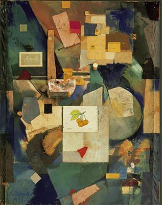
Merz Picture 32 A. The Cherry Picture
In this work Schwitters continues his exploration of abstract collage, creating an intricate and complex work that incorporates many different materials and pieces. Merz Picture 32 A. The Cherry Picture is remarkable for its abstract design and its abandonment of any sense of illusionistic hierarchy. An interplay of colors (light and dark areas) as well as added materials such as wood and scraps of paper, suggest depth and there is a total abandonment of traditional one-point perspective. Especially notable is the use of elements featuring text, such as product labels and newspaper clippings. These examples of commercial culture provoked the viewer to consider the relationship between art and everyday life.
The focal point of the image is a white flashcard featuring a printed cluster of cherries and the German and French words for "cherry" upon which he has scribbled an ungrammatical phrase "Ich liebe dir!" ("I love she!"). He essentially takes a standard educational tool and destroys its utility with blatantly incorrect language. Like other Dada artists, Schwitters manipulated words and images in order to highlight the irrationality and arbitrariness of conventional systems, in this case, language.
Cut and pasted colored and printed paper, loth, wood, meal, cork, oil, pencil, and ink on paperboard - The Museum of Modern Art, New York
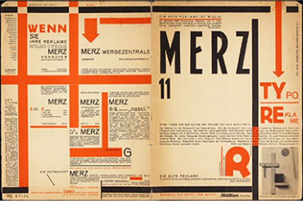
Merz 11: Typoreklame
Merz 11 offers an example of Schwitters work within the print media, groundbreaking both contextually and stylistically. The content of the Merz Magazine, launched by Schwitters in 1923, was varied and eclectic, featuring a range of artistic forms, including poetry, prose, art and advertising, and representing a variety of avant-garde artistic movements including De Stijl, Constructivism, and Dada. In this way the Merz journal united different avant-garde networks while serving as a platform to promote Schwitters' own diverse work.
Formally, the journal had a very different look. With its bold red and black lines, irregularly positioned negative space, simplified sans-serif type, and asymmetrical layout, the cover of Merz 11 resembles the striking geometric style of Constructivism practiced at the Bauhaus. Noted in other books and periodicals published at the time in both Europe and Russia, this aesthetic exemplifies the most innovative, daring and up-to-date graphic design trend. Unique to Schwitters' composition, however, is the unpredictable, irregular, and lively use of space on the pages. This would have been quite startling to the contemporary viewer. The dynamic arrangement of text and the space left between on the page highlights the artist's awareness of typography's creative possibilities and his desire to elevate the status of graphic design to art.
Letterpress - The Museum of Modern Art, New York
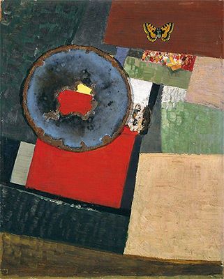
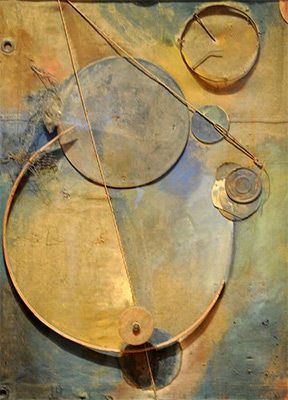
Maraak, Variation I (Merzbild)
This work, featuring mono-color painted rectangles laid out side by side in a way that emphasizes the flatness of the canvas, demonstrates Schwitters' grasp of a more abstract style in the late 1920s, one indicative of his growing interest in De Stijl. It is the irregular arrangement of these shapes and the lively and expressive brushwork used to describe them that distinguishes the work from de Stijl's strictly linear and expressionless compositions. The artist's formal evolution is additionally noted in the way the artist alters his found materials, painting over their surfaces in an effort to deemphasize their origins as elements from the outside world.
To maintain some sense of a known reality, and perhaps even a sense of whimsy, he includes an easily recognizable object here: the enameled tin butterfly. There is indication that Schwitters originally intended to include other everyday objects as well (a broken piece of china and two wooden balls that would project directly into the viewer's space) in order to ground the work in the viewer's world. Maraak encapsulates Schwitters' attempt to negotiate between the viewer's world and that presented within the constrictive space of the work itself, commenting on their overlapping yet ever distinct essence.
Oil, rusted steel, laminate, enamled tin, butterfly, paper, cork, and china, mounted on board - The Solomon R. Guggenheim Museum, New York
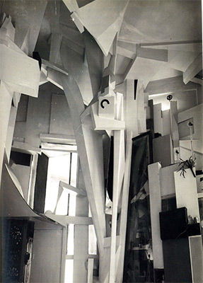
Merzbau (Merz Construction)
Schwitters' most ambitious work is a (no longer existent) multimedia construction that he eventually named the Merzbau. This project, located in the artist's Hanover studio, began as a single "column" comprised of cardboard scraps, newspaper clippings, and varied detritus. Schwitters continued to add objects to this "column" which gradually changed and transformed Schwitters' entire living space into a series of grottoes and caves. While it is difficult to ascertain the exact appearance of what became this multi-room installation, as it was destroyed during the Second World War, written records and three photographs from 1933 document a sprawling accumulation of uncontained and varied material. Apparently other artists, including Hannah Hoch, Raoul Hausmann, and Sophie Taeuber-Arp, contributed their own artwork to the installation that, alongside Schwitters' additions, transformed the original structure into a complex and virtually inaccessible morass of material and matter.
In effect, Schwitters' Merzbau was a continually changing, immersive environment meant to be experienced by the viewer (become visitor) as she walked through it; an all-encompassing work of art that defied categorization. Schwitters' created another Merzbau in Norway immediately following the war and one last one in England shortly before he passed away. Despite the fact that no physical evidence of these projects remain, Schwitters' Merzbau continues to influence artists seeking to blur the boundaries between art and life as well as those who seek art whose definition lies in its experience.
Paint, paper, cardboard, plaster, glass, mirror, metal, wood, electric lighting, and other materials
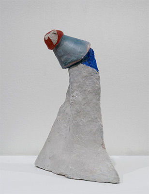
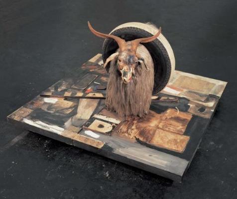
Untitled (The Clown)
Fashioned from plaster and found objects, this diminutive assemblage is characteristic of the mixed media sculptures Schwitters produced toward the end of his life, while exiled in England. Despite its unassuming stature and materials, this sculpture embodies the enduring tenderness and whimsy unique to the artist's oeuvre. For example, he attaches a hat-shaped mass to the irregularly shaped conical mass forming the base in order to add the playful characteristic of the pointed clown's hat it comes to resemble. The manner in which the top section teeters above the bottom adds a sense of spontaneity overall, adding a note of levity to the whole ensemble. Schwitters accordingly uses limited found materials to boldly question the conventional notion of sculpture as monumental and lofty, manipulating these materials into an abstract concept that provokes with both light-heartedness and elegance.
Mixed media - Collection of the Tate, United Kingdom
Biography of Kurt Schwitters
Childhood
Kurt Schwitters was born on June 20, 1887 in Hanover, Germany. He was the only child in a middle-class family. As a boy, he travelled with his father to the 1900 World's Fair in Paris. When he was 14, he had his first epileptic fit, signifying the start of a recurring condition that the artist felt continually impacted how he related to the world.
Early Training
Although not a diligent student, Schwitters studied art and drawing at the Dresden Academy from 1909-1915, distinguishing himself by his skill in rendering. This relatively long period of academic training prepared him for a conventional career as a painter and indeed, his works from this time show no sign of avant-garde modernist ideas, such as Cubism, currently in Paris. On October 5, 1915, he married Helma Fischer, a cousin, and the couple lived with Schwitters' parents in a large and comfortable apartment building in Hanover. They had one son who died shortly after birth and then a second child, Ernst, in 1918. Schwitters was originally exempt from military service during World War I, due to his epilepsy, but when conscription was extended to a wider portion of the population, he was enlisted. He spent the last year and a half of the war working as a technical draftsman in a factory not far from Hanover, an experience he later claimed responsible for his fascination with the idea of machines as metaphors for human activity.
Mature Period
Schwitters' art changed dramatically around 1918 when, seeking connection with the modernist avant-garde in Berlin, he began using litter found in the street to make works of art. This sudden shift is largely associated with the collapse of economic and political stability in Germany at the end of World War I and the rising tide of the multi-national Dada movement. That year he had a solo exhibition at the important Der Sturm gallery in Berlin and published An Anna Blume, a nonsensical Dadaist love poem. This poem garnered him the significant attention of members of German Dada such as Raoul Hausmann and Hans Arp, and gained him a local following in Hanover.
His relationship with Hausmann was quite significant in his eventual creation of Ursonate, a sonata based on two of Hausmann's poems featuring, instead of recognizable words, sounds created by letters connected in unexpected ways. The purpose of the sonata was to startle and awaken an audience expecting traditional prose. Schwitters hoped to encourage listeners to make connections between the sounds and accordingly arrive at their own personal meaning, exactly as he hoped would be the effect of his collages. Although greatly intrigued by other artists, especially the Zurich Dada group, he began to develop his own style. He called this style Merz after finding a fragment of an advertisement from the Kommerz - a local bank - (containing the four letters MERZ) in his wanderings around Hanover. He continued to use the Merz moniker for his works over the course of his lifetime.
In 1923, Schwitters began to produce Merz magazine, which would solidify his place in the international Dada network. Avant-garde periodicals provided an excellent means of exchange for European artists, and through this publication Schwitters formed relationships with leading modernist thinkers such as Theo van Doesburg, Hannah Höch, Hans Arp, Tristan Tzara, and El Lissitzky. His relationship with the Dutch van Doesburg was especially close and in addition to exchanging content and advertising in their periodicals, the two frequently visited one another's family homes. Tokens of the artist's various friendships were integrated into the fabric of his home in an ever-growing Merzbau, a large sculptural installation worked on for fourteen long years that incorporated a collection of art and objects from these friends, combined into continually changing tableaux. His close relationship with El Lissitzky at this time was fruitful as both artists explored art environments. Lissitzky's museum installation environment was titled Abstract Cabinet, and it came to Hanover in 1927.
During the same period Schwitters worked as a commercial artist, graphic designer, and typographer for local businesses, collaborating with his friend, Kate Steinetz. Together they created children's stories notable for their bold, linear design and typography. All of his design work, whether commercial, for the Merz magazine, or private, is characterized by Constructivist and De Stijl ideas of balance, order, and line. This graphic aesthetic gradually replaced the Dada one by which his earlier works were noted.
Schwitters was an idiosyncratic character. He rode his bicycle through the streets of Hanover, often loaded down with scrap paper and materials he would later make into art. Unfortunately, his work was not commercially successful during his lifetime, his various projects rarely resulted in profits. He often carried a second suitcase packed with potatoes, carrots, and a portable stove in order to save the cost of eating at restaurants. Despite this, he traveled frequently throughout Europe organizing exhibitions and maintaining contact with an extensive network of artists. His creative work extended beyond the visual arts and he was well known as an inveterate poet who enjoyed reciting his poetry aloud to fellow avant-garde figures. Artist Raoul Hausmann recalled how Schwitters presented himself: "[I remember] the night he introduced himself in the Café des Westens [in Berlin]. 'I'm a painter,' he said, 'and I nail my pictures together."
The artist's personal connections led to wonderful opportunities. Schwitters was included in the exhibition 'Abstrakte und surrealistische Malerei und Plastik' at Kunsthaus Zurich in 1929 and in 1930 contributed to the Parisian journal Cercle et Carré. In 1932, he joined the Paris-based Abstraction-Creation group, occasionally publishing in their eponymous journal. In 1936 his work was featured in two seminal exhibitions at the Museum of Modern Art in New York, 'Cubism and Abstract Art' and 'Fantastic Art, Dada, Surrealism.' Despite these promising developments, the turbulent political environment negatively affected his career. His shocking aesthetic did not fare well in Germany and in 1937 the Nazi regime banned his work as "degenerate." In response, Schwitters left for Norway, leaving his wife Helma behind to manage their property.
Late Period
In the later part of his life, Schwitters compulsively produced art even under the most difficult circumstances. He created a second Merzbau while in exile in Norway before being forced to flee to the United Kingdom. As a German, he was interned in a series of camps, moving around quite a bit until 1940 when he finally settled in with a group of other detained Austrian and German artists on the Isle of Man. During this period he created art out of whatever materials were available, allegedly even using leftover oatmeal for small sculptures. Schwitters was finally released from this last camp on November 21, 1941 and moved to London. There he tried, unsuccessfully, to obtain a visa to America, a long-held dream.
In April of 1944 the artist suffered his first stroke, which left him temporarily paralyzed on one side of his body. Schwitters' wife Helma, with whom he had been separated since the onset of the war, died of cancer in October 1944 in Hanover, but Schwitters only learned of it months later. Despite being largely bedridden from 1946 to 1947, Schwitters began construction of a new, third, Merzbau in England (directing others on the physical work) with financial support from the Museum of Modern Art in New York. He died on January 8, 1948 before it was completed.
The Legacy of Kurt Schwitters
Schwitters believed in his own artistic importance and kept copious records of all his work in manila folders in the attic of his family home in Hanover. Tragically, an Allied bombing raid in WWII destroyed all of them, including his complete archives, the magazines and books he had designed and written, multiple works of art, and his first Merzbau - the elaborate sculptural environment that was his masterwork. This tremendous loss, and the fact that he did not receive commercial success during his lifetime, has complicated gauging his significant contribution to modern art.
Nevertheless, Schwitters anticipated many of the most significant trends in avant-garde art, most importantly the combination and manipulation of ordinary materials within multi-media oeuvre, as noted in the works of Jasper Johns and Robert Rauschenberg and an almost whimsical approach to art as noted in that of Claes Oldenburg. His belief that art could not be restricted to a canvas on the wall and anticipated the Happenings, participatory events of the 1960s characterized by mixed media, art, and performance. The idea that art should provoke the audience to make their own connections between the given elements, so fundamental to his Merz creations, was key to many postmodernist artists.
Influences and Connections


Useful Resources on Kurt Schwitters
- Kurt Schwitters: A Journey Through ArtBy Gwendolen Webster, Roger Cardinal
- Kurt Schwitters: Space, Image, ExileBy Megan R. Luke
- Kurt Schwitters: Artist PhilosopherOur PickBy Mel Gooding
- Kurt Schwitters: Color and Collage (Menil Collection)By Isabel Schulz and Josef Helfenstein