 Ask The Art Story AI


Summary of British Pop Art
Although the term Pop Art is usually associated with the work of artists working in New York in the 1960s such as Andy Warhol and Roy Lichtenstein, the movement actually found its earliest voice in Britain a decade earlier. Still recovering from World War II, with a bankrupt population dependent on rations, the nation's artists looked west to the new consumerist paradise being advertised in the prospering United States. British Pop Art rose out of a strong outsider's perspective as it looked both longingly and critically, yet with a healthy sense of irony, at the new visual imagery arising from this far off dream where everything from toasters to cars to beauty creams were placed on colorful pedestals in the glossy pages of magazines or touted on television in the hands of long legged beauty queens.
As early British Pop artists like Eduardo Paolozzi, Richard Hamilton and Peter Blake began to borrow heavily from this marketing language of post-War Americana, they initiated a significant movement away from the traditional parameters of what constituted art. This departure from tradition also extended to new techniques such as collage and commercial screen printing - breaking down previous orthodox distinctions between art and design, popular culture and high culture, and between mass production and individuality. The work also complemented, and often was intricately connected to, the energetic pop music scene, which originated around the same time in Britain marked by bands such as The Beatles and The Rolling Stones.
Key Ideas & Accomplishments
- British Pop artists aimed to shake up a stale art tradition in which works were customarily related to mythological, biblical, or emotional themes. Pop Art became their vehicle of expressing this hunger for change. Although much of their inspiration was founded in the Dadaist language of creating irrational combinations of random images to provoke a reaction from the establishment of the day, British Pop artists found their original fodder in the brash, fun, and bold world of contemporary culture. Their new work thrived with a youthful energy, and by infusing their topics with humor, new images began to topple the historical parameters of art by representing the current mood.
- Although British Pop Art makes extensive use of the American advertising that came out of the post-World War II consumer boom, it remains distinct from American Pop Art. This is due to the fact that while American artists were primarily inspired by what they saw and experienced within their own culture, early Pop Art in Britain was fueled by American popular culture viewed from a distance. Later, as the swinging London musical and fashion scenes began to rise, British artists began incorporating the culture of their own country into their artistic lexicon as well.
- By utilizing innovative advertising and design industry methods such as screen printing and collage-style graphic layouts, artists were able to construct works reminiscent of ads, album covers, pages of popular magazines, posters, catalogs, and other marketing-related propaganda. By creating relatable works that tweaked resonance within the common man, British Pop Art successfully pierced the veil between high and low art making it accessible to all.
- By making art that was essentially about art, embedded with a strong adverse reaction to the introspection and elitism that had dominated Abstract Expressionism, British Pop artists reintroduced the image as a structural device. Subject and object became the same thing, instantly recognizable and un-laden with abstraction. This neutrality and literalness provided artists with an opportunity to explore the visual and physical qualities of the medium while asking the viewer to reevaluate preconceived notions about what constitutes art.
Key Artists


Artworks and Artists of British Pop Art

I was a rich man's plaything
This collage, composed of a selection of images from American magazines given to Paolozzi by American ex-soldiers in Paris, was created as part of a series noted for prompting the beginnings of the Pop Art movement. The work is credited for being the first to use American advertising toward creating a new visual language for a post-War world.
The collage includes the cover of a magazine called "Intimate Confessions", which features a voluptuous woman who, it is implied, spills her secrets inside the magazine. Paolozzi combines this with an image of a cherry pie, pointing to the similar treatment of women and food as objects of desire in the seductive new sphere of American advertising. She is also faced with an image of a hand holding a gun, which has been fired and says "POP!" in a cartoonish way. This is considered to be the first use of the word "pop" in art of this type. The inclusion of the gun makes the effect of the work slightly sinister, giving an unsavory twist to the "confessions" supposedly revealed in the magazine. At the same time, however, the gun with its seemingly harmless "pop", perhaps points to advertisers' and consumers' preference for visual effect over real substance or quality. While this work was a vital forerunner of the movement, it also differs from later work by artists such as Richard Hamilton or Peter Blake. This early example makes use of a significantly less polished aesthetic than later Pop Art works, taking dog-eared or dirty cuttings from advertisements and mounting them on a similarly marked and unclean piece of card.
Collage - Collection of the Tate, United Kingdom
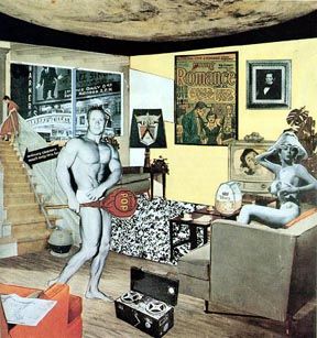
Just what is it that makes today's homes so different, so appealing?
For this collage, Hamilton uses images cut from American magazines to create a contemporary interior featuring fashionable furniture and modern domestic products such as a television, tape recorder, and vacuum cleaner. In the room are a muscleman holding a suggestive lollipop, which bears the word "POP", and a naked woman who is perched provocatively on the couch. The man and woman are posited as a modern day Adam and Eve, surrounded by the temptations of the American post-War consumer boom.
The work was created by Hamilton for the catalog cover of the seminal 1956 exhibition at London's Whitechapel Gallery, "This is Tomorrow," which was a key starting point for the British Pop Art movement. Similarly, the work has been credited as being fundamental in initiating the movement; as early as 1965 is was described as "the first genuine work of Pop."
Hamilton's collage microcosm presents a world in which there is a constant influx of information. In drawing up a list of the image's components, Hamilton pointed to his inclusion of "comics (picture information), words (textual information) [and] tape recording (aural information)." This sense of information overload became compounded at the time by the addition of the television, newspaper, and cinema. A comic cover has been framed on the wall adjacent to a more traditional piece of artwork (which is smaller, and is relegated to the corner), illustrating both Hamilton's idea of Pop as a new kind of art with popular culture as its key source and the breakdown of the walls between fine art and graphic design.
Collage - Kunsthalle Tubingen, Tubingen

On the Balcony
In this piece, Blake combines images of ordinary, everyday people with a plethora of references to the theme "On the Balcony." These range from ephemeral magazines and snapshots to consumer goods to the art found in museums and galleries. For example, the figure on the left-hand side holds a copy of Eduard Manet's The Balcony (1868), while a copy of LIFE magazine obscures another figure's head. The youthful subjects appear to be teenagers and can be seen as tokens of a fresh generation receptive to Pop art's key principles, which were the breakdown of traditional understandings of the art object and sources, and the breakdown of the boundaries between art and popular culture.
Although On the Balcony may look like a collage, it is actually an oil painting. This signature technique was used by Blake to create an altogether new version of the Pop Art aesthetic. His accumulation of imagery, all represented through paint on a singular plane, came to represent an overall visual consciousness which married both high and low art sources with no discernable boundaries between the two. Perceived value between subjects becomes blurred in Blake's homogenous depictions - a thumb in the eye to the hallowed halls of the institution of painting.
Oil on canvas - Collection of the Tate, United Kingdom

Greece Expiring on the Ruins of Missolonghi (After Delacroix)
Made during his last year at the ICA, Caulfield chose to create his own version of a work by the same name by Delacroix. In his version, he draws on both the tradition of fine art and the aesthetics of widely distributed propaganda posters, particularly those of the Soviet Union. Indeed, the work has a political edge to it, making a statement in support of the Greeks, who fought a civil war in 1927. Caulfield uses the historical event to convey his message of the importance of freedom, a popular idea in the 1960s and amongst the Pop artists in particular. Caulfield chose to work from a black and white photograph of the painting so that he could apply his own color palette without the distraction of Delacroix's original. By simplifying and removing most of the detail, Caulfield recreates Delacroix with a distinctly modern view.
Caulfield can be seen as an early pioneer of the "flat" art movement, itself a precursor to today's graphic designers who utilize Photoshop filters to reduce realistic images to pure outline and color. Working in much the same way as a commercial sign painter, he employed simple flat images of objects lined with black and isolated against unmodulated fields of color absent of visible brushwork. He frequently used house paint (which has a limited range of colors available) and other commercial materials to create his works, in an attempt to break down the boundaries between artists and commercial painters and designers. This stark and stripped down aesthetic challenged realism while adding vibrancy to the possibilities of Pop.
Paint on board - Collection of the Tate, United Kingdom

Brigitte Bardot
This portrait of Brigitte Bardot, universal sex symbol of the cinema, is perhaps Gerald Laing's best-known work. In it, an actual appropriated print of the starlet's face is showcased within a thick black circle. By zeroing in on her moneymaking features, the artist's hand causes us to reflect on the way we frame celebrities, viewing them as objects targeted by our societal obsession with icons of beauty and fame.
Gerald Laing's contributions to the British pop art movement often explored the relationship between an everyman audience and the pop cultural explosion that he saw around him. He created large canvases based on newspaper photographs of famous models, astronauts, film stars, and contemporary events positioned as larger than life. Moving away from the generic-based objects of everyday advertisements, his subjects represented iconic figures in the popular culture of the time and their injection into the communal psyche. His earliest pieces presented many young starlets or bikini-clad beauties but later work frequently mirrored current events. For example, his piece Souvenir (1962), commented on the Cuban missile crisis via a 3D effect, which allowed the viewer to see Khruschev from one angle and Kennedy from another.
Oil on canvas - Private Collection

BUM
Kenneth Tynan, one of the most influential theater critics of the twentieth century, wanted to create, in his words, “a pop art ballet designed by Pauline Boty, based on paintings that focus on the principle erogenous zones”, and commissioned Boty to create pieces for this new musical production called, Oh, Calcutta!. It was an “anti-censorship” revue (with scenes written by the likes of Beatle, John Lennon, and Irish playwright, Samuel Beckett) that featured many fully naked performers. The title Oh, Calcutta! Was a play on the French saying meaning “oh what an arse you have” thus providing the inspiration for Boty’s joyously irreverent painting.
The “cheeky” cartoon-like bare female buttocks are placed within the theatrical framing device of the proscenium arch. The added element of kitsch is achieved using gaudy – yellow, pink, green, red – colors. The letters BUM are spelt out in bold red letters while decoration above the arch features what appears to be a coat of arms.
Questions have been raised about Boty’s secondly role in the British Pop Art movement, especially so given her appearance in the British director Ken Russell’s documentary for the BBC, Pop Goes the Easel. It gave equal billing and screen time to Boty, and three other emerging pop artists, Peter Blake, Derek Boshier and Peter Phillips. Russell’s film achieved truly seminal status with critic Ali Smith calling Boty’s segment “far and away the wildest, most experimental, surreal and eye-catching part [and] still strange to the eye today”.
Sue Tate, writing the BUM catalogue entry for Christie’s auction house, said the painting “could be read as a sensuous celebration of life. Yet the meaning is surely more ambiguous. We have a reified body part, set above a demonic title, BUM, rawly proclaimed in chunky san-serif lettering and revealed ‘on stage’ inviting perhaps a slap or a caning as much as a caress: Tynan’s sado-masochistic tastes and desires were well documented. Certainly, any simple celebration of sexual pleasure has been superseded by something more complex and interesting”. Tate adds that while her sex was a likely setback in being taken more seriously as an artist, Boty’s “proclaimed identification with mass culture was perhaps problematic [too] for a movement that insisted on artistic ‘detachment’ from low cultural sources in order to be taken seriously. […] In the wake of feminist interventions and postmodern collapse of hi/low cultural boundaries, the significance of the work is finally fully revealed, and it resonates profoundly with contemporary understandings and concerns”.
Oil on canvas - Pallant House Gallery

Perfect Match
A contemporary of Hockney and Blake, Allen Jones was particularly interested in the representation of women in popular culture and advertising. In Perfect Match he creates a highly sexualized image in which all the viewer can see of the woman's face is her disproportionately large mouth while her unnaturally perky breasts and legs, tottering on impossibly high heels, are emphasized as well. The piece implies that women are only valued for their body parts. The arrangement of three separate canvases hung one on top of another as a triptych furthers this notion, pointing to the way that advertisements would often promote consumer goods by associating them with fragments of the female form.
Jones' regular use of the bright primary and secondary colors of Pop Art to illustrate the body lends an unnatural feel to his figures in which they become completely artificial, just as fake as the invented images to be found in magazines and on billboards. In the late '60s this oeuvre expanded to include sexually provocative life-size fiberglass sculptures of women as furniture with fetishist and sado-masochist overtones. His work offered a challenge to traditional art representations of women to be found on orthodox gallery walls.
Jones' pieces tend to be two-fold. On the one hand they are a critique of the overt sexualization of women by the media, but they also present deliberately titillating (and sexist) images in their own right. He therefore manages to both criticize and contribute to the mainstream system from which he takes his inspiration.
Oil on canvas - Museum Ludwig, Cologne
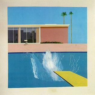
A Bigger Splash
In A Bigger Splash, David Hockney explores how to represent the constantly moving surface of water, intrigued by the idea that a photograph could capture the event of a split second, which he sought to recreate in this painting. He said in his autobiography, "I love the idea first of all of painting like Leonardo, all his studies of water, swirling things. And I loved the idea of painting this thing that lasts for two seconds: it takes me two weeks to paint this event that lasts for two seconds." The buildings are taken from a previous drawing he had made of a Californian home, while the splash was contrived from a photograph in a magazine. The dynamism of the splash contrasts strongly with the static and rigid geometry of the house, the pool edge, the palm trees, and the striking yellow diving board, which are all carefully arranged in a grid containing the splash.
This painting becomes slightly jarred by a disjointed effect that is absolutely intentional, and in fact one of the hallmarks of Hockney's style. The effect nods to the stylization and artificiality presented at the time of a "perfect" lifestyle within the modern home lexicon while drawing on the aesthetic vocabulary of Pop Art and fusing it with Cubism.
Although a significant member of British Pop art's early generation of artists, David Hockney came to take Pop Art painting in a new direction incorporating lifestyle architecture and fantasy landscapes into his work. He was also one of the first artists to make extensive use of acrylic paint, which was then a relatively new artistic medium.
Acrylic on canvas - Collection of the Tate, United Kingdom
Beginnings of British Pop Art
Eduardo Paolozzi's Collages
In 1947, Eduardo Paolozzi started work on a series of collages, which borrowed cutout imagery from American magazines. He spent time in Paris in the late 1940s, where he got to know members of the Surrealist group such as Alberto Giacometti and Jean Arp. Much of his work from this era was inspired by Dadaist and Surrealist works, and these collages in particular were influenced by artists such as Max Ernst. Paolozzi gathered magazines from American soldiers, who were stationed there on training programs after the Second World War, and became fascinated by the bold, colorful, and sexualized visual language employed by advertising designers. Britain and France were still feeling the bitter economic after-effects of the War and the American advertisements provided a degree of fantasy escapism from Europe's impoverished reality. Paolozzi's 1947 work, I was a rich man's plaything, is the first artwork to employ the word "pop," which is depicted bursting out of a gun in a cartoon-like white cloud. These compilations of popular imagery became the foundation for the Pop Art movement.
The Independent Group
Although Paolozzi started making his collages as early as 1947, it wasn't until 1952 that he began showing them to his peers. Paolozzi was a founding member of the Independent Group, a gathering of artists based in London, who would meet at the new Institute for Contemporary Arts. Other members included artist Richard Hamilton, artist and sociologist John McHale, architects Alison and Peter Smithson, and critics Lawrence Alloway and Reyner Banham.
Paolozzi's proto-pop collages were greeted with excitement, and the group began discussing the possibilities of using popular culture more extensively as a source for their work. References were soon extended beyond advertising into Hollywood movies, pop music, comic books, and industrial design as artists started to explore and expand the genre's boundaries.
The origin of the term "Pop art" has been much disputed. However, it is often attributed to Richard Hamilton, who wrote a definition of Pop Art in a letter in 1957. He wrote "Pop Art is: popular, transient, expendable, low-cost, mass-produced, young, witty, sexy, gimmicky, glamorous, and Big Business."
This is Tomorrow - The Exhibition
In 1956, London's Whitechapel Gallery staged a seminal show called "This is Tomorrow," where artists, architects, and designers were invited to collaborate on a series of works. Exhibitors included the core Independent Group from the ICA, and some of the most important early works of Pop Art were produced for the show. These included Richard Hamilton's seminal collage What is it that makes today's homes so different, so appealing? - created in association with John McHale for the cover of the show's catalog. The piece used images cut from American magazines, compiled to reflect the interior of a contemporary home, complete with a modern Adam and Eve amidst the furnishings. Other important works in the show included Fun House, for which Hamilton collaborated with the architect John Voelcker. It was a fully immersive Pop experience, with larger-than-life images of cartoon robots and Marilyn Monroe, a large three-dimensional model of a Guinness bottle and pop music blaring from speakers.
A New Generation
British pop artists, particularly Hamilton and others involved in the Independent Group, took an intellectual or even academic approach to what Pop Art could achieve in its confrontation of popular culture and the orthodoxy of the art world. Following the acclaim of "This is Tomorrow," Richard Hamilton was offered a post teaching at London's Royal College of Art. There, he maintained a strong influence over his students including newcomers David Hockney and Peter Blake, who would become fundamental in furthering the movement. Both artists participated in the 1961 Young Contemporaries exhibition, alongside other young British Pop artists such as Allen Jones, Patrick Caulfield and R.B. Kitaj (an American-born artist who nonetheless contributed to the British Pop Art scene). During this time other artists such as Joe Tilson, Gerald Laing, Jann Haworth, and Pauline Boty were also forging their own voices within the British Pop Art lexicon.
British Pop Art: Concepts, Styles, and Trends
Art & Culture: Combining Popular Imagery
The merging of Pop and popular culture was something particularly British, wrapped up in the inextricable dynamics of the vibrant art and music scenes of London in the swinging '60s. Borrowing from movies, magazines, and music was a key feature of Pop art, but artists and their works also entered the popular sphere themselves. One of the main facets of British Pop art, which established it as an insular movement was its close association with British popular music, which rose as an alternative to rock and roll. Focused on the singles chart, it burgeoned in the late 1950s and 1960s, with The Beatles and The Rolling Stones taking the world by storm.
Peter Blake's colorful collage approach culminated in the iconic cover he designed, along with his wife Jann Haworth, for the Beatles' album Sgt. Pepper's Lonely Hearts Club Band. Richard Hamilton was a member of the circle of notorious art dealer Robert Fraser, whose art gallery was a hub not only for many important exhibitions but also the infamous drug-fueled parties attended by pop stars such as Mick Jagger. Mick Jagger and Fraser were both (famously) arrested in 1968 and charged for drug possession, an event which Hamilton documented in his painting Swingeing London (1968-9). Hamilton also designed a Beatles album cover and heavily influenced Roxy Music-founder Bryan Ferry when he taught him in Newcastle. Thus, the British Pop movement was unusual, in that the world of the Pop artists and that of the popular culture they borrowed from interacted heavily and were sometimes indistinguishable from each other.
Use of American Adverts
The visual language of American advertising was hugely influential for early British Pop Art. Paolozzi in particular made extensive use of adverts cut from American magazines that he got from US soldiers based in Paris after the end of the Second World War. Paolozzi described American advertising as a medium "where the event of selling tinned pears was transformed into multi-colored dreams, where sensuality and virility combined to form, in our view, an art form more subtle and fulfilling than the orthodox choice of either the Tate Gallery or the Royal Academy." British Pop artists were looking at American advertising imagery and its highly sexualized visual language both with a degree of envy and with an outsider's view of the alien.
Advertising would continue to inspire other British Pop artists. Richard Hamilton pulled images to construct intricate interior collages where commercial products and furnishings from popular catalogs sat side by side with models from magazines. Peter Blake's paintings often featured painted visuals copied from popular culture. David Hockney scoured architectural and lifestyle periodicals as inspiration for his modern indoor/outdoor environments. Gerald Laing appropriated media images of celebrities and notable people pulled from news sources, and Patrick Caulfield often painted products such as housewares into flat renditions much like they would appear in catalogs.
Use of Screen Prints
In the 1960s, British Pop artists such as Hamilton, Paolozzi and Blake began to explore the artistic possibilities of screen printing as a medium. Traditionally, screen printing had only been used as a commercial process, utilized particularly in the advertising world. Pop artists were naturally drawn to the medium because of its connotations with non-traditional art and with the commercial language of advertising.
Indeed, Paolozzi used screen printing for both "art" and "design" processes in his own practices, using it to create art images as well as in the textiles and wallpaper business he ran for ten years in the 1950s. He thus attempted to break down the traditional distinction between art and design, artist and designer. His work was furthered by Hamilton, Blake, Laing, and others, who made extensive use of screen printing as a means to create multiple versions of a work, and to question the taboos around making copies of one-of-a-kind art pieces. Screen printing was also famously taken up by Andy Warhol, whose experiments with the medium in the 1960s resulted in his iconic Marilyn Monroe works (along with prints of Elvis, Jackie Kennedy, and others), which have come to be emblematic of Pop Art as a whole.
Interest in Interiors
Another regularly occurring trope in British Pop Art is the interior environment. Richard Hamilton frequently depicts domestic rooms as part of his commentary on how advertising manipulated a person's sense of identity within their own home or personal space. Tongue-in-cheek nods to the ideal, cheery lifestyle motivated by a consumerist's impetus to buy and own all the right things was accentuated by works where rooms contained all the latest products and men and women were posed as model inhabitants of these perfect worlds. Hamilton's interest in interiors was also picked up by his student David Hockney, whose paintings of everyday life in California homes such as Beverly Hills Housewife (1966) were to take the British Pop aesthetic in a new direction. He also revisited the interior trope in the 1980s, when he made a series of paintings of Los Angeles interiors, using the bold colors of Pop but offering a skewed, nearly abstracted perspective.
Collaboration
Collaboration between artists and across disciplines was a key characteristic of British Pop Art. The important "This is Tomorrow" exhibition at London's Whitechapel Gallery was a collaborative show where artists were invited to create a selection of works and installations. One of these was Fun House (1956), created by Richard Hamilton in collaboration with architect John Voelcker. The piece was designed as a full Pop Art immersion, where a viewer could literally experience a house decorated with images from popular culture. Hamilton also later collaborated with American pop artists and the German artist Dieter Roth. Similarly, Eduardo Paolozzi frequently worked with his friend, the photographer Nigel Henderson, creating works of both art and design together. These collaborative acts of making were intended to undermine the traditional notion of the solitary artist and the artistic genius, suggesting that, as in popular culture and design, several people could work together to create an artwork.
Later Developments - After British Pop Art
Pop Art from Britain soon began to influence work across the Atlantic in America. In the 1960s American art critic and historian Barbara Rose coined Neo-Dada as a new movement exemplified by its use of modern materials, popular imagery and absurdist contrast with a nod to Dadaist roots combined with a Pop philosophy. On the international Pop Art stage, artists such as Andy Warhol, Roy Lichtenstein, James Rosenquist, and Claes Oldenburg soon outstripped British Pop artists in terms of fame with their colorful paintings and designs that injected glamor into the everyday and popular culture.
While the tightly knit nature of the British Independent Group and its collaborative work started to splinter in the 1960s, artists such as David Hockney continued to evolve the aesthetic vocabulary of British Pop Art providing a counterpart to the work of American peers entering the Pop lexicon. His bright, flat paintings of Britain and the US, such as A Bigger Splash (1967) began to expand the genre beyond its national borders.
The legacy of British pop artists can also be seen in some of the work inspired by popular culture that came to the fore in the 1980s, such as that by Jeff Koons. Koons' recent design for Lady Gaga's album ARTPOP could be seen as inspired by Hamilton and Blake's work for pop icons such as The Beatles. The influence of Pop can also be seen further afield, such as in the "superflat" movement made popular in Japan by artists such as Takashi Murakami, which makes extensive use of the imagery of advertising and popular culture.
Useful Resources on British Pop Art
- Richard HamiltonBy Richard Hamilton edited by Richard Morphet
- David Hockney: The Biography, 1937-1975Our PickBy Christopher Simon Sykes
- No Place Like Utopia: Modern Architecture and the Company We KeptBy Peter Blake


