Ask The Art Story AI

Summary of Corita Kent
Corita Kent, a nun for over three decades, created bold and colorful silkscreen prints that championed social justice causes. Kent took seriously the Catholic ideas of finding the holy in one's everyday life and so turned to popular images and song lyrics as well as commodity labels and lettering. Kent combined these with biblical verses and her own handwriting to create compositions that spoke to the weighty themes of poverty, racism, and war. Kent merged a Pop Art aesthetic, inspired by Andy Warhol, with spiritual and compassionate thinking in order that her art be accessible to the largest public possible. Through her work and her decades of teaching avant-garde art Kent inspired and showed new directions for numerous artists and activists.
Accomplishments
- Working almost exclusively in silkscreen printing, or serigraphy, Kent not only emulated Pop Art methods, but she was also adamant that this medium, which created multiple prints of the same image, was more accessible and affordable for more people. This democratic notion of art making and art buying went hand-in-hand with her social justice activism.
- Unlike much Pop Art, which glorified and criticized the new American commodity culture, Kent used the everyday - a loaf of bread or a can of tomatoes - to imbue it with a sense of spirituality and religiosity. Additionally, her inclusion of texts written in her own handwriting added a sense of the personal that most Pop Art lacked.
- Steeped in the liberal tradition of Catholicism that promoted social justice, Kent, even after she left the convent, combined the radicality of artistic avant-garde practice with social activism, creating a protest art that railed against America's war in Vietnam, that supported Civil Rights, and that shone a light on poverty and hunger. While much Pop Art eschewed overt politics, Kent thoroughly embraced socially outspoken art.
The Life of Corita Kent
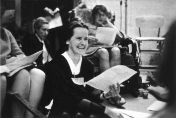
When Sister Corita Kent became an influential Pop Artist, religious elders were unhappy. Complaints were made about her art and she was asked to abandon her creative calling. She left her convent as a result and found herself at the age of 50 living alone for the first time and lacking life skills. Unable to drive or cook, she was unperturbed and went on to create a body of powerful art that wowed the likes of Andy Warhol!
Important Art by Corita Kent
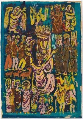
The Lord Is With Thee
The Lord Is With Thee was Kent's breakthrough piece after graduating from her MA program at the University of Southern California. Kent remembered of her last year at USC, "[D]uring that course I made two prints. And the summer following that, I looked at one of them, and it was really so bad that I started adding colors on top of it, making a completely new print, which is that print hanging over there called The Lord Is With Thee. It turned into a completely different picture because underneath it was a picture of the Assumption, with a very, as I remember it, a kind of fashion-modelish lady in the center. It was a very unwhole picture."
In many ways, the composition is traditional, showing the veiled and crowned Virgin Mary with her hands raised, surrounded by haloed saints, angels, kings, and shepherds. Influenced by Byzantine and medieval art, which Kent had studied at college, the flat, two-dimensional style lends itself to the screen printing process. Yet in other ways the print is far from traditional. The scene is a riot of garishly celebratory color, with uneven lines and simplified figures. The searing yellow overlaps messily with the deep blue background and pastel pink detailing, while many of the figures are roughly filled in with earthy brown. Brushstrokes and drips of color are left visible in this print, clearly an early example of the influence of the Abstract Expressionists. Even in this early and most traditional of her works, Kent's idea of a celebration of the heavenly Madonna did not necessarily coincide with the more conservative Catholic taste of 1950s Los Angeles.
Serigraph - Corita Art Center, Immaculate Heart Community, Los Angeles, California
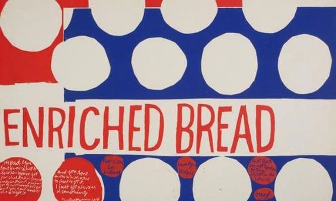
That They May Have Life (Enriched Bread)
By 1962, Kent's art had changed significantly, having taught for many years and travelled to new places. The world had become more consumer-driven, and Hollywood was suddenly engulfed by advertising, branding, fashion, music, and movies. With this cultural background in mind, when Kent saw Andy Warhol's work for the first time in 1962, her immediate response was a print called Wonderbread.
In 1964 Kent developed the idea, creating a print called That They May Have Life (Enriched Bread). Kent took inspiration from the wrapper for Wonder Bread, where she noticed these same circular shapes were used to decorate the packaging. In her reproduction of the advertising, these shapes, paired with the phrase "enriched bread," transforms the geometric packaging design into a symbol of the Eucharist, the consecrated bread that Catholics believe is the body of Christ, which they consume in the Communion ceremony that commemorates the Last Supper. Here, Kent incorporates, or sees, Christ in the everyday, a real presence in the modern world, yet the piece also contains a social commentary on hunger. On the left side, Kent included a quote from a Kentucky miner's wife, talking about her struggles to feed her five hungry children. And across the smaller red circles, a quote from Gandhi: "There are so many hungry people that God cannot appear to them except in the form of bread." The two speakers, a poor white woman and a famous activist, are given equal space in the composition and so too their insights. By combining the written and the visual, Kent plays on the languages and graphics of advertising in early 1960s America, while imbuing them with real social and spiritual significance.
Serigraph - Photograph by Arthur Evans, Corita Art Center, Immaculate Heart Community, Los Angeles, California
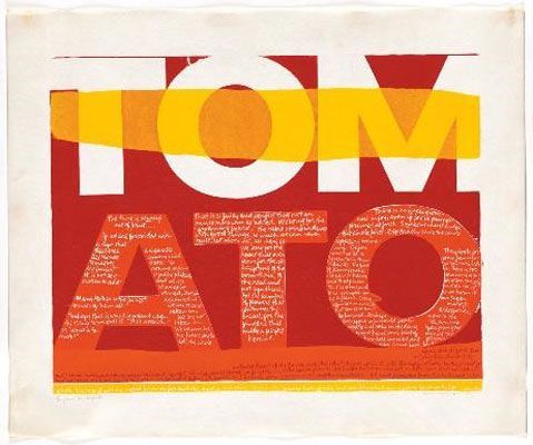
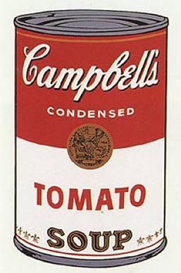
The Juiciest Tomato of All
In 1964, Sister Mary Corita appropriated the label for Del Monte tomatoes, whose tagline, "The Juiciest Tomatoes of All," became the basis for a print. The screen print perfectly represents Corita's use of what she would term "Footnotes and Headlines." She uses the "headline" of the word "tomato" in bold, supermarket-like lettering, making it reminiscent of a billboard advertisement or logo. An easy to understand and recognizable reference, it draws the viewer into the composition, and once drawn in, they then encounter the "footnote," the smaller, cursive writing inside the letters, which declares: "Mary Mother is the Juiciest Tomato of All"..."Perhaps this is what is meant by the slang 'she's a peach!' or 'what a tomato!'" Some saw such language - describing the Virgin Mary as a "juicy" tomato - as sacrilegious because of its sexual connotations.
This "footnote," or supporting text, completely transforms the meaning of the "headline" text. The word "tomato", rather than being a quotation from a food brand, becomes something imbued with the divine. It becomes a part of the everyday world in which the spiritual can shine through in a real, embodied way. The new Vatican II directives included combating world hunger, and Kent reclaimed the capitalist use of language to promote that goal. With characteristic humor, Sister Corita appropriated pop language for her own uses, allowing her to demonstrate the way in which the generosity, kindness, and abundance of the Mother Mary and Christ can be found in modern day-to-day existence.
Sister Corita wrote that "in a way, all the words we need are in the ads." While her contemporaries Jasper Johns, Jim Dine, Robert Indiana, and Edward Ruscha also played with language in their Pop compositions, none imbued it with Kent's spirituality. Despite her differences from Andy Warhol, he was fascinated by her work, perhaps because of his own complicated relationship with Catholicism. In 1965, an Immaculate Heart Sister wrote of Sister Corita's yearly winter exhibition, "The opening is crowded with fans. Andy Warhol is there. He would be captivated by the idea of an artist nun, especially one who uses Wonderbread wrapping as a symbol for Eucharist."
Screen print - Corita Art Center, Immaculate Heart Community, Los Angeles, California
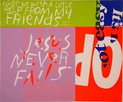
Jesus Never Fails
Jesus Never Fails is typical of Corita Kent's mid-1960s output. At this time, she was fully committed to Pop but still enveloped in the Immaculate Heart community and unwilling or unable to transparently produce protest art. However, her prints from this time obliquely suggested a kind of social protest against despair and disillusionment, encouraging hope and positive action.
A classic Pop arrangement, brightly colored blocks divide the space, in the way brand names, logos, and slogans divide billboards and packaging. The tightly controlled shapes are interrupted with snippets of phrases which cross the boundaries of squares and are, in some instances, written at a slight angle. The typography is interrupted, rotated, flipped, or cut up, making the viewer concentrate on working to excavate meaning from the words, a process distinctly different from the passivity of advertising.
Each phrase featured in the composition seems disconnected from the others: from the religious "Jesus never fails" and the demand "DO," to the inscription "It's not easy" and the Beatles lyric "I get by with a little help from my friends." A typically eclectic mix of references, when taken together they leave the viewer with a simultaneously vague but distinct message: life is hard and hope is not easy, but if one commits oneself to living actively, in awareness of the presence of God and friendship, hope can be found. When considered in the context of 1967 California, known for the Summer of Love, Jesus Never Fails becomes part of a wider call for focus on harmony and spirituality.
Serigraph - Corita Art Center, Immaculate Heart Community, Los Angeles, California
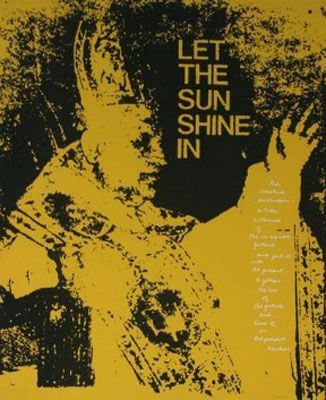
Let the Sunshine In
In 1962, Pope John XXIII formed Vatican II, a reforming council that aimed to modernize Catholic Church. The council stressed increased dialogues with other religions and the use of vernacular (non-Latin) language, music, and artwork in the church. John XXIII said that it was time to "open the windows [of the Church] and let in some fresh air," but by 1968, Kent and the Immaculate Heart sisters were on rocky footing with the archdiocese in Los Angeles.
The nuns (especially Sister Corita) took these changes to heart and aimed to form their lives, community, and art around this new, modern Catholicism. Yet, while these seismic changes were discussed in Rome, many leaders in America did not welcome the new directives. The Archbishop of Los Angeles, Cardinal James Francis McIntyre, was highly conservative and strongly objected to what he described as Sister Corita's "weird and sinister" art.
Showing a bright yellow, grainy image of Pope John XXIII, the print was accompanied with the text "LET THE SUN SHINE IN." The phrase appeared in the 1954 song "Open up your heart (and let the sunshine in)" by Stuart Hamblen but was reprised in the 1967 countercultural musical Hair, whose number "Aquarius (let the sunshine in)" became extremely popular. The combination of text and image appeals to the leaders of the Catholic Church to allow the promised "fresh air" and sunshine in, by accepting new ideas and attitudes.
To add to the print's revolutionary call to the church, Sister Corita quoted Arthur Waskow, the revolutionary Rabbi linked to the Jewish Renewal Movement of the time: "The creative Revolution - to take a chunk of the imagined future and put it into the present - to follow the law of the future and live it in the present." She goads the American Catholics, suggesting that if figures like Waskow succeeded in modernizing Judaism, why not Catholicism? Yet, it is likely that Sister Corita's 1968 print Let the Sunshine In was a final straw for the Cardinal. After a sabbatical, by the year's end, the disapproval of the Archbishop was too much for Corita, and she officially left Immaculate Heart College and the life of a nun forever.
Serigraph - Harvard Art Museums, Corita Art Center, Immaculate Heart Community, Los Angeles, California
Manflowers
By 1969, two key changes affected Corita Kent's screen-prints; she was freed from the censorship or pressure she was under as a nun formally serving the Catholic Church, and it was clear that the Summer of Love was definitively over. The gentle calls for peace and love had given way to angry protests and a mass of political unrest in the United States, most forcibly, in outrage at the continued American involvement in the Vietnam War and in the riots following the assassination of civil rights leader Martin Luther King, Jr. While President Nixon said he was taking steps to end the war rapidly and promising to achieve "Peace with Honor," many American citizens felt appalled that honor could ever be a quality connected to America's actions in Vietnam. In addition to the tens of thousands of American troops who were killed and the hundreds of thousands wounded, over a million Vietnamese and Viet Cong fighters were killed as well as 2 million civilians through the brutal regime of bombing and chemical warfare.
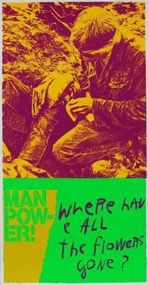
During this period, Kent produced a series of prints she entitled Heroes and Sheroes. One of the prints, Moonflowers, addresses the occasion of the first man on the moon, but Manflowers takes on the casualties of the Vietnam War. A searing yellow and deep purple image tops the composition, showing two young, wounded American soldiers. One soldier crouches in the mud, tending to another with bandages as he lays on his back. Under the image, Kent printed two phrases: "Man Pow-er!" and "Where have all the flowers gone?" The second phrase is from a popular song, "Where have all the flowers gone?" written by the folk musician Peter Seeger. The song laments the loss of joyful youth through war and questions whether we will ever learn peace from deaths caused by war. The phrase "Man Power" is disjointed and ripped apart, and instead, these vulnerable young men are now Manflowers, rooted in the mud of the battlefields so many fought and died on.
Serigraph - Fuer/Mesler, New York
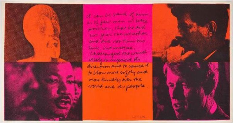
It Can Be Said of Them, from a set of Heroes and Sheroes
In addition to the Vietnam War and world hunger, Kent was deeply and emotionally involved in the Civil Rights Movement. It Can Be Said of Them, also from the series Heroes and Sheroes, shows four men who she understood as martyrs for the cause of human equality. In the top left is a favored image of Christ that she used across many of her prints. In each of the other three corners are Martin Luther King, Jr., John F. Kennedy, and his brother Robert Kennedy. Each of these men were killed in response to their selfless, "Christian" work; just as Christ was killed on the cross, each of these Civil Rights proponents and politicians were assassinated. President Kennedy had been killed in 1963, while both King and Robert Kennedy were gunned down in 1968, just three months apart.
In the center of the composition is a quote attributed to E.B. White after President Kennedy's assassination: "It can be said of him, as of few men in like position, that he did not fear the weather and did not turn his sails, but instead, challenged the wind itself to improve its direction and to cause it to blow more softly and more kindly over the world and its people." The "him" in this instance applies to all of these figures, who turn from each corner of the print to look in towards this central statement. They all become incarnations of a modern Christian martyr, who take the spirit of Christ's message as a call to be fearless in commitment to the change and betterment of society. This composition gives the effect of a closed circle of heroes; a kind of unity. It is significant that each man is given equal space to the image of Christ, including Martin Luther King, a black man. This equality of space impresses on the viewer a wider sense of equality.
The gridded composition of orange and pink squares, with each man facing the center of the composition, creates a unified, circle of heroes, and while the print is reminiscent of a Christian triptych, Kent substitutes the biblical saints for modern-day heroes. Additionally, the piece also has affinities with contemporary protest and psychedelic rock concert posters, thus underscoring her belief that one does not only look back to the past but to the present day to find saints.
Serigraph - UCLA Grunwald Center for the Graphic Arts, Hammer Museum, Los Angeles
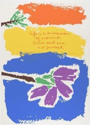
Life is a Succession, from Moments Suite
By the mid-1970s, Kent was approaching her sixties and suffering with her first diagnosis of cancer. Moving away from strident protest and political themes, her work became more introspective and philosophical about her own time on earth, exploring new modes of spirituality and becoming more aware of the natural environment. By 1977, both herself and her dear friend Sister Mary Catherine were suffering from cancer; Mary Catherine died two years later in 1979.
After all of her focus on the fast-paced commercial and political world, these late prints reveled in the simpler and quieter things. Small simplified flowers in bright colors crisscross abstract strokes of pastel-colored hues and frame the understated but moving thoughts written in Kent's tiny cursive handwriting. Artist Julie Ault explains, "The handwriting - Corita's - became so recognizable in the 1960s that a type company produced it as a type-transfer sheet. The font Corita was used as a typographic blueprint for laying out Bible verses on church posters."
Life is a Succession completely encapsulates the spirit of these late pieces. Rough orange, blue and yellow stripes are overlaid with simply painted flowers and delicate leaves. On the yellow plane, one reads, "Life is a succession of moments. To live each one is to succeed." A message of universal, yet simultaneously personal, wisdom, it encourages the reader to have hope, faith, and joy in every moment of their existence, as each is a blessing in itself. Even in the last few years of Corita Kent's life, as one critic put it, alongside her achievements in protest art and pop aesthetics "above all, her work sends a message of hope and love."
Serigraph - UCLA Grunwald Center for the Graphic Arts, Hammer Museum, Los Angeles - Corita Kent Bequest
Biography of Corita Kent
Childhood and Education
Born in Iowa in 1918 to a large, loving, and pious Catholic family, Frances Elizabeth Kent was the fifth of six children. Her father was a businessman in Iowa, but at a young age they moved to Vancouver, Canada for him to try his hand in his brother's hotel business. Then, in 1923, the family moved again to Hollywood, California. Not the world-famous, star-packed area it is today, in the 1920s Hollywood was an up and coming, but fairly quiet area. Throughout Kent's lifetime she saw the city change drastically, but in her childhood, she remembered it as a fairly unassuming part of Los Angeles.
Throughout her childhood, Kent was always drawn to creative design and sketching. She recalled "always making things, like designing things, paper dolls and their clothes, and then drawing." Kent said, "My parents - my father especially had always been very encouraging. But both my parents were always encouraging. I took it very lightly; I didn't think of it as being anything too much. But I was always interested. I did the posters in school and all that." Whilst she did not think too much of her early talents, her parents and teachers did. Her father, perhaps, saw a talent he wished he had explored himself; Kent told an interviewer, "Well, I think he was probably meant to be a poet. He could play the piano; he was just a really fun guy. And he was burdened, I think, by six kids. And my mother, too, I think was really probably meant to be more a person of my kind of life, who had a chance to develop her own thing. So they were both, I think, people who were saddled with six kids at a time when Catholics had lots of kids..."
Kent attended a Catholic primary school, and then the Catholic Girls High School, run by nuns of the Immaculate Heart, in Hollywood. Kent remembered ruefully that the older nuns' approach to art classes was to have students copy Old Masters, but some of the younger nuns were passionate and engaging teachers. They saw great potential in Frances and encouraged her to continue her training in art after she graduated from high school in 1936. To the shock of some of her young school friends, 18-year-old Frances declared her intention to join the Immaculate Heart Convent and continued studying at the private college the sisters ran. That year, she became a novice nun and student at Immaculate Heart College.
Education and Early work
From 1936 to 1941, Kent studied and lived in the Immaculate Heart community, taking the name Sister Mary Corita. Throughout these five years, Kent not only studied art but also trained as an art teacher and then taught students after her first year. While she enjoyed the teaching to some extent, she mostly relished the opportunity to expand her own art. While one might imagine Immaculate Heart College to have a reputation for traditionalism and conservatism, given the religious nature of the school, it was in fact dedicated to the liberal arts and known as a hotbed of avant-garde ideas. Several members of faculty made a large impression on her, including art historian Alois Shardt, who had escaped Nazi Germany and wrote about avant-garde German art.
In 1941, Corita graduated with her BA degree. She remained in the convent community but was called away in 1944 for a teaching post in British Columbia, Canada. When she returned in 1947 to teach at Immaculate Heart, she also began a Master's degree in art history at the University of Southern California, which she completed in 1951. Toward the end of her time at USC, she took a printmaking class, where she learned more about silk-screen, or seriagraph, printing.
In 1952, only a year after completing her studies, Corita Kent had a breakthrough: she won first prize in both the Los Angeles County print competition and the California State Fair for The Lord Is With Thee. Kent recalled in an interview that much of her subsequent, formative education in screen-printing came from Maria Sodi de Ramos Martínez, a printmaker married to the Mexican muralist Alfredo Ramos Martinez. Also in 1952, Kent returned to Immaculate Heart and took up a full-time teaching post at the college art department; as only one of two permanent members of staff. Her reputation, as both a teacher and an artist, was growing.
Mature Period
By 1954, Corita began using text in her prints. Following from the graphic posters she had made in her schooldays, Corita began consciously using a more graphic style in her work, mixing images with typeface. Art historian Donna Steele explained, "Her work evolves from abstract, figurative, religious pieces to a point where it becomes entirely typographic text. The word becomes the picture." During the mid-1950s and throughout her experimentation, Kent's classroom became a magnet for avant-garde artists, including the composer John Cage, the architectural luminary Buckminster Fuller, and, consequentially, the designer Charles Eames, who Kent credited with being one of her greatest teachers. She recalled, "From Eames or any of his works we learn to form outworn distinctions and separations and to see new relationships - to see that there is no line where art stops and life begins. He talked a lot about connections."
She also went on an informative trip in the late 1950s, with her fellow art department colleague Sister Mary Magdalene, travelling throughout Europe and Egypt and collecting folk art for Immaculate Heart College's collection. Having experienced more of the world and different artistic traditions, she returned after several months to see her own art refreshed. A fateful day in 1962, though, changed her trajectory; she went to see Andy Warhol's breakthrough exhibition of Soup Can paintings at the Ferus Gallery. She said, "Coming home you saw everything like Andy Warhol."
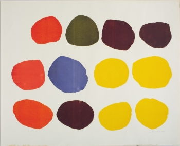
Corita saw a kindred spirit in Warhol. She immediately began working on her first true Pop print, Wonderbread, in 1962. Wonderbread consists of twelve, slightly irregular oval shapes in bright primary colors, set against a white background. Gone are the layers of paint, the Abstract Expressionist drips and brush strokes. Wonderbread is a pure Pop print; clean lines, bold colors, simplified shapes. Only the title gives an indication of what these oval shapes could be; Kent hints at the shape of the most wondrous bread, the communion wafer used to represent the body of Christ in the Catholic Communion service. Subsequently, her work became bigger, bolder, and more colorful; she began to use a much wider and more eclectic range of reference material in her prints, from advertising logos, packaging aesthetics, Beatles lyrics, quotes from Albert Camus and Samuel Beckett, and Bible verses. She began to print prolifically and cheaply; her work balanced the commercial and spiritual worlds to produce a message of hope and joy. She enjoyed printing, as it was accessible for a wide range of people and explained, "art enhances people's lives and that people needed to be able to see it, own it and possess it."
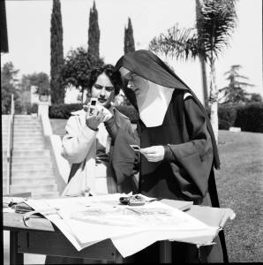
She began to mix with influential LA figures, including filmmakers, writers, teachers, academics and artists. She regularly visited the Eames household for dinner parties and welcomed the visionary architect and designer of the geodesic dome Buckminster Fuller into her studio. Corita Kent, now a nun in her mid-40s, became an absolutely vital and ground-breaking artist and art educator in L.A.
Meanwhile, Kent had become the head of the Art Department of Immaculate Heart in 1964. Her classrooms became unique and dynamic environments. Artist Julie Ault explains, "Multiple films were screened simultaneously, rock music played on the stereo, and large-scale collaborative projects were usually in process. Buckminster Fuller, described visiting her classroom as 'one of the most fundamentally inspiring experiences of my life.'" Her students were taken to supermarkets and intersections for observation sketching and often practiced blindfolded painting.
Her countercultural influence was felt not only in the art department but the entire college. Kent took over planning for the annual Mary's Day celebration for the college. For years, the ceremony had been the same; the women wore white gowns and walked in a procession to mass, but under her guidance in the mid-1960s, the festival became more like a hippie happening, with bright summer dresses, flowers, tambourines, and guitars. In the first year of the new celebrations, the theme was World Hunger, and Sister Mary Corita's students carried 3D placards of blown up food packaging.
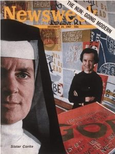
As well as these innovations, Kent continued with an exhaustive schedule of lecture tours, exhibitions, teaching, and printing. In 1967, Newsweek featured her as "The Nun: Going Modern." Within the Catholic Church, however, complaints against her controversial art and teaching built up against her. For Kent, art was an important tool in modernizing and "shaking up" the Church and presenting Christian messages in new ways. However, the archdiocese saw her work as frivolous and potentially blasphemous, and the archbishop wrote to the Mother General of the convent complaining that he had "received many adverse comments and criticisms of this type of artistic representation...." His furious letters continued, "What pertains to the liturgy and to sacred art comes within my jurisdictions. We hereby request again that the activities of Sister Corita be confined to her classroom."
By 1968, exhausted by the busy schedule and constant pressure from the Church, Sister Mary Corita took a sabbatical on Cape Cod and then decided to seek dispensation from her vows and left the Immaculate Heart Order for good. Only a year later, the entire order left the official control of the Catholic Church following continued criticism of the remaining sisters' teaching methods.
Late period and Death
Aged 50, Corita found herself living alone for the first time in her life. She could not drive or cook. She moved to Boston and found herself an apartment of her own. With this dramatic life change, her work became more radical. Loosened from the censors of the Church, Kent began to more forcibly express her political views in the turbulent late 1960s. She said, "I admire people who march. I admire people who go to jail. I don't have the guts to do that. So I do what I can." What she could do was to draw attention to issues of hunger, race, civil rights, poverty, and the violence of American military aggression in Vietnam through her prints. She was strongly influenced by the radical priest Daniel Berrigan, who was a Christian Pacifist who publically campaigned against the war in Vietnam.
After a flurry of political works from 1969 to the early 1970s, Kent's work mellowed considerably. Like many activists of this time, she was tired of the fight and said that "the time for physically tearing things down is over." Also, her life became more physically difficult, as she was first diagnosed with cancer in 1974. She reacted to this in two ways: concentrating on personal introspection and articulating worldwide messages. No longer concentrating on particular issues, Kent's work became philosophical about her own life and struggles and incorporated public messages of peace and love. Throughout the late 1970s and early '80s, Kent's artistic output was mostly a mix of soft-hued silkscreen prints and small, pastel watercolors, or huge scale public works, designed to add positivity to daily life, but she didn't completely abandon bold, fluorescent colors. For example, she designed the now famous Love postage stamp for the US postal authority in 1985, that issued 700 million stamps with the design, and she designed the huge Rainbow Swash artwork for the Boston Gas Company's gas tanks - the largest copyrighted work of art in the world. The work caused controversy in the years following, as it was conjectured that it contained a subtle profile of Ho Chi Minh as an anti-Vietnam War protest. However, Kent denied this, saying that the design was simply a joyful rainbow, a Pop Art gift to the City of Boston. When in 1992 the Boston Gas Company tore down the original tank, there was such a backlash that they immediately reproduced the design on a new tank.
In 1977, Kent was diagnosed with cancer for a second time but carried on working. However, by 1986, cancer was found to have spread to her liver. In September of 1986, she passed away at age 67. She left her copyrights and unsold artwork to the Immaculate Heart College Community, which founded the Corita Art Center.
The Legacy of Corita Kent
In 1980, the deCordova Museum in Massachusetts staged the first retrospective of Kent's work, called simply "Corita." However, during her lifetime, and especially in the twenty years following her death, Kent's work never quite worked its way into the mainstream. Being a female artist and a nun, she did not fit into the detached, jaded aesthetic narrative of Pop.
However, since the early 2000s, Kent's work has been steadily recognized outside of the small artistic circles in L.A. and Boston. Exhibitions of her work have increased year after year in the United States and more recently also in the United Kingdom, Australia, Portugal, Switzerland, Germany, and France. During the last decade, Kent has been recognized as one of the most original and important Pop artists of her time. Donna Steele, curator of Kent's work, says it is "as important as that of Warhol....It stands up there with the work of the Pop Art greats - people like Robert Rauschenberg, Jasper Johns, Richard Hamilton, and Peter Blake. It's big and bold and it's of the moment."
Not only was her work fun, modern, and culturally aware, it was simultaneously meaningful and heartfelt, with its own unique and democratic message. "What you get is this visual feast of twisted text and messages, and the more you look, the deeper you realize the messages go," says Steele. "She picked up on everyday language and advertising slogans - this was the 1960s, and consumer culture was exploding; she used words like 'tomato,' 'burger,' and 'goodness' and she made them into messages about how we live, and about humanitarianism and how we care for others." An important message is wrapped in a visual feast; as Kent explained, it was "the idea that using words with visual forms and using just short passages is often a way to help awaken people to something they may not be aware of, rather than enclosing it in a book or making a speech."
Kent's art and philosophy were deeply influential in her own social circle, including the poster and graphic designer Saul Bass. However, her reach is felt just as strongly in the work of several modern printmakers, artists, and designers, including Julie Ault, Mike Kelley, and Ciara Phillips, who feel a unique emotional connection with Kent. Unlike many other Pop Artists, she had a refreshingly hopeful and compassionate approach to her work that connects with people to this day.
Influences and Connections
-
![R. Buckminster Fuller]() R. Buckminster Fuller
R. Buckminster Fuller ![Charles Eames]() Charles Eames
Charles Eames![No image available]() Alois Schardt
Alois Schardt![No image available]() Ray Eames
Ray Eames


-
![R. Buckminster Fuller]() R. Buckminster Fuller
R. Buckminster Fuller ![Charles Eames]() Charles Eames
Charles Eames![Alfred Hitchcock]() Alfred Hitchcock
Alfred Hitchcock![No image available]() Ray Eames
Ray Eames

-
![Mike Kelley]() Mike Kelley
Mike Kelley -
![Shepard Fairey]() Shepard Fairey
Shepard Fairey ![Julie Ault]() Julie Ault
Julie Ault![No image available]() Saul Bass
Saul Bass![No image available]() Lari Pittman
Lari Pittman


Useful Resources on Corita Kent
- Learning by Heart: Teachings to free the creative spiritOur PickBy Corita Kent and Jan Steward (2008 2nd Edition)
- Corita Kent and the language of PopBy Susan Dackerman, Jennifer L. Roberts, Richard Meyer and Julia Bryan-Wilson (2015)
- Come Alive! The spirited Art of Corita KentBy Julie Ault (2006)
- Corita Kent. Art and Soul, The BiographyBy April Dammann (2016)