 Ask The Art Story AI
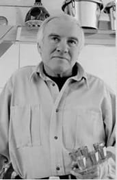

Summary of Patrick Caulfield
Describing himself as a "formal artist", Caulfield's reputation was built on a series of eye-catching artworks rendered through simplified forms. But beneath the artist's preference for clean lines, and large areas of pure color, lay a deceptively ambiguous and cryptic quality. Adding to his many works that drew on the history and traditions of European art, Caulfield became equally well-known for a series of empty public interiors that brought an added Romantic and elegiac quality to his repertoire. Although there can be little mistaking a Caulfield artwork, his shyness, and his general reluctance to engage with the blunt commercial aspects of the art world, meant he did not perhaps reap the dizzy heights of fame enjoyed by some of his contemporaries.
Accomplishments
- Caulfield's early art is identifiable for its pared down quality and the thick black lines that contain his luminous fields of gloss paint (on board). His paintings, which often play with traditional perspective, only rarely introduced human figures although they regularly imply an "off-screen" human presence. His art of this period has been compared favorably to that of the American Pop Art icon, Roy Lichtenstein.
- Unlike his friends and colleagues who were associated with the rise of the British Pop Art movement, Caulfield avoided commercial imagery and turned instead to established art history genres including landscapes, still-lifes, and domestic interiors. It is true that, like the Pop artists, he was interested in the idea of appropriation. But rather than objects and icons drawn from consumer culture, Caulfield's art was more inclined to reference the likes of European masters such as Juan Gris, Eugène Delacroix, Francisco de Zurbaran, and Pablo Picasso.
- Amongst Caulfield's most iconic works are his empty and still restaurant interiors. Works such as After Lunch (1975) and Paradise Bar (1974), rendered through a simplified use of line, and dominated by saturated colors (of blue and red respectively in these examples), the effect is one of melancholy as the viewer is asked to consider what types of human interaction that had gone before (or, indeed, is yet to come). As historian Simon Martin put it, "[his interiors] are like stage-sets with the minimum of props in order to provide the atmosphere that the viewer needs to mentally enter the drama".
- From early on in his career, Caulfield was attracted to the direct and simple quality (if not necessarily the content) of commercial sign painting. It provided the inspiration for his screen-printing which complemented his paintings. In both spheres, Caulfield employed lurid colors and thick black outlines that recalled something of the style of Fernand Léger and inspired next generation British artists such as Gary Hume and Julian Opie.
The Life of Patrick Caulfield
Known for its deceptive simplicity, Caulfield said of his art, "I try not to overpaint too much because I like the flat surface. I like the idea that things have been done in the most minimal fashion, that you don't keep adding."
Important Art by Patrick Caulfield

Portrait of Juan Gris
This is a rare example of a portrait by Caulfield, whose body of work is dominated by interiors, landscapes and still-lifes. It pays tribute to the Spanish Cubist, Juan Gris, who Caulfield greatly admired and who was a major early influence on his own approach to painting. He stated, "What I like about Juan Gris's work is not that he's dealing with different viewpoints, it's the way he does it. It's very strong, formally, and decorative". Caulfield had intended to paint Paul Cézanne, the forebearer of Cubism. But as art historian Marco Livingstone explained, that choice would have amounted to a satirical gesture in which the artist intended to represent Cézanne, "the master of spatial complexity and the quivering brushstroke as a flat cut-out shape". Caulfield abandoned the idea of ironic commentary, however, in favor of a genuine act of homage (to Gris). The portrait is in fact based on a photograph of Gris by Man Ray, while Caulfield asked a friend to model in a three-piece suit to help him achieve the overall effect of an honorable and respectable gentleman (and a far cry from the clichéd image of a bohemian Montmartre artist).
Caulfield painted the portrait on a hardboard using enamel paints. The choice of cheap and accessible materials expressed his desire to disassociate himself with the aesthetic affections of high art. Gris himself is flanked by zig-zagging geometric lines, a reference to the spatial devices the Gris used in his own paintings. As Livingstone points out, the lines function "as framing elements and as signifiers of pictorial modernity emptied of their previous function and laid out neatly on the surface like freshly pressed linen". Caulfield's combination of bright tones of blue and yellow, meanwhile, reflects the optimism that so appealed Caulfield in the Spaniard's art. The decorative color contrasts also bring an element of humor to the work, as they undermine the name "Gris", which means "gray" in Spanish and French. The portrait is also notable because it was one of the first instances in which Caulfield adopted the black outline as a means for delineating the shape and its implied spatial position.
Alkyd housepaint on hardboard - Pallant House Gallery Chichester, United Kingdom

Greece Expiring on the Ruins of Missolonghi (after Delacroix)
Greece Expiring on the Ruins of Missolonghi was painted during the artist's last year at the Royal College of Art (RCA) for an assignment that required a transcription of an Old Master painting. Caulfield selected Eugène Delacroix's Greece Expiring on the Ruins of Missolonghi (1826), in part because he thought Delacroix would be an unexpected choice for the assignment: "He would paint Arabs fighting lions, which he could never have seen, even though he had been to Morocco. They were the most unlikely pictures". Delacroix's painting, which imagined a scene of devastation following an Ottoman attack that left the Greek municipality of Missolonghi, was reduced by Caulfield to a hard-edged style of flat color shapes and black outlines which gave the image the appearance almost of a propaganda poster.
Caulfield's painting was executed in the same "cartoonish" style, and in the same year, as Roy Lichtenstein's Woman with Flowered Hat, in which the American Pop artist appropriated Picasso's 1939 portrait of his lover and muse, Dora Maar. Indeed, comparisons between the two works lend support to the view that Caulfield was, or rather could be considered, a Pop artist. Although Pop Art addressed itself to the iconography of consumer culture (rather than fine art), Lichtenstein said of his painting that "a Picasso has become a kind of popular object [and that] one has the feeling there should be a reproduction of Picasso in every home". Indeed, the American appropriated other mass reproduced works from the canon of Western art during his career.
However, Caulfield, who referred to himself a "formal artist" (rather than a Pop artist), produced a painting that was an aesthetic investigation into the relationship between color and shape rather than a commentary on the blurred lines dividing high and popular culture. As Sotheby's auction house said of the work, "[Caulfield] emphasised and clarified the image while neutralising the formal qualities so intrinsic to Delacroix, simplifying his painterliness into basic black outlines and flat colour plains. Caulfield never saw the original painting and only worked from a black and white photograph and so the resulting picture not only negates Delacroix's dexterity with the brush but also tempers his infamously sophisticated use of colour".
Oil on board - Tate, London

Pony
Following his participation in The New Generation exhibition at Whitechapel Gallery in 1964, where he exhibited next to the likes of David Hockney, Derek Boshier and Patrick Procktor, Caulfield became linked with the British Pop Art movement. Caulfield refuted the connection, and viewed himself as an artist rooted in the early European Modernist tradition, and a successor to the likes of Juan Gris and Fernand Léger.
Although it might at first appear so, Pony is not a work of Pop art. Pop art deals with imagery from popular/consumer culture, whereas Caulfield's choice of subject was inspired by the British tradition of equestrian painting, and especially the work of eighteenth century painter Georges Stubbs, while the animal's motionless pose recalls the tradition of ancient Egyptian art. Pony was also painted using traditional material and technique, which indicate the artist's desire to remain respectful of the European tradition. While many of his contemporaries experimented with new techniques (such as stencils, spray paint and brush rollers) Caulfield relied on fine brushstrokes to achieve the refined modulation of color and the smooth and flattened image.
A third source of inspiration for Caulfield's art of this time were the Minoan frescoes in Crete, which he first encountered during a trip to Greece in 1960. His choice of dusty pinks and flattened forms can be attributed to the imagery in the Throne Room of the Minoan ruins, while the horizontal line used in the background is framing device borrowed from the frescoes. Caulfield had collected postcards of the frescoes and later realized that the figures had black outlines which had only been added during the printing process. The black outlines were, for Caulfield, a revelation and became a signature feature of his painting.
Oil on board - Waddington Custot, London

After Lunch
The painting represented a new phase of Caulfield's art, in which he mixed painting styles in a single work, creating a "picture within a picture". This is one of his earliest and best-known examples. It combines a hyperrealistic depiction of a lakeside Swiss Château (thus recalling his student training when he painted objects from life in the realistic trompe l'oeil technique) and a restaurant interior rendered in the style of a technical drawing. The painting depicts an after lunch service (confirmed by the title) with the lonely figure of the maître d' in the background wearing his uniform (including a black bowtie). The figure of the maître d' was modeled on one of the artist's friends, while the unusual yoke-like object hanging from the ceiling was copied from a photograph Caulfield came across in a design magazine. The self-conscious references to Swiss stereotypes - the fondue pot, the wooden interior, the image of the Château - suggest that the restaurant might not, in fact, be in Switzerland.
A second notable aspect of After Lunch was Caulfield's experimentation with light. He stated, "I'm not actually painting from observation of light. I'm making up an idea of how light could appear to be. The angles of light in naturalistic terms could be totally wrong, but they either help the composition of the picture or they help the feeling of light more strongly". In the painting, a beam of light shines into room marked by a paler shade of blue. However, the beam is broken by the naturalistic light in the image of the Château, thereby underlining the contradictory elements within the painting. This idea is further stressed by the inclusion of the fish tank (a reference to Henri Matisse's Interior with a Goldfish Bowl (1914)) which alludes to the idea of transparency with its structure of glass and water. These inconsistencies serve as a reminder that the naturalistic image of the Château is, like the painting overall, illusory.
After Lunch relates very closely to an earlier work, Paradise Bar (1974), which was Caulfield's first attempt at merging two styles in a single painting. He stated, "One reason I choose restaurant interiors is that they give one more scope to introduce space and objects than in a normal design setting". In their conversation about Caulfield's interiors, meanwhile, Thomas Lawson and Katherine Lewis observe a sense of melancholy that becomes more intense the longer one looks at the painting: "The room is abandoned, cleared of the messy evidence of human enjoyment; no dirty glasses, empty bottles, no cutlery or crumpled napkins. Only the downcast gazing of the disembodied waiter. The room is haunted by a sense of unfulfilled desire; in the end the illusion failed to work and lunch was merely lunch, and probably not so good".
Acrylic on canvas - Tate, London

Hemingway Never Ate Here
Hemingway made its debut at the exhibition, Encounters: New Art from Old, at the National Gallery in June 2000. The Gallery commissioned 24 international artists to produce works that were in dialogue with the artworks from their collection. Caulfield created, Hemingway Never Ate Here, an interior that incorporated several references to Hispanic culture. This was partly motivated by personal reasons, as Caulfield wanted to celebrate his son's marriage to a Spaniard. As Livingstone notes, Hemingway Never Ate Here is "characteristic of the artist's paintings of the 1990s: rich monochromatic interiors with strong accents of white, yellow or pink that penetrate the dark tones and create the effect of artificial light. The intimacy of his interiors evokes a human presence, but as no figure appears in the space, a sense of solitude lingers".
The artist engaged with the museum collection by borrowing the central motif from A Cup of Water and a Rose on a Silver (c.1630) by Francisco de Zurbarán, a seventeenth century Spanish painter. This motif also appeared in another painting by Zurbarán, Still Life with Basket of Oranges (1633). In Zurbarán's art, this simple still life composition can be interpreted as a work of religious significance since clear water and a rose are both objects associated with the purity and holiness of the Virgin Mary. However, Caulfield was primarily drawn to the visual simplicity of the imagery (rather than its religious connotations). While he carefully rendered the cup and the silver plate, he made one major alteration to Zurbarán's motif by replacing the rose with a slice of lime. Next to the plate, he also added a bottle with a wedge of lime in its neck, making a contemporary reference to Hispanic culture - a fashionable custom of inserting lime wedges into beer bottles that gained popularity in the UK in the late 1980s.
The inclusion of the bull head was inspired by a visit to Madrid in 1998, where he saw one hanging in a bar near Plaza Mayor. To capture its likeness, Caulfield hired a taxidermy bull head in London. The title of the painting was taken from the inscription, "Hemingway never ate here", which he saw in a local bar. The tongue-in-cheek statement poked fun at the many establishments that marketed themselves by claiming the iconic American author (Ernest Hemingway) dined there. Indeed, Hemingway's depictions of Spain in books like Fiesta helped popularize representations of brave bullfighters and hard drinking. Like other paintings, Caulfield challenges pictorial conventions by contrasting the realistically rendered elements like the bullhead and the cup with the flat minimalistic background. By creating spatial inconsistencies, he highlights the artificial nature of the pictorial space. It is also worthy of mention that in later works such as this, Caulfield had abandoned his signature black outline technique.
Acrylic paint on canvas - Tate, London

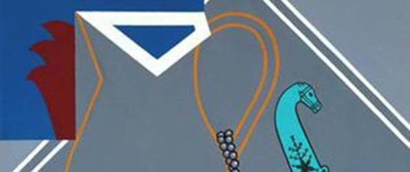
Les Demoiselles d'Avignon vues de derrière
In this bold and humorous homage, Caulfield created a print that depicts the reversal of Picasso's famous cubist prototype, Les Demoiselles d'Avignon. Picasso's painting shows prostitutes in a Spanish brothel brazenly confronting the viewer. Caulfield's print, on the other hand, shows the women from behind: four in standing positions with their arms behind their head, and the fifth woman seated with her legs open. The print corresponds with key elements of Picasso's painting, emphasizing the highly stylized bodies of the women through angular forms and bright blue and red against pastel shades of peach, pink and blue. At the same time, Caulfield rejected elements of Picasso's work. He favored his signature detached style over Picasso's expressive brushstrokes and omitted memorable details such as the bowl of fruit in the foreground of the painting. Despite the significant stylistic changes, the reference remains recognizable and thus the artist confronts the viewer with what he once described as "the 'shock' of the familiar".
The depersonalized nature of the work is further highlighted by the choice of the printing medium, which is characterized by its ability to accurately reproduce an image in unlimited quantities. In this way, Caulfield subtly undermines the role of Les Demoiselles d'Avignon in art history - a painting celebrated for its individualistic innovation and introduction of a ground-breaking visual language. Furthermore, as curator Clarrie Wallis noted, the title of the print, that translates to, Les Demoiselles d'Avignon from the rear, serves a double function: "the reversal of this image is both a visual pun on the printing process, which reverses the original design, and a verbal pun on the French word derrière, which means rear end". Throughout his career Caulfield showed great admiration for Cubism, a movement that influenced many of his paintings, especially his still lifes. His rendition of Picasso's work was motivated by a personal connection to the painting: "I have been haunted by that painting [Les demoiselles d'Avignon] throughout my life and I needed to exorcise the ghost".
Screenprint - Tate, London

Braque Curtain
This was the last painting produced by Caulfield, finished only a few weeks before his death. In it the artist's explored light and shade in an interior setting. Through his flat forms painted in unmodulated colors, he created an overlapping effect, making it difficult to differentiate between the actual object and its shade.
It was an homage to one of his major artistic inspirations, Cubist painter Georges Braque. Caulfield was inspired by Cubist movements from the outset of his career, but as Sarah Whitfield notes "as his paintings became more complex, so did his appreciation of the complexities of Cubism and in particular, of Braque's interiors of the mid-1930s". As the title suggests, the yellow curtain is based on elements from two paintings by Braque, The Duet (1937), and Artist and Model (1939). In both cases, Caulfield concentrated on Braque's geometric ornamentation through the patterned yellow wallpaper panels in the background.
Acrylic on canvas - Tate, London
Biography of Patrick Caulfield
Childhood
Patrick Caulfield was born to working class parents in the London suburb of South Acton (in an area he later dubbed "Bagwash City" because several residents ran makeshift laundries from their garages). Shortly before the outbreak of World War II, Patrick, with his elder brother, John, moved with their parents' to their hometown of Bolton in northern England to be closer to extended family, and from where, his parents aided the war effort: Patrick's father worked at the De Havilland aircraft factory; his mother in a local cotton mill. As the war neared its end, the Caulfields returned to London where Patrick attended Acton Central Secondary Modern School. He left school at the age of 15 as his parents were unable to pay for his continuing education.
Early Training and Work
With the help of his brother, Caulfield secured a job at the food company Crosse & Blackwell. He initially worked as a filing clerk, but later joined the commercial art department where he washed brushes and varnished chocolates for displays. Called up for National Service, the 17-year-old Caulfield enlisted in the Royal Air Force (RAF) with whom he spent three years. He was stationed in Northwood, north London, and during that time attended evening classes in life drawing and portrait painting at Harrow School of Art. The classes gave him the confidence to apply to art school, and in 1956 he was accepted to Chelsea School of Art where he studied graphic design before transferring to the fine art department. At Chelsea he experimented with different styles, from works inspired by the naïve style of Henri Rousseau, the diagrammatic stylized paintings of apartment buildings, to the abstract tendencies pioneered by the French Tachisme movement.
While at Chelsea, Caulfield was taught by Lawrence Gowing, who was appointed principal in 1959. Gowing was very supportive of Caulfield, encouraging him to continue his studies at the Royal College of Art (RCA). Before he joined the RCA, Caulfield traveled abroad for the first time. He took a train to Greece with seven fellow students, among them painter Pauline Boty, and returned home by hitchhiking to London through Italy and France. On his trip, he collected postcards of the Minoan frescoes in Crete. He admired the frescos for their simplicity and decorative quality but when he himself arrived Crete, Caulfield noticed something different about the Minoan frescoes: the black lines on the postcard reproductions had actually been added by the printer. Nevertheless, the postcards left a strong impression on Caulfield: "these cards struck me as being very amusing and quite strong imagery. So I thought about using lines around my own work".
When he commenced his studies at the RCA in earnest in the autumn of 1960, he joined the likes of David Hockney, Derek Boshier and R. B. Kitaj, who belonged to a student cohort one year above. While still at the RCA, Caulfield participated in the Young Contemporaries exhibition, an annual showcase of student's works exhibited at the galleries of the Royal Society of British Artists (RBA). This was a rare opportunity for young artists like Caulfield whose works were featured in the exhibitions between 1961-1963. After he completed his studies in 1963, Gowing offered Caulfield a part time teaching position in the painting department of Chelsea School of Art (his former school). Among the staff were artists Mick Moon and John Hoyland. The trio would become lifelong friends.
Mature Period
From around 1963-64, Caulfield's art reflected his interest in romantic and exotic themes, for which he frequently turned to the great French Romantic artist, Eugène Delacroix, for inspiration. The crumbling ruins in the background of Greece Expiring on the Ruins of Missolonghi (1828), for example, became the subject of the print View of the Ruins (1964), while exotic objects taken from the Frenchman's art, such as Mughal daggers and Turkish pottery, were appropriated by Caulfield in still lifes including Still Life with Dagger (1963) and Still Life with Necklace (1964).
In 1964, Caulfield big break came when he was invited to participate in the New Generation exhibition at the Whitechapel Gallery. With a rollcall that included: Derek Boshier, Anthony Donaldson, David Hockney, John Hoyland, Paul Huxley, Allen Jones, Peter Phillips, Patrick Procktor, Bridget Riley, Michael Vaughan and Brett Whiteley, Caulfield became linked to the British Pop Art movement. But it was a connection that the artist, who described himself as a "formal artist", politely rejected. The Oxford Dictionary of Modern and Contemporary Art states, "Discussing his painting in the 1964 New Generation catalogue, David Thompson argued that Caulfield was interested in 'devalued' motifs, the way in which a painting by Delacroix or a device from Cubism or early abstraction could become 'vulgarized'".
Caulfield's participation in the New Generation exhibition saw him receive considerable attention, including from the London art dealer, Robert Fraser. Fraser, who already represented artists including Peter Blake, Richard Hamilton, Eduardo Paolozzi and Bridget Riley, took on Caulfield and mounted his first one-man show in 1965. Still teaching at Chelsea, Caulfield tutored Pauline Jacobs before she transferred to the fabric printing department at the RCA. The pair were married in 1968, and over the next decade they raised three sons (Luke, Louis and Arthur).
From around the mid-60s Caulfield, who had been introduced to its creative possibilities by Hamilton, and the printer Chris Prater, had been working extensively with screen printing. But, as historian Simon Martin writes, from the early 1970s Caulfield was painting "almost exclusively in acrylic paint on canvas. He would plan his detailed paintings of interiors featuring black lines on flat coloured backgrounds carefully in advance using precise squared-up drawings, sometimes even transferring the entire composition from a full-scale felt-tip pen drawing on polythene".
In 1980, the Caulfield family moved to Primrose Hill in north-west London, where they were neighbors with Hoyland. That year Hoyland was set to begin an artist residency in Melbourne, and he invited Caulfield to join him. Although Caulfield's work was exhibited in Australia, it would be his first visit to the country. The artist recalled having a "fantastic time" and postcards he collected from is trip inspired the color scheme of his painting Still Life: Maroochydore (1980-1981).
In August 1981, Caulfield had his first major retrospective (featuring 48 works) at the Walker Gallery in Liverpool. A great success, the exhibition moved to London before touring Japan. The exhibition marked a turning point in his career. As curator Michela Parkin writes, "In 1983 [Caulfield] stopped using the [black] outlines both in his paintings and his prints, choosing instead to use areas of entirely flat colour. He continued to use flat areas of black, particularly in his prints, to create a dynamic interplay of light and shadow and a play on the relationship between two and three-dimensions". Indeed, Caulfield himself reflected, "having painted and drawn in a linear way, without shadow, I gradually abandoned the linear structure and began to rely much more on light and shade which is perhaps a more sculptural interpretation of my visual world". Caulfield further expanded his repertoire when he accepted a commission to design the set and costumes for Michael Corder's ballet Party Game that premiered at London's Royal Ballet in 1984.
In 1986, his move to a new studio (in London's Belsize Square) coincided with his separation from Pauline, although the two remained close. Caulfield then began his relationship with fellow artist Janet Nathan, the woman with whom he would spend the remainder of his life. Also in 1986, the National Gallery invited Caulfield to mount an exhibition of his work which he titled The Artist's Eye. The solo collection was shortlisted for the Turner Prize the following year.
Late Period
Caulfield continued to enjoy professional success throughout the 1990s. His second retrospective, which was held at the Serpentine Gallery in 1992, presented some of his most emblematic works dating back to 1963. In 1994, he was commissioned to design the rotunda at the extension of the National Museum of Wales in Cardiff. The result was Flowers, Lily Pad and Labels, a mosaic that referred to Claude Monet's waterlily paintings in the adjacent gallery and the labels that surround the wall of the space. In 1995 he designed the set and costumes for the Royal Ballet's new production of Frederick Ashton's Rhapsody. Caulfield's third career retrospective opened to acclaim at the prestigious Hayward Galley in February 1999. The exhibition, organized by the gallery and the British Council, later toured Luxembourg, Portugal, and the United States.
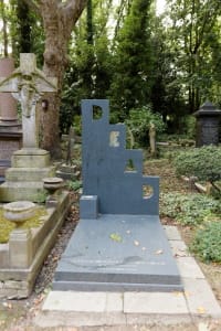
In the late 1990s, Caulfield was diagnosed with cancer of the tongue and throat (he attributed his condition to his love of whiskey). In November 1999, he married his longtime partner, Janet Nathan. Caulfield continued to work despite his tough health battle, finishing his last painting Braque's Curtain in 2005, just two weeks prior to his death. He dedicated the painting to Janet thanking her for her devotion and care. He died of cell cancer in September 2005 at his home in Belsize Square aged 69. Even in death, Caulfield managed to maintain his wry sense of humor, having designed his own tombstone with cut out letters spelling "DEAD". The road on which he was born, was renamed "Caulfield Road" following his death.
The Legacy of Patrick Caulfield
Despite their obvious aesthetic similarities, Caulfield distanced himself from the the British Pop Art movement. He was in search in subject matter that acknowledged (rather than broke with) the traditions of European painting. As historian Bojan Zlatkov (citing the Daily Telegraph) writes, "[Caulfield] absorbed the wavering of 20th-century art in his own original and authentic way, yet his control of the design can be compared with Ingres's, his pallet with Matisse's and the Fauves, the setting up the rules of his own world to Picasso and the Cubists. Patrick Caulfield was 'a painter's painter, an artist whose work revealed great depths when contemplated, and to those with an understanding of art, its history and possibilities, his work could resonate on a grand scale'".
Caulfield himself seldom gave interviews, and this reserve, which extended towards a tendency to shun publicity and promotional opportunities, likely prevented him from reaching the same level of acclaim enjoyed by some other British artists from his generation. Nevertheless, Caulfield's place as one of the most important British painters of the second half of the twentieth century is now undisputed. The Oxford Dictionary of Modern and Contemporary Art states, "What Caulfield was actually doing was using a highly accessible and apparently simple pictorial language, not out of irony, but to achieve effects of the utmost refinement. Although on the surface his style changed comparatively little, the uses to which he put it were extraordinarily varied". Indeed, the legacy of his his deceptively simple imagery can be traced in the work of Irish conceptual artist Michael Craig Martin, and in the art of next generation British artists, Duggie Fields, Gary Hume, and Julian Opie.
Influences and Connections


-
![Howard Hodgkin]() Howard Hodgkin
Howard Hodgkin ![No image available]() John Hoyland
John Hoyland![No image available]() Mick Moon
Mick Moon![No image available]() Pauline Jacobs
Pauline Jacobs![No image available]() Janet Nathan
Janet Nathan


-
![Julian Opie]() Julian Opie
Julian Opie ![No image available]() Duggie Fields
Duggie Fields![No image available]() Michael Craig Martin
Michael Craig Martin

-
![Sarah Lucas]() Sarah Lucas
Sarah Lucas ![No image available]() Marc Bolan
Marc Bolan![No image available]() Syd Barrett
Syd Barrett![No image available]() Fiona Rae
Fiona Rae![No image available]() Simon Linke
Simon Linke


