Ask The Art Story AI
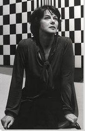

Summary of Bridget Riley
Bridget Riley's geometric paintings implore the viewer to reflect on how it physically feels to look. Her paintings of the 1960s became synonymous with the Op Art movement, which exploited optical illusions to make the two-dimensional surface of the painting seem to move, vibrate, and sparkle. Grounded in her own optical experiences and not color theories, math, or science, Riley experiments with structural units, such as squares, ovals, stripes, and curves in various configurations and colors to explore the physical and psychological responses of the eye. Her paintings inspired textile designs and psychedelic posters over the decades, but her objectives have always been to interrogate what and how we see and to provoke both uncertainty and clarity with her paintings.
Accomplishments
- Steeped in the paintings of the Impressionist, Post-Impressionists, and the Futurists, Riley dissects the visual experience of the earlier modern masters without their reliance on figures, landscapes, or objects. Playing with figure/ground relations and the interactions of color, Riley presents the viewer with a multitude of dynamic, visual sensations.
- Riley's formal compositions invoke feelings of tension and repose, symmetry and asymmetry, dynamism and stasis and other psychic states, making her paintings less about optical illusions and more about stimulating the viewer's imagination.
- While Riley meticulously plans her compositions with preparatory drawings and collage techniques, it is her assistants who paint the final canvases with great precision. Riley creates a tension between the artist's subjective experience and the almost mechanical feeling of the surface of the painting.
- Riley's artistic practice is grounded in a utopian, social vision. She views her art as an inherently social act, as the viewer completes the experience of the painting. This belief in an interactive art led her to resist the commercialization, and in her mind, the vulgarization of Op art by the fashion world.
Important Art by Bridget Riley

Kiss
Riley started work on Kiss after her relationship with Maurice de Sausmarez ended. While with de Sausmarez, she enthusiastically studied Futurist art in Italy and painted the Italian countryside. She made careful studies of paintings by the Neo-Impressionist Georges Seurat and the abstractionist Piet Mondrian. While working in this manner, Riley wanted to go further than these modern masters in investigating optical experience. In her words she wanted "to dismember, to dissect, the visual experience." With Kiss, Riley found her own forms to explore the vibrating and oscillating space she was so drawn to in these modern painters.
The black and white composition enacts a visual drama on the canvas. The two black forms almost touch, and the white space diminishes toward the center between the two sensuous black forms and then crescendos at the right edge. She said, "I decided on two black shapes, one with a curve, the other with a straight line, opposites, nearly touching, but not touching, the white spaces between them making almost a flash of light." She felt it was a success, and although she had told herself it would be her last painting, the painting pointed to further explorations.
The work is abstract, drawing on the open and shallow pictorial space established by Mondrian and the Abstract Expressionists such as Jackson Pollock. She activated that space with minimal means: sharply delineated black and white forms often asymmetrically arranged. With these means she embarked on a series of numerous black and white paintings that came to define the Op Art of the early 1960s.
Oil on canvas - Private Collection

Movement in Squares
Riley cites Movement in Squares as the first major step, after Kiss, towards her breakthrough into abstraction. During a difficult time in her art making, and in an attempt to make a new start, she began with the simple square. She said "Everyone knows what a square looks like and how to make one in geometric terms. It is a monumental, highly conceptualized form: stable and symmetrical, equal angles, equal size. I drew the first few squares. No discoveries there. Was there anything to be found in a square? But as I drew, things began to change." She created the design for Movement in Squares in one sitting without stopping, and then painted each alternate square black to provide contrast. When she stepped back to look, she was "surprised and elated" by what she saw.
Riley establishes the square as the basic unit and then modulates it across the canvas, maintaining its height but changing its width. The square's width diminishes toward the center of the canvas until it becomes a sliver, and then increases again toward the right edge. It's as if two planes are coming together and bending into each other, not unlike the pages of a bound book lying open. The progression of shapes intensifies, climaxes, and then de-escalates, provoking the viewer to confront their perceptual senses as well as their ideas of "stabilities and instabilities, certainties and uncertainties." Riley's exploration of how we see came to be rooted in her own experience and experimentation, her own intuition, and not on theories of optics.
Acrylic on canvas - Arts Council Collection, London

Current
Current graced the cover of the catalog for the seminal 1965 MoMA exhibition of Op Art, "The Responsive Eye," that launched Riley's notoriety in the United States. Working in black and white, Riley repeats a wavy black line at regular intervals across the canvas. The curve and the proximity of the lines make the painting appear to vibrate and move, as the viewer attempts to process the forms.
This composition confounds the usual foreground/background arrangement of pictorial space by not privileging one over the other. It is difficult to ascertain if the black is on top of the white or the white on top of the black, and instead the relation between the two colors never settles into an easy harmony. Riley has always been a little skeptical of the label "Op Art" because of its "gimmicky" sound. While her work produces optical illusions, of movement for instance, Riley insists that her paintings are not mechanical or depersonalized. She stresses the subjectivity of her own decision-making process in creating the forms.
In addition to the vibratory space created by the contrasting black and white forms, the viewer will also notice another phenomenon: colors not painted on the canvas begin to appear. One critic described them as "strangely iridescent disembodied colors, like St. Elmo's fires" that occur around points of tension in the composition. Where a light color meets a dark one, the brain creates color out of the juxtaposed lightness and darkness. Through stimulating our visual and mental processes, Riley fulfills her aim for "the space between the picture plane and the spectator to be active."
Synthetic polymer paint on composition board - The Museum of Modern Art, New York

Cataract 3
This work is part of a series of cataract paintings Riley made in 1967, which constitute her first explorations into the use of color, just before the 1968 Venice Biennale, where Riley became the first British painter and the first woman to win the International Prize for Painting. As with the careful, studied exploration of form Riley pursued in her earliest abstract paintings, she had to take on color in a similar manner. She said "I had to work through the Black and White paintings before I could even begin to think about possibilities of color. There are no short cuts. I had to go step by step, testing the ground before making a move." What she discovered was that "the basis of color was its instability." That is, color is never entirely "pure"; adjacent colors always affect it. She could now explore the dynamism, repetition, contrast, and harmony found in the earlier paintings in color.
To create Cataract 3, Riley painted a repeated pattern of vermillion and turquoise stripes, which wave like ribbons across the canvas. This strong warm and cold color contrast plays with the viewer's sense of vision to create a plethora of other colors that appear at the edges of where the vermillion and turquoise meet. The whole canvas appears to shift and move, creating a degree of dynamism, which feels at odds with the fundamentally static nature of traditional painting. There is a concentration of vermillion pigment towards the center of the canvas, which simultaneously draws the viewer in and repels them outward, invoking the sensation of simultaneous tension and dissolution.
Riley claims that the curve, which she frequently uses in her work, relates to the fundamental human condition. Underscoring the somatic nature of vision, Riley explains "The curve is frozen movement. It relates to the way we walk. This side contracts, this side extends. When we see a painted curve we somehow recognize that."
Emulsion PVA on linen - Arts Council Collection, London

Cantus Firmus
After Riley introduced color to her work in 1967, she began to expand her palette to include a range of hues. In Cantus Firmus, Riley paints a repeated pattern of straight lines of varying widths in pink, turquoise, and lime green set between additional lines of black, white and grey across the canvas. This variation of width and shade provides the work with a sense of movement that develops across the work, and also with a depth that seems to defy the flat plane of the canvas.
The title of the work is a musical term referring to a fixed musical theme that is then transformed in various ways through changes in melody, rhythm, or instruments. The effect of Riley's painting is similarly rhythmical, and the concept of musical variation is echoed in the way in which Riley's bold and deliberate placement of different colors affects what the viewer is seeing. The lime-green and pink stripes placed next to white or grey cause the eye to mix these colors in the mind, while the black bands instead intensify the colors and their positions, demonstrating the mutability of colors depending on their surroundings.
Riley discovered that using stripes didn't distract the viewer from her exploration of light and color because the stripes are "unassertive forms." She said that "form and color seem to be fundamentally incompatible; they destroy each other... Colour energies need a virtually neutral vehicle if they are to develop uninhibited. The repeated stripe seems to meet these conditions."
Acrylic paint on canvas - Collection of the Tate, United Kingdom

Achaean
Achaean is one of the striped paintings that Riley created after her 1979 visit to Egypt. She was taken with the colors of the landscape and those she saw in Egyptian tomb paintings, and subsequently began working in what she referred to as her "Egyptian palette". The colors that characterize works like Achaean are richer and more intense than those used in her earlier works, enhanced by her switching from acrylic and synthetic paints to more traditional oil paints, which tend to capture and refract light on the surface of the canvas.
With this series of paintings, Riley found a new sense of freedom in placing the stripes irregularly, without pattern, across the surface of the canvas. Beginning in the 1960s with her Black and White paintings, Riley drew and sketched multiple iterations of a composition before committing it to canvas. Riley continued the process but transformed it into more of a collage-like activity, creating strips of paper painted with gouache and rearranging them before settling on a final composition.
Riley has suggested that the painting should be read horizontally, looking across the stripes from left to right in order to appreciate the variations between warmer and cooler colors amongst the darker accents. The title refers to ancient Greek peoples, who according to Riley created "the finest early sculpture - vigorous but simple." Riley translated that vigorous simplicity into a two dimensional painting. To this day, Riley's paintings continue to evolve, as she further explores the interrelations of colors and various shapes.
Oil on canvas - Collection of the Tate, United Kingdom
Biography of Bridget Riley
Childhood
Bridget Riley was born in Norwood, London. Her father, John Fisher Riley, was a printer and owned his own business. He relocated his firm and the family to Lincolnshire in 1938 and when the Second World War broke out a year later, he was drafted into the army. While on active duty, he was captured by the Japanese and forced to work on the Siamese railway. He survived, but Riley remembers he was never the same. She recalls how "he had learned to live in a self-contained way, to isolate himself from what was around him."
During the war years, Riley was sent with her mother, sister and aunt to live in Cornwall, near the seaside town of Padstow. While she was there, she was given a great deal of freedom. Later she would claim that these early experiences roaming the countryside, spending hours watching cloud formations and the shifting light throughout the day, strongly informed her artistic practice.
Early Training
After attending secondary school at Cheltenham Ladies' College, she studied first at Goldsmith's college of art at the University of London (1949-1952), and then at the Royal College of Art, also in London, where she graduated with a BA in 1955. While there, she met fellow students Peter Blake and Frank Auerbach.
Being exposed to the London art scene for the first time, Riley found her studies at the Royal College of Art difficult, and she faced the dilemma most modern painters also experienced: "What should I paint, and how should I paint it?"
After leaving college, Riley returned to Lincolnshire to care for her father, who suffered from injuries sustained in a car accident. While there, she underwent a physical and mental breakdown. She returned to Cornwall in an attempt to recuperate, but the stay did little to revive her health. After returning to London in 1956, she was hospitalized for six months. During this period her artistic productivity diminished along with her weak health.
Mature Period
In 1956, Riley saw an important exhibition of American Abstract Expressionist painters at London's Tate Gallery. She returned to painting seriously again, exploring the lessons of Henri Matisse and Pierre Bonnard. The following year she was sufficiently recovered to take a job teaching art at a girls' school in Harrow, near London.
Two years later, in 1958, she left teaching to become a commercial illustrator. That year, visiting an exhibition on "The Developing Process," she became interested in the ideas of Harry Thurbon, a teacher at the Leeds School of Art. Thurbon was a proponent of a new form of arts education that moved away from romantic ideas of expression toward concrete skills, embracing a connection to professional contexts, such as illustration and design. Thurbon's ideas echoed the much earlier ideas of form and function taught at the Bauhaus, which was an important inspiration in early Op art.
Riley attended Thurbon's well-known summer school in Norfolk, where she met influential artist, writer, and educator Maurice de Sausmarez. The pair began an intense relationship, and with de Sausmarez acting as her mentor, Riley began to expand her knowledge of the history of art and culture. In 1960, the couple traveled to Italy, where Riley painted the countryside and took in the art of the Futurists, especially the paintings of Boccioni and Balla, as well as the frescoes of Pierro della Francesca, and the black and white Romanesque facades found on the churches of Ravenna and Pisa.
On her return to London, Riley synthesized her experiences into her first geometric patterned paintings. She continued to develop this new, bold abstract style over the next year. In 1962, in a legendary bit of luck, she took shelter from a sudden rainstorm in Victor Musgrave's London gallery, and he offered her a show. This first exhibition met with great critical acclaim, and over the following decade she was included in many of the well-known survey shows that came to define British painting in the 1960s, including the 1963 "New Generation" exhibition at the Whitechapel Gallery, London, with artists such as Allen Jones and David Hockney.
In 1965, Riley made her debut in the United States with a sold-out solo show at the Richard Feigen Gallery and with a prominent place in The Museum of Modern Art's influential exhibition of Op art, "The Responsive Eye." Unfortunately this rapid success led to one of the more difficult moments in her career. In later accounts, Riley recalled her drive from the airport to the museum, passing shop window after window with dresses whose fabrics were inspired by Op art or, in some cases, taken directly from her paintings. Despite the affinity between many Op art artists and the textile and design industries, she was dismayed by the commercialization of her work and claimed "the whole thing had spread everywhere even before I touched down at the airport." She tried to sue the designers of one of the dresses, but was unsuccessful. Riley said at the time that "it will take at least 20 years before anyone looks at my paintings seriously again."
Current work
While Op art's critical acclaim suffered in the United States due to its rapid commercialization, Riley continued to enjoy success in Britain. After 1967, Riley introduced color into her previously black and white paintings and has continued her explorations of form, color, and space to the present. In 1968, Riley worked with Peter Sedgley (her partner at the time) and Peter Townsend (a journalist) to create SPACE, an artists' organization that assisted artists looking for studio space and fostered community.
In 1981, Riley traveled to Egypt. She was moved by the dynamic use of color in ancient Egyptian art, saying that "the colors are purer and more brilliant than any I had used before." She was fascinated by the way Egyptian artists managed to use only a few colors to represent what she described as the "light-mirroring desert" around them. Her paintings after this trip contained a freer arrangement of colors than she had previously used and a palette inspired by the Egyptian art she had seen.
In the later 1980s and 1990s, Riley completed a number of large-scale, site-specific commissions. For example, in 1983 Riley painted a series of murals on the interior of the Royal Liverpool Hospital. The color scheme she chose was intended to make the patients calmer, and the murals significantly lowered the rates of vandalism and graffiti within the hospital.
Riley continues to produce art today. She works from several studios, including in her home in South Kensington, where four out of the five floors are dedicated to artistic production. Although Op art's visibility diminished over the last decades, Riley's example of pursuing tradition and innovation has inspired a younger generation of painters seeking to enliven the medium.
The Legacy of Bridget Riley
Riley became an icon, not just of Op art, but of contemporary British painting in the 1960s, and she was the first woman to win the painting prize at the Venice Biennale in 1968. Riley's innovations in art inspired a generation of Op artists, including Richard Allen and Richard Anuszkiewicz. Due to the abstract geometric nature of much of her work, she has also been cited as an influence for many designers, including the well-known graphic designer Lance Wyman, whose work on the Mexico 1968 Olympic Games shows a strong correlation with Riley's aesthetic.
She also had an impact on a diverse number of artists associated with the YBA movement, including Damien Hirst and Rachel Whiteread. Even if artists aren't influenced by her abstract style, they cite her intelligence and perseverance in an ever-changing art world as a model.
The organization that she founded in 1968 with friend and fellow Op artist Peter Sedgley, SPACE, which helps artists find studio space and fosters a community of creative individuals, continues today in London.
Influences and Connections


-
![Peter Blake]() Peter Blake
Peter Blake -
![Frank Auerbach]() Frank Auerbach
Frank Auerbach ![No image available]() Richard Allen
Richard Allen


![No image available]() EH Gombrich
EH Gombrich

Useful Resources on Bridget Riley
- The Eye's Mind: Bridget Riley - Collected Writings 1965-2009Our PickBy Bridget Riley
- Bridget RileyBy Paul Moorhouse