 Ask The Art Story AI
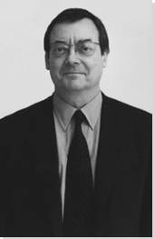

Summary of Robert Ryman
When Robert Ryman and his first wife Lucy Lippard were expecting their first child, the two went through a protracted search for the right name, leaving the unborn baby without a clear identity for several weeks, before they eventually settled on "Ethan." The absence of a name was fitting, given that many of Ryman's painted progeny are both untitled and noted for their absence of color due to his overwhelming use of white paint. Despite Ryman's difficulty in finding names for either his human offspring or his artwork, the paintings have endured and in latter years have raised his stature as one of the most important and committed figures of Minimalism, though his fame did not come as immediately during the 1960s as some of as his comrades in the movement. Nonetheless, Ryman's attachment to one idiom and its variations have proven remarkably resilient, allowing him to move away from content and instead raise larger questions about the nature of art and its exhibition.
Accomplishments
- Though not as well-known as figures such as Frank Stella, Sol LeWitt, or Dan Flavin, Ryman is nonetheless one of the pioneers of Minimalist painting, whose works attempt to empty the painting of content - and color - in order to focus almost entirely on form and process, an idiom in which he has continued to work for some sixty years, long past the demise of Minimalism as a cutting-edge movement. He thus might be termed one of the movement's most committed adherents.
- Like much Minimalist art, Ryman's work often asks the viewer to reconsider larger questions about the work of art - its placement within the gallery, the figure-ground relationship, its manufactured qualities vs. the hand of the artist, its permanence and boundaries, and others, and in many ways his paintings become more like objects than flat images.
- Ryman's works are nearly universally characterized by his wholesale use of white paint - almost to the exclusion of all other hues - which tends to be worked extremely thoroughly to give the surfaces a varied, almost tectonic, three-dimensional quality, so that his working process becomes plainly visible, a technique that can be traced to his formative experiences viewing Abstract Expressionist works.
Important Art by Robert Ryman

Untitled (Orange Painting)
Ryman considers this painting to be his first "professional" work. Though primarily orange, small points of green paint can be seen, mostly at the edges of the canvas. Inspired by Abstract Expressionist works at MoMA, Ryman bought some art supplies from a local store. He later recalled his thought process when approaching his early works: "I thought I would see what would happen. I wanted to see what the paint would do, how the brushes would work. That was the first step. I just played around. I had nothing really in mind to paint. I was just finding out how the paint worked, colors, thick and thin, the brushes, surfaces."
Unlike almost all of Ryman's later works, this piece is essentially a study of color and the interaction between pigments. It appears at first glance to be monochromatic, but a closer inspection reveals the subtlety both in texture over the surface as well as in the variations in tone. At the edges of the canvas, the orange contrasts sharply with the green paint behind it, and in certain areas, such as the bottom right, it is possible to see where thinner regions of orange paint have begun to blend with the layers of color underneath them. Also unlike Ryman's other works, there appears to be no underlying "strategy" that creates a sense of unity; instead, there is an uneven application of thickness to the canvas. This, however, forecasts the way that Ryman's use of paint in his mature work tends to be nearly sculptural relative to the picture plane, and like the rest of Ryman's work its form assumes that of the square canvas, devoid of representation.
Oil on canvas - The Museum of Modern Art, New York

Untitled
This work from 1960 shows the development of Ryman's mature style and his habitual use of white on a square canvas, but it also suggests a lingering influence from his early experiments with color, as the edges of the canvas reveal layers of blue and green underpainting. It also points to Ryman's debt to the Abstract Expressionists such as Jackson Pollock, characteristically termed "action painters" by critic Harold Rosenberg due to the way their painting revealed the process of creation. Ryman's work constitutes "action painting" in the sense that it indicates how the thick layers of white are built up with a knife or another tool, with more paint deposited towards the upper left corner, thus making the composition appear "off center." Even a neatly painted white rectangular form is visible along the bottom edge, along with the green and blue streaks, making evident each method that Ryman has used in compiling the final product. Also like the Abstract Expressionists, Ryman inserts his bright yellow signature at the bottom, signaling the work's completion.
Ryman's use of color here also serves a second important function, which is to reveal the substantive nature of the materials. Though traditionally white is treated as a background or for its distinct absence of other characteristics, here its application on top of the blue and green parts of the painting reveals its active quality, with distinct mass, shape, pliability, and opacity that proves its ability to literally cover and fully hide the other regions - as well as to seemingly "pull" the center of the painting up towards the top corner.
Oil and gesso on canvas - Dia, New York

Untitled (Background Music)
This painting emphasizes the importance of color in Ryman's work; even when the key color he uses is white, shade and tone are always carefully calculated. Here, the thickly laid white paint acts as a type of screen for the red, purple, and yellow hues behind it. The screen-like quality of the white painting dovetails with the title, possibly a reference to Ryman's attempt to become a professional saxophonist. By 1962, he had abandoned his musical career for one as an artist, thus relegating the former to the background with respect to his new profession.
The textured surface of Untitled (Background Music) seems to ripple if the light changes in the gallery space, emphasizing the importance of the work's context for the viewing experience, but also the general experience of background music, which by its nature is always partially blocked or indistinct for the listener, due to the screen created by distance or interposed barriers. The work presents the viewer with a set of choices, since it is possible to ignore the overlaid white paint to focus in on the regions of color, and vice versa. Much in the same way that one can "tune out" background music by refusing to strain one's ears to capture the sound or, alternatively, focus on the background music completely.
Finally, the "rippling" of the color in the painting parallels the way that some clips of background music seem clearer than others depending on the screening conditions and variability of volume. Such variation can be extended to a sense of randomness in both the nature of improvisational jazz music as well as the absence of any clear logic in the painting to undergird the way that Ryman covers the colored paint with white. The random quality is underscored by the square format of the canvas, which presents no obvious orientation for up, down, left, or right for the way that the painting must be hung.
Oil on canvas - Dia, New York

Arista
Arista is a painting that provokes far more questions about the nature of art than it answers. The work includes a six-foot square section of linen that has not been stretched over a canvas frame. The painted fabric is stapled to the gallery wall and bordered by lines drawn on the wall in blue chalk. Peter Schjeldahl correctly comments that "the lines suggest a guide to placement", but also argues that they are in themselves "the most interesting feature of the work." The unstretched fabric and chalk lines give the piece an air of being incomplete, as one traditionally assumes that the chalk lines would be erased and the painted fabric itself placed within a frame. This raises a series of important questions: does the work only exist as a whole when it is fully installed? Is it destroyed if it is re-hung on a different wall or in a different gallery? And, as a result, how do we know when the painting is truly finished, and how should we even properly describe the painting's dimensions? How integral are the staples and the original chalk lines to the work (can we really treat the chalk lines as "guides"?), and, since the chalk lines can easily fade or be erased if touched, Ryman also introduces a temporal dimension to the work: can it be altered and still be considered whole?
On the other hand, Arista also critiques the nature of the gallery itself and the respect accorded to art displayed there, and by extension, the artist himself. Must paintings be traditionally hung and therefore removable in order to be examined? Does permanently stapling the painted surface to the wall necessarily "cheapen" the experience of viewing or the treatment of the work? Or does it suggest a deeper sense of belonging because of the difficulty in removing or even shifting the painting? And, ultimately, does Ryman himself assume a greater degree of control over the museum due to the way his work governs the ability of the staff to set up and arrange exhibitions?
Oil on unstretched linen with staples and chalk lines - Dia, New York

Counsel
Unlike paintings such as Arista, which is stapled directly to the gallery wall, Counsel sits slightly away from the wall, raised from the surface by steel brackets. The brackets are visible at the top and bottom of the painting, drawing attention to the work's interaction with the space around it and the importance of its physical presence in the gallery. Most importantly, on this level Counsel plays with the traditional notion of framing even more than Arista, since a frame can both refer to the way the painting is encased in a type of boundary that often accentuates its presence and can refer to how the surface of a canvas or substrate is supported by a backing structure, in this case the durable and plainly visible (though not obtrusive) brackets protruding above and below the linen.
The raised bracketed frame, of course, introduces the question of whether an encasing frame raises the profile of a work within the gallery to a greater degree than the way that Ryman has chosen here. But the positioning away from the wall also points to the "constructed" as opposed to painted nature of the work. The brackets and bolts are industrially manufactured, and in combination with the square format of the painting suggest a sense of standardization, as if it has been factory-produced. Yet, this is held in tension with the revelation of the hand of the artist in the way that Ryman has laid the white paint on the fabric, building it up thickly in the center and tapering it off, so that its coverage stops before reaching the edges. In perhaps the ultimate display of artistic process, the work appears like a tabletop with a base substance poured onto it and ready to be worked and shaped, but permanently frozen in a moment of preparation and hung up for posterity.
Oil and enamelac on linen with steel fasteners and bolts - Dia, New York

Accord
This is one of several works that Ryman made during the 1980s that he called "three-dimensional paintings," existing somewhere on the boundary between painting and sculpture. Critic Lidija Haas claims that Accord, and other Ryman works from this era, "feel like gentle jokes as well as experiments: is it a painting or a frame, or a podium on which an artwork will be presented to you?"
Like many Minimalist works of the 1960s, Accord straddles the boundary between art and object and asks the viewer whether or not these categories are mutually exclusive. Even more so than Counsel, Accord appears as if it has been industrially manufactured, with a precision to the cuts of aluminium and the steel bolts. It is only upon closer inspection that the brush strokes of Ryman's characteristic white paint become visible, hence the way that the hand of the artist seamlessly finds an accord with the process of factory production.
On another level, Accord even turns the idea of hanging artwork in the gallery on its head, as the work's form and bolted attachment to the wall make it appear like a template for a section of signage or a metal panel ready to be installed for a utilitarian purpose, like housing a vertical set of elevator buttons, both of which are objects that could be seen in a museum or gallery. In this sense, Accord also refers to the way in which Ryman's work seems to blend into its own surroundings, thereby questioning the function of gallery display as a frame or podium intended to increase rather than reduce an artwork's visibility.
Oil on aluminum with steel bolts - Dia, New York
Biography of Robert Ryman
Childhood
Robert Ryman was born in Nashville, Tennessee. After finishing high school in 1948, he matriculated to the Tennessee Polytechnic Institute (now Tennessee Tech) in Cookeville, where he studied the saxophone. The following year, he enrolled at the George Peabody College for Teachers in Nashville, now part of Vanderbilt University.
He subsequently enlisted in the US Army and completed his national service in the reserve corps during the Korean War, when he was stationed in Alabama.
Early Training and work
After leaving the army in 1953, Ryman moved to New York, planning to become a professional jazz saxophonist. He studied with well-known pianist Lennie Tristano, while reportedly renting a room in the home of a Russian cello player on 60th Street. His musical background was to have a strong influence on his art later.
He needed to get a job flexible enough to allow him to practice the saxophone regularly, so he applied to work at the Museum of Modern Art as a security guard. There he met and became friends with the Minimalists and fellow MoMA employees Dan Flavin and Sol LeWitt. At the museum, Ryman spent much time exploring the work of artists such as Matisse, Picasso and Cézanne, who were to have a strong influence. He was also intrigued and inspired by the paintings of Mark Rothko, whom he once met in the museum cafeteria in 1957. The work of the Abstract Expressionists such as Rothko and Jackson Pollock intrigued Ryman and inspired him to explore the medium of painting himself. In 1955, Ryman bought some art supplies and produced his first painting in his apartment.
Around this time, Ryman entered a life-drawing class to learn more about fine art, but found it less interesting than he anticipated and only went to six weeks' worth of lessons. Later, he took another course that explained the fundamentals of painting. His skill and unique style was otherwise self-taught.
Mature Period
In 1958, Ryman attended the reopening party for MoMA (which had been damaged by a fire), where he met Lucy Lippard, an art critic known for her feminist perspective and her seminal book The Dematerialization of the Art Object. The pair married in 1961.
One of Ryman's paintings was shown for the first time in the MoMA staff exhibition in 1958. Although his very first extant painting was orange, almost all of his subsequent works have used white paint. The color (or absence of color) fascinated Ryman and he swiftly found his mature style, although it was several years before the art world seemed to take note of his work. His first solo show was held in 1967 by gallerist Paul Bianchini, who had also helped launch the careers of Andy Warhol and Roy Lichtenstein.
In the 1960s, Ryman and Lippard immersed themselves within the New York art scene, becoming close friends with Sol LeWitt, as they were neighbors living in Manhattan's Lower East Side. Lippard had supported LeWitt in his early career, and later founded a bookstore with him. The pair were also friendly with artists such as Eva Hesse, a dear friend of LeWitt, who lived nearby.
During this period, the major preoccupation for Ryman and Lippard besides work was Lippard's pregnancy with their son, (eventually) named Ethan, whom she accused of "systematically destroying my insides and outside shape. We can't agree on a damn thing (Bob wants a boy named Jazz), yet. If it's a girl we seem to temporarily agree on (don't laugh) Delancey." Lippard then added, "It took the Rosenquists a month to decide on John. Hope we don't get to that stage of dilution."
Ryman's marriage to Lippard ended in divorce, but he later married artist Merrill Wagner, and together they had two sons, Will and Cordy. Will later recalled that his father was very private about his working practice, and would rarely let anyone into his studio. Cordy, who is also an artist, sums up his father's career thus: "Dad started working in the mid 1950s and no one cared, and in the '60s no one cared, and then in the '70s maybe a couple people cared. He worked on his own style of painting for a long time before they blew up." In 1969, Ryman's work was included in an exhibition in Bern, Switzerland called When Attitudes Become Form, which was key in drawing together work by several important Minimalist and Conceptual artists.
Will Ryman also remembers adding some White-Out to one of his father's white paintings, wondering if it would be noticed (it was, and had to be fixed). The Rymans loved pets, living with seven cats and four dogs, as well as a parrot that apparently copied sound effects from the boys' video games. Two of the dogs notoriously hated each other and had to be kept apart at all times.
The first retrospective of Ryman's work was organized in 1974 by the Stedelijk museum in Amsterdam. He continued to produce his series of white paintings in the intervening years, and in 1992 a significant touring exhibition of his work was arranged by MoMA and the Tate.
Later Career
In the last 20 years of his life Ryman continued to work in the style that had characterized much of his lifelong artistic output, usually using white paint on square mounts. However, he had also been working with brackets to give his paintings an element of three-dimensional life, designing many of these brackets himself and having them custom-made. In 2009 he participated in a contemporary art project entitled Find Me, working alongside artists such as Lawrence Weiner and Paul Kos.
In 2014, the Hallen fur Neue Kunst in Schaffhausen, Switzerland, which had held many Robert Ryman works in its permanent collection, permanently closed. The paintings were acquired by the Dia Foundation and exhibited in a landmark career-spanning show in Chelsea, New York City. Ryman passed away, at the age of 88 in New York City.
The Legacy of Robert Ryman
Ryman's work has always been difficult to define and classify, a facet that has prevented it from receiving extensive coverage in the academic or popular press, and in some ways, has limited his sphere of influence. Nevertheless, Ryman was a key figure as a pioneer of Minimalist painting, which took the movement in a different direction from its typical industrial aesthetic. His reliance on a single color (or absence thereof) has also inspired several painters more recently, as painting has seen a revival. These include Brazilian artist Fernanda Gomes, whose simple semi-sculptural works use white paint on a variety of surfaces.
Influences and Connections


![Fernanda Gomes]() Fernanda Gomes
Fernanda Gomes


Useful Resources on Robert Ryman
- Robert Ryman: Used PaintOur PickBy Suzanne Hudson
- Robert RymanBy Janet Boris, Walter Hopps and Deborah Schwartz


