 Ask The Art Story AI
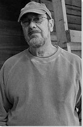

Summary of Robert Mangold
Robert Mangold is perhaps one of the lesser-known figures associated with the Minimalist movement that came to dominate the North American art scene in the 1960s. But he was there at its conception and is held in high regard by many of the most famous sons and daughters of the genre. Once employed alongside Sol LeWittt as a security guard at New York's Museum of Modern Art, he rose to prominence through his inclusion in a series of well-received Minimalist exhibitions in the mid-1960s. In addition, his turn in the 1980s to brighter, bolder color palettes influenced the new generation of Post-Minimalist artists who rose to prominence in that decade. Mangold remains creatively active and, in a Movement sometimes teased for its high-falutin metaphysical and conceptual propositions, is notable for speaking about his practice with an eloquent clarity and directness.
Accomplishments
- Although Mangold is known as a Minimalist painter, a movement primarily associated with sculpture, his paintings really exist on the cusp between painted and sculptural form. Using effects of layering, segmentation, notching, and combination with other strips and squares of canvas, Mangold is able to emphasize the presence and form of the painted surface in a way which generates subtle architectonic and sculptural effects. His work therefore contributes to a key ethos within Minimalism, the collapse of the medium-specific processes and creative approaches that had defined Abstract Expressionism, North America's last major art movement.
- A repeated maneuver in Mangold's work is the use of a graphite pencil stroke to articulate a curved or counterpointed line within the rectilinear external shape of a frame. This often seems to leave his pieces on the cusp between one shape and other, such that the viewer must imagine a form extending beyond the physical boundaries of the piece that resolves the structural quandary. In this sense, they generate the classic Minimalist impression of a potentially infinite form extending beyond the boundaries of the object presented.
- Mangold's earliest works were presented in pale, matt, monochrome hues, but in the 1980s he opted for brighter and bolder color combinations, which perhaps responded to the new colors and shapes of the nascent digital space. Through this maneuver his influence extended beyond his Minimalist peers to a younger generation of artists such as the post-Conceptualist Peter Halley.
Important Art by Robert Mangold

Pink Area
Pink Area is a spare but visually impactful piece. Two slender, rectangular strips of Masonite join to form a square, a notch cut in the bottom right-hand corner to mar the symmetry of the form and reveal the plywood board behind, adding a visual and textural quirk. The Masonite panels are spray-painted - Mangold chose to apply paint in this way to avoid the impression of the artist's touch - with a gradient running from creamy grey to soft pink in the bottom fifth of the painting.
Pink Area is part of the Walls and Areas series, which expressed Mangold's perception of urban structures: windows, walls, obfuscated buildings, and the sharp spaces created between them. Of these works Mangold explained: "each work is a totality, but it implies that much more could be there." The series exemplifies the principles of Minimalism both in its enigmatic suggestion of illimitable form and because, Like Donald Judd's Specific Objects, it presents itself as "neither painting nor sculpture." Though painted, it lacks the mark of individual creation, and the color is monochromatic and unobtrusive, calling attention to the surface to which paint is adhered. Affixed to the wall, the piece takes on a sculptural element because of the cut-away bottom corner. Mangold himself, however, always preferred the term "Geometric Painter" to Minimalist.
In a sense Mangold's painting, with its strong associations of a smoky urban sunset, begs the question of whether Minimalist artists were ever able to create truly "non-referential" works. That said, the critic Daniel Marzona states of Walls and Areas that "although to a certain degree allusive, these early works already reveal Mangold's focus on the four independent but related elements of painting; shape, color, line, and surface."
Sprayed oil on Masonite on plywood - Mnuchin Gallery, New York

Circle In and Out of a Polygon 2
Circle is a deceptively simple work, suggesting a series of different visual forms that the viewer is invited to complete in their mind. As with Pink Area, the extraction of part of the implied shape of the canvas creates a sense of tension between the qualities of painting and sculpture: a semi-circular curve marks out the right-hand side of the surface, but the circle is completed on the left-hand side by a thin graphite line. This contrast between drawn and sculpted shape generates a sense of formal play, complemented by marking out the sides of a polygon inside the right perimeter of the circle. This adds to the subtle sense of flux, as if the work were unsure whether to resolve itself into one shape or the other.
By the 1970s Mangold was tired of waiting for his oil paints to dry. He switched to acrylic paint, but because this often dried in his spray gun, he seized upon the roller as an ideal medium of application. He described paint rolling as "a very practical way of applying the paint without seeming sentimental or romantic about it." Lack of sentimentality also figures in the austere flatness of this work, with the lines of the polygon articulating the space of the canvas in the sparest possible terms. This self-reflexive minimalism reminds the viewer, as John Yau writes, "that a painting is a flat fragment mounted on the wall."
At the same time, Mangold's interest in the basic elements of a painting such as line and shape manifest themselves in works like this that challenge the very stability of both categories: if a line only partially expresses the outline of a shape, for example, is it part of that shape, or just a line? As Mangold put it: "[t]he work is a shape, but it's a shape in relation to the drawn figure in the composition; it's the marriage of those two things that starts the world in motion - what's going to be inside and what the outside is going to be, or how the outside works in relation to the inside."
Acrylic and graphite on canvas - Guggenheim Museum, New York

Green / 2 Orange X Painting
As the title suggests, this piece consists of several canvases fused together to form the shape of an X, painted in shades of orange - a warm pumpkin and a fiery reddish hue - and jungle green. The green section, extending from bottom-left to top-right, consists of a single thin strip of canvas. The orange sections, irregularly sized, consist of two different canvases affixed to the center of the strip. Black pencil lines mark out the inner spaces of the cross, forming a second X within the painted composition.
In the early 1980s Mangold's muted, unprepossessing colors gave way to vibrant, saturated shades like those used in Green / 2 Orange. Whereas color had previously been subordinate to structure it was now an emphasized compositional feature. The oranges and green heighten the viewer's comprehension of the X form, but at the same time, as the critic Suzanne Muchnic notes, their irregular sizes "prove how eagerly the eyes generalize subtle inconsistencies." We want to make that familiar shape in our minds even if Mangold's piece insouciantly belies it. Again, the piece subtly suggests the presence of a different form to the one we are presented with, probing the dimensions of our formal unconscious.
But despite the new emphasis placed on color in Mangold's 1980s work the X shape remains the most important component of this piece. Moreover, though it is clearly possible to read allusions to religious iconography into the shape, and thus to Malevich's cruciform works, some observers have stressed that in the spirit of Minimalism all allegorical interpretation should be cast aside. In presenting their show of Mangold's X and + works, curators at London's Parasol Unit gallery emphasized that: "[t]he pencil inscribed figure of x or + on the painted canvas eliminates categorically any illusory effect and keeps the painting to the surface." To reference Frank Stella, one of the Minimal artists whom Mangold most admired, "what you see is what you see."
Acrylic and black pencil on canvas - The Art Institute of Chicago

Four Color Frame Painting #5
Mangold made numerous "frame" paintings in the 1980s, using strips of canvas to draw attention to the presence of the bare wall behind the work. This piece unites four individual shaped canvases whose irregular size creates the same notched corner-effect as earlier works like Pink Area. Each panel is painted a different color, with a neon green section extending along the top cut short by a vertical yellow which, in turn, stops shy of the bottom of the frame. Glowing red and thin dark brown segments complete the square. The most striking feature, however, is the ovoid shape traced through the four parts of the frame in black pencil. This partly functions as a practical instruction to gallerists for wall-mounting, but also creates that same subtle effect of formal metamorphosis as in Mangold's Circle In and Out of a Polygon.
Mangold's art-world peers Eva Hesse, Dan Flavin, and Jo Baer also experimented with "framing," using quadrilateral forms to emphasize a segment of empty wall or a white monochrome space integrated into the canvas. Though the point of such works is partly to draw attention to the permeable boundaries between the artwork and the world beyond it, Mangold made his frame more visually arresting than the space it contains. The bright colors and misalignment suggest an element of chance or spontaneity that pushes against the Minimalist aesthetic, while the odd ovoid shape invites us to ask which form is functioning as the work's defining boundary: the square canvas or the curved line. It also creates a curious sense of harmony and interplay between two contrasting forms. As Mangold put it, the line "had to be continuous so you had a sense that there was one line that tied the rectangles together."
While Mangold largely elides reference or narrative from his art, the void created by the frame calls for at least an acknowledgment of possible metaphor. Critic John Yau ruminates that "the oval - or head-like contour - adds another consideration into our experience. What are we to make of this absence presented palpably before us?"
Acrylic and black pencil on canvas - Pace Wildenstein collections

Attic Series XVII (Study)
The Attic Series features Mangold's signature shaped canvases, though the motifs used are simpler than the Xs, frames, rings, and columns favored in other runs of work. In this case, a square canvas has been cut away on its left-hand side to create a gentle, sloping arc. This only begins to manifest itself about a fifth of the way down the canvas, making the piece appear as an irregular square rather than a partial circle. Like Mangold's earliest works, it is monochromatic, painted in a deep ochre shade. In light pencil two triangles are added, their tips meeting roughly in the middle of the canvas and their bottoms spanning the bottom-left and top-right corners; the image resembles a geometric hourglass tilted on its side.
Mangold has explained in recent interviews that with age he feels more connected to classical and Renaissance art and architecture. Classical Greek architecture and pottery are frequent allusions in his work, with the Attic Series specifically deriving its shape, color, and line from Greek vases. Mangold champions what he sees as the "linear" quality of these vases, which often feature narratives on their fronts and backs. He also enjoys how the vase is a "simple form on which there is something, a design or drawing, that's applied; and then there's a color that's put on in one way or another; and all of it together makes this union that I have in my work." XVII suggests the curve of a vase on its left side, and in the way the penciled triangles look as if they could be encompassing a curved shape. The ochre shade of the work alludes to the oxidized color of the clay used in Greek black-figure pottery.
Acrylic and pencil on canvas - Lisson Gallery, London

Column Structure XXII
Forty years after he began experimenting with shaped, geometric canvases, Mangold demonstrates that he still has a rich trove of shapes to mine. The Column Structure series consists of variations on the column form, some works comprising simple linear shapes, others resembling crosses or trees, some alluding to roads or even Atari video-game landscapes. In XXII, the overall shape is of an irregular cross, making an inevitbable nod to Christian iconography and Malevich's Suprematist constructions.
Mangold fused several canvases together to create this work, with a horizontal segment bisecting a vertical. In another signature move, he uses graphite pencil lines to add internal shape and rhythm, segmenting the canvas into a series of squares in turn divided into lozenge-like forms. Mangold's Column works, like many of his other series, allude to architecture, though these suggestions encompass both completed structural forms and blueprints. The column is an essential building element dating to antiquity, and Gothic cathedrals utilized the cross shape as a floor plan, the transepts intersecting with the nave before culminating in the choir and sanctuary. Further utilizing the language of architecture, Column Structure XXII is segmented into grids, though Mangold complicates the mathematical regularity of the piece with the curving lines that undulate throughout the canvases.
Again, then, much of the interest of the work likes in a sense of tension and interplay between curvaceous and rectilinear forms. But the grid and the line do not war with each other. David Hodge of the Tate has praised the Column series for its combined sense of "confinement and flowing continuity". As Mangold himself explains, "I realized that the grid gave a structure to these curved lines and reassured the viewer as to what they were seeing because it gives them a framework."
Acrylic, graphite, and black pencil on canvas - Albright-Knox Art Gallery, Buffalo, New York
Biography of Robert Mangold
Childhood
Robert Mangold was born in 1937 and spent most of his childhood in Buffalo, New York. He has described himself as coming from a "rural factory background", noting that most of the men in his family worked at the Wurlitzer factory in North Tonawanda, which made organs and jukeboxes. His mother worked odd jobs, including wallpapering and stock-buying for a department store. Mangold would accompany her on occasional trips to New York City, and also used to go with her to the library, where he would borrow books on art and drawing. Mangold remembered being told by people in his elementary school that he had a lot of talent, and as most of his family worked in factory or on farms, art seemed an attractive career choice.
In high school Mangold decided he either wanted to be a commercial artist or study illustration. Though his family recognized his abilities, they hadn't immersed their children in the art world, and Mangold admitted to an interviewer that "I don't actually think I knew there were contemporary artists...I knew there were people who would park their car and set up an easel and do a picture of something, but I didn't think this was a career choice." After high school Mangold cobbled together money from various small jobs to attend college.
Early Training and Work
In 1956 Mangold enrolled in the illustration department at the Cleveland Institute of Art, but transferred to the fine arts division, where he studied painting, sculpture, and drawing. He graduated in 1959 and attended the Yale Summer School of Music and Art on a scholarship. In the Fall of 1960 he entered Yale's graduate school program in Art and Architecture, where he befriended artists such as Nancy Graves, Brice Marden, and Richard Serra. It was at this time that Mangold began to experiment with large abstract canvases.
Mangold married his classmate, the artist Sylvia Plimack, in 1961, and after completing his M.F.A. in 1962 they moved together to New York. The aesthetics of the city, with its skyscrapers, bridges, and plazas, permeated Mangold's mind: particularly the way that modern architecture created sculpted in-between spaces. He would later describe the city as containing "[p]ieces of architecture that are both solid and atmospheric. A similar form in one way could be a gap between a building and in another way could be a building." He was also interested in the fragmentary quality of these forms: "[w]hat struck me when I first moved to New York was that so much of what we see, we see in fragments. We see part of a truck going by, or part of a building. We never see anything in completeness." He was invigorated by the grittiness of the city, which, though it presented "an image-rich situation, a material-rich situation", was "not [rich] with natural color - you were not looking at sunsets, or feeling gentle shifts in the breezes - but the scale and color of industry and commerce surrounded you."
Mangold took a position as a guard at the Museum of Modern Art, where he met fellow artists such as Sol LeWitt and Robert Ryman who had taken up similar jobs to immerse themselves in the world of modern art. Mangold loved chatting with the other guards on breaks, and then going back up "[to] be with the works and watch people, which is what you did most of the time." The Conceptual Art critic Lucy R. Lippard, who was married to Ryman and researching in the museum at this time, dubbed the three men "The Bowery Boys," because of the cheap but spacious flats they had taken in the Bowery district. The sense of creative community in that part of New York was strong. Mangold later commented: "[i]t was important to have friends and be able to visit their studios and have them visit yours, because you need others who are sympathetic and interested to show your work to."
Mature Period
Mangold started displaying his work in commercial galleries while still a guard at the Museum. His first solo exhibition was held at the Fischbach Gallery in 1965. He attained art-world status surprisingly quickly, when he was included in an exhibition of Minimalist art at the Jewish Museum in 1965, and in Peggy Guggenheim's Systematic Painting show the following year. Not long afterwards he began working as an instructor in the fine arts department of the School of Visual Arts.
Mangold had created his earliest works in oil, but he moved away from this medium in 1968, opting instead for acrylics, which he applied with a roller - rather than spraying as he had with his previous work - onto Masonite and plywood. From here he moved to canvases, experimenting with shaped canvases and incorporating an increasingly vibrant color-palette into his work during the 1970s.
After Mangold received a Guggenheim Fellowship in 1969, he and Sylvia took a house in the Catskills, where they spent an increasing amount of time. Mangold explained that "one reason for living the city was economic, but there was also a lot of disillusionment in the late '60s, partially political, the assassinations and so on. And there was a lot of art world craziness." He had been initially unsure about the effect of moving to the countryside on his art-making, but he soon found that the fragmented patterns and shapes he had admired in the urban environment were present here as well, albeit in simplified forms.
Late Period
Mangold continued to paint his bright, minimal works throughout the 1980s-2000s. He featured in the 1993 Venice Biennale and in four Whitney Biennials, the most recent in 2004. He still paints, though he recently told an interviewer that, due to his policy of working alone in the studio, stretching all his own canvases and performing all drawing and painting himself, he was "getting to a kind of crisis in my life... I'm getting to the age where I can't do everything myself. I can't handle the size of paintings I once handled. So it's a question of whether I want to have somebody in the studio doing this with me, or whether I want to cut down the size a bit, or make it in parts."
Mangold and Sylvia continue to live in upstate New York. Their son, James Mangold, is a renowned director and television writer and Sylvia is a successful artist in her own right.
The Legacy of Robert Mangold
Robert Mangold is one of the most significant painters in a movement, Minimalism, that was primarily concerned with sculptural objects. His 1960s-70s monochromatic paintings, with their slender graphic lines limning shapes offset against the exterior shape of the canvas, inspired artists including Frank Stella, Jo Baer, Robert Ryman, and Al Held, all of whom were unwilling to forsake the application of paint onto canvas in an era when painting was deemed to be over. Like the Minimalist sculptors, however, Mangold held fast to the "objectness" of his art, refusing to assign any meaning to it external to the artwork itself. In this sense, his contribution to the genre of Minimalism was both exemplary and exceptional.
Mangold's turn during the 1980s to bright, bold colors and playful shapes, such as his X and + canvases, is reflected in the work of a younger generation of artists such as the neo-Conceptualist artist Peter Halley, the painter Robert Kelly, and Mangold's contemporary the sculptor Joel Shapiro. In the 2010s, Mangold's commitment to the manifold possibilities of line, shape, and color might seem to have found a dubious legacy in so-called "Zombie Formalism", though the work associated with that term tends to lack the cerebral elegance of Mangold's best pieces. A range of artists working with the legacies of Minimalism, including Daniel Gottin, Richard Caldicott, and Jose Keerken, continue to benefit from what Phillip Barco calls Mangold's "legacy of freedom."
Influences and Connections


![Jo Baer]() Jo Baer
Jo Baer![No image available]() Daniel Gottin
Daniel Gottin![No image available]() Richard Caldicott
Richard Caldicott

-
![Robert Ryman]() Robert Ryman
Robert Ryman -
![Brice Marden]() Brice Marden
Brice Marden -
![Eva Hesse]() Eva Hesse
Eva Hesse ![Mel Bochner]() Mel Bochner
Mel Bochner


-
![Minimalism]() Minimalism
Minimalism ![No image available]() Neo-conceptualism
Neo-conceptualism


