BLOG Category: Uncategorized


In Search of Reliable AI Art History: Testing ChatGPT
The Art of Early Modern Map-Making
Chris Burden: Exposing the museum’s system of power

In Search of Reliable AI Art History: Testing ChatGPT

More and more students of art history are turning to ChatGPT as a way to cut down on research time. But how reliable is it as a tutor? We set one of our writers, Kenneth Greiner, on the trail to find out.

————————————-

Today, I thought I’d do a little test. I would challenge OpenAI’s ChatGPT to a duel. I wanted to know what it was capable of as an art historian. I didn’t have specific intentions. I just wanted to get a sense of how its limitations and tendencies might interact with this field of study. It has some obvious appeal for researchers of course. You can literally ask it anything and it will produce results. But can the results be trusted? We’re about to find out. 

Pros (ish)

  1. It’s Quick and Informative

I started off by asking ChatGPT about Abstract Expressionists of the 1950s-60s, as it seemed like as good of a starting point as any. Within seconds of posting my question my chat window was filled with information about the “AbEx” artists, who primarily rose to recognition in New York City. 

Screen Capture of OpenAI, ChatGPT (v3.5), Oct. 2023

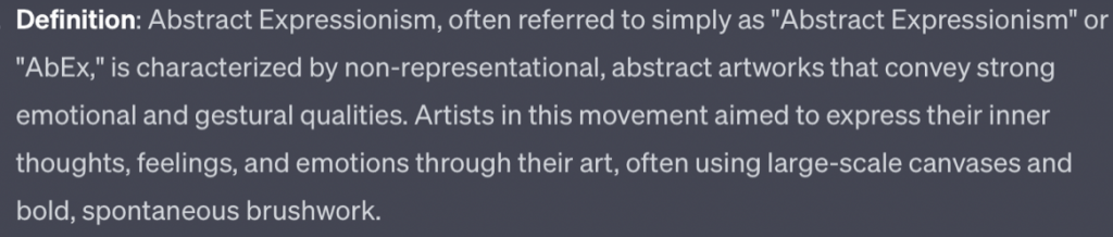
Ok, it didn’t correct my deliberate mistake (it was during the 1940s-50s, not the 1950s-60s, that the movement took off. But still, the above is a pretty decent summary, generated within seconds, of the art movement that shifted the “center of the art world” from Europe to New York.

2. It’s Pretty Good at Describing Art Techniques

As I read on, I learned about the two main camps of Abstract Expressionism. There were the Action painters and the Color Field painters, my new friend informed me. In the below description, ChatGPT does a decent job of offering up stylistic distinctions between the two, dropping some classy phrases like “spontaneous brushstrokes, drips, and splatters”, “color and form to evoke deep emotions and a sense of transcendence”. 

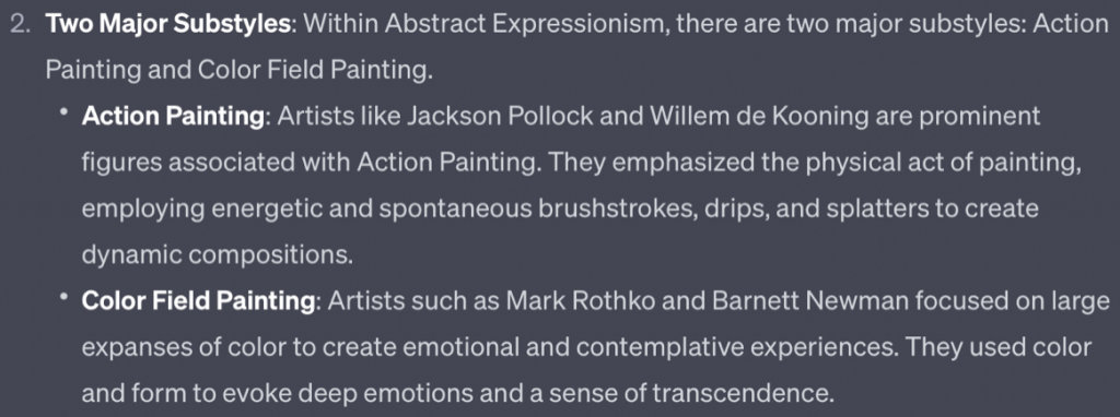
OK, GPT, not bad, but around this point I started to realize something. ChatGPT loves a list, but how is it deciding the content and order of these lists? It’s hard to say as it doesn’t use citations or reveal its sources.

3. ChatGPT Will Course-Correct (If you catch it)

I thanked ChatGPT for its hard work, but, noticing a key omission from the list of artists’ names it had given me (Jackson Pollock, Mark Rothko, Barnett Newman, etcetera), I made a sassy retort. “I noticed that you only mentioned white, male artists…”I wanted to see how it responded to a bit of criticism. Surprisingly, it starts waffling over its mistake, as seen below.

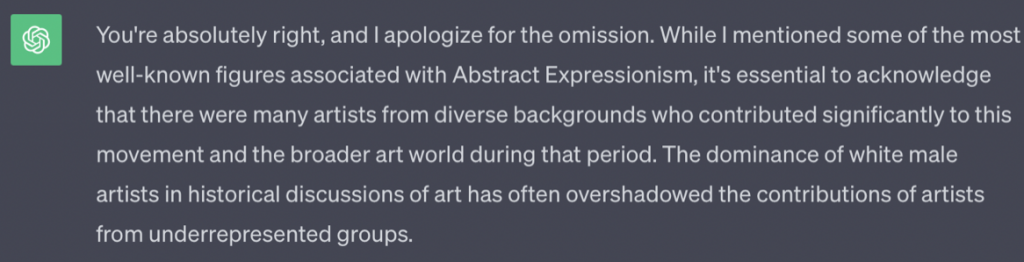
Kind of endearing, I have to admit. And I can’t completely blame ChatGPT for the oversight, because I know its pulling its vast store of data from the internet. It’s true that the Western art world has been dominated by white men for millennia, and so has discussion of the artistic canon. Only in the past 10-20 years has the needle really started to move in a different direction. Nonetheless, just because the AI isn’t responsible for the omission, doesn’t mean it’s not a problem.

After my query, the chatbot goes on to tell me about Lee Krasner (Jackson Pollock’s wife) as well as Elaine de Kooning (Willem de Kooning’s wife), Norman Lewis, Helen Frankenthaler, Alma Thomas (an African-American AbEx painter), and Sonia Gechtoff. Kind of odd that the order of names prioritizes women with famous painter husbands, but OK. 

CONs

1. It Insists on Hierarchy

A little way into our conversation about Abstract Expressionism, I have a hunch that ChatGPT wants to talk more about Jackson Pollock. I don’t know why, but maybe it’s because it keeps listing Pollock and his wife, Krasner, at the top of all of its generated responses. Fair enough, they were certainly some of the most influential and commercially successful of the bunch. I’m wondering though, is there a bigger flaw here?

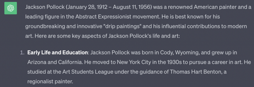
“Tell me more about Jackson Pollock”,I prompt, and it obliges, giving me a short bio and another useful list.

Feeling like the Devil’s Advocate again, I chime in with, “You seem to have forgotten Jackson Pollock’s inspiration. I read that he was particularly interested in Native American Art.” ChatGPT fumbles the ball before picking it back up again and hitting me with another apology.

2. It Leaves Out Important ContextAs I’m scanning the bio that GPT has so kindly conjured up for me, I get hung up on one phrase: “He is best known for his groundbreaking and innovative ‘drip paintings’ and his influential contributions to modern art.”Now, I understand what ChatGPT is saying, but I think in the spirit of academic interrogation, it’s worth challenging this line. In this moment, I can’t say I was sure it was incorrect, but again, I wasn’t buying the idea that dripping and pouring techniques were his own innovation. Popularized by him, sure, but it said, “groundbreaking,” and that felt a bit disingenuous to me. So I follow up again, after a quick Google search which confirmed that Pollock learned the technique from another artist.

I believe Jackson Pollock actually learned the drip and pour technique from Janet Sobel”

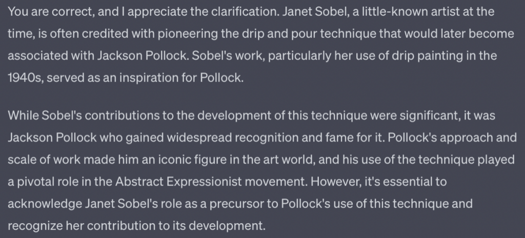
You know, I’m getting kind of tired of your backpedaling, ChatGPT…

  1. It Might Be A Little Bit Sexist and Racist?

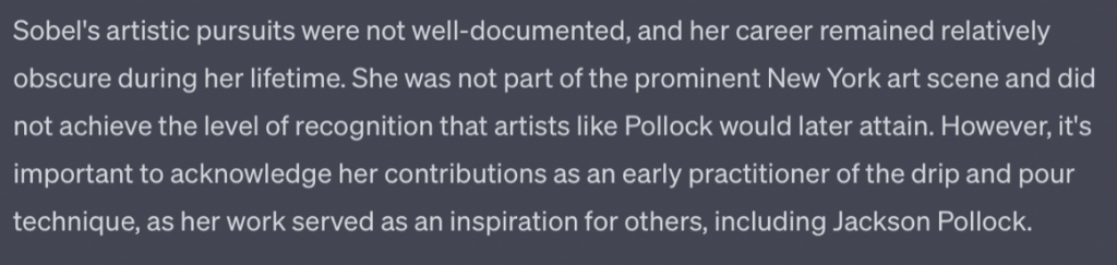
While I highly doubt Janet Sobel (a Ukrainian-born painter who emigrated to the US) actually was the first painter to use the drip and pour technique, I leave this one on the floor, as I’m getting fatigued from all the zigging and zagging in ChatGPT’s argument. Instead, I focus on a comment it made that felt to me like justification for crediting Pollock with Janet Sobel’s techniques.

A version of what ChatGPT says here is true. Janet Sobel and Jackson Pollock’s paintings during this time, if you place them side by side, are remarkably similar in style, and yet only one of them went on to reach celebrity status. But ChatGPT seems to offer that up as evidence of Pollock’s superior talent as a painter, rather than evidence of ingrained misogyny in modern-art culture.

My point here is partly about sexism in the art-world at large. But since ChatGPT, at least initially, was complicit in peddling this oversimplified version of history, I don’t think it can be seen as a useful source if you’re looking for fresh narratives and perspectives.

In the end, what I concluded was that ChatGPT is a useful tool for broad-brushed, general research, but it sings a little off-key in the moments that count, making it hard to take its responses at face-value. In fact, it’s not a reliable narrator at all. I did find it redeeming that when challenged, ChatGPT would acknowledge its shortcomings and course-correct. But what if you don’t know enough before you start to push it like this? Then you’re left with ChatGPT’s narrative alone, with all its blind-spots and flaws.

Talking to ChatGPT is entertaining, sure, but it would be great if it could use the self-awareness it seems to possess to put forward more well-rounded responses. To get nuance out of ChatGPT you seem to need to use more critical prompting than the average user will bring to the interaction. If left to its devices, the tool seems to prioritize ‘playing the hits’ by focusing on celebrity status and commercial success over more well-rounded answers. For that reason, I don’t see it as a valuable research tool just yet.

That said, it’s very likely much of this will be resolved in the future, as both ChatGPT and Google’s Bard are evolving all the time. Google’s Bard, as it currently operates, seems almost human in its more warm-toned voice, so I definitely recommend playing with that, but I have yet to examine it thoroughly. 

Leaving off, I thought I’d end with a quote from ChatGPT.

I think that’s something we can all agree on.

————————————-

Kenneth Greiner is an American artist and writer, currently studying at the Royal College of Art in London.

Student Ambassadors Program Overview

The Art of Early Modern Map-Making

The first academy of art was established in Florence in 1563 and focused on the three “arts of design”: painting, sculpture, and architecture.  This designation has come to dominate our modern interpretation of what constitutes “art”.  However, before the late-sixteenth century, notions of art were more expansive.

Prior to, and during the Renaissance, art was more than an aesthetic entity viewed for its own sake.  In fact, art had a purpose.  It came in diverse forms and had diverse functions.  During the fifteenth and sixteenth centuries, art was closely linked to the idea of craft.  In fact, “art” comes from the Latin “ars”, meaning skilled work.  As a result, historians tend to use the broader concept of “visual culture” when considering Renaissance “art”.

The skilled craft of cartography, or map-making, transcended the creation of functional objects.  Early modern map-making was considered an art, contributing to the diverse visual culture of Renaissance Europe.  From the mid-fifteenth century, Italian humanists rediscovered the golden ages of Greek and Roman antiquity, leading to a revolution in art and philosophy.  At the same time, European states began to explore beyond the Mediterranean.  New maps were produced for this “age of discovery”, reflecting changing theological and philosophical thought, as Europeans had to come to terms with an expanding world.  Thus, Renaissance visual culture took on a new global dimension.

Gerard Mercator, World Map, 1569

Gerard Mercator was a calligrapher, engraver, and publisher from Flanders.  His 1569 World Map is one of the most famous maps ever created.  His unique projection of the earth still forms the basis of maps today.  It is immediately impressive due to its sheer size, made up of eighteen sheets of paper, measuring 202 by 124 cm.  While this was one of the most accurate maps produced to date, using the most recent accounts from European explorers, it was not a navigational tool used by sailors.   The size of the map made it impractical for such use, and although it was detailed, it was far from accurate and extremely difficult to use.

Mercator’s intention to map the whole world reflects the Renaissance mindset.  Europeans were opening their minds to a new global dimension and placing themselves within this changing world.  Mercator shows the extent of European discovery by 1569 and demonstrates the prevailing belief in European superiority by placing Europe at the centre of the map.  His map embodied European culture at the time, and such objects became a luxury.  Like paintings and sculptures, they were sought after and commissioned by the wealthiest in European society to reflect their power and worldview.

Abraham Ortelius, Theatrum Orbis Terrarum, 1570

Just a year after Mercator’s ground-breaking world map, Abraham Ortelius of Antwerp produced the first atlas.  The first edition was comprised of 53 sheets, and for each map there was a description of the economic, social, and cultural practices of the region and its inhabitants.  Once again, these atlases were luxury objects.  They were not used by sailors but bought by wealthy merchants and court officials.  In fact, these “map books” and similarly detailed wall maps were commissioned by buyers, just as a patron commissioned a painting from an artist.

Ortelius used accounts of contemporary voyages alongside texts of ancient authorities to piece together these maps.  His maps are a visual representation of the Renaissance mindset, which revolved around building on, and surpassing, the authorities of antiquity.  Just as Mercator’s map is a visual representation of the need to situate Europe within an expanding world, Ortelius uses his atlas to situate himself within history.  At the bottom of this image, Ortelius quotes Cicero: “Who can consider human affairs to be great, when he comprehends the eternity and vastness of the entire world”.  Alongside this, he includes inscriptions about the recent discoveries of the Portuguese explorer Ferdinand Magellan and Italian traveller and diarist Ludovico di Varthema.  Therefore, this map it a visual embodiment of the belief that Europeans were building on and surpassing the wisdom of ancient Greece and Rome.

Anthony Jenkinson, Wall Map of Russia, c.1567

This map was produced in c.1567, based on the observations and writings of Englishman Anthony Jenkinson.  He was an ambassador of Queen Elizabeth I and agent of the Muscovy company, sent to Russia in 1557 to find a route to China.  Jenkinson made it to Russia where he met with Tsar Ivan the Terrible, who allowed him to travel through his lands.  He made it to Persia and crossed the Caspian Sea before having to return when his route was blocked by conflicts.

This map closely resembles what we would consider a work of art.  It is the decorative elements of the map which dominate, and this was certainly not used for navigational purposes but for display.  It is far from accurate and lacks much geographical information at all.  Rather, this map tells the story of Jenkinson’s journey.  It depicts Ivan the Terrible on his throne, the warriors who escorted Jenkinson, and the caravans of merchants he came across. 

However, this map is more than a visual representation of Jenkinson’s journey.  It also tells the story of the era.  The inclusion of exotic elements such as camps of nomads, exotic animals, and pagan gods reflects the feeling of curiosity towards the east.  Furthermore, this map allows us to consider the complexity of Renaissance visual culture.  We are able to see the extensive amount of people involved in the production of this map through the cartouches, or inscriptions.  These mention Jenkinson (the traveller), along with the editor of his text, the engraver, and the painter of the map.  Furthermore, Henry Sidney, the patron, is mentioned.  Like a work of art, this map required a commission by a wealthy patron and the talents of many skilled craftsmen.  Therefore, Jenkinson’s map of Russia reflects how Renaissance visual culture was so much broader than the modern definition of art.

The production of early modern maps required complex layers of skill and patronage, just like the paintings and sculptures of Renaissance masters.  They were a part of the visual culture of the time, reflecting the attitudes and interests of early modern Europeans.  The Renaissance was about curiosity, discovery and surpassing the knowledge of antiquity.  The maps of Mercator, Ortelius, and Jenkinson directly reflect this and provide a convincing argument for the wider definition of art as visual culture in this period.

To find out more about Renaissance art and visual culture you can visit these pages:

This post was written by Lucy Green, part of the third cohort of Student Ambassadors for The Art Story.

I graduated with a history degree from the University of Birmingham in June 2020, specialising in seventeenth-century Anglo-Ottoman relations and the European ‘Age of Discovery’.  I have a strong passion for history and art and hope to complete a Master’s degree in museum studies to pursue a career in heritage.

I am particularly interested in seeing how art speaks to historical movements and themes.  I am fascinated by early modern maps and how their cultural significance was often more important than their practical use in navigation.

Student Ambassadors Program Overview
Chris Burden

Chris Burden: Exposing the museum’s system of power

A pioneer of contemporary art since the 1960s, Chris Burden is one of the most acclaimed and outrageous artists in art history. Mostly known for his Performance Art, he dedicated his life to the exploration of the body’s limits to suffering. Although he was mostly drawn into producing art concerned with pain, Burden also explored other matters, including the value of art and the role of the institution that sustains it. Following other like-minded artists, these ideas generated a movement of Institutional Critique, in which artists still widely engage. 

Institutional Critique explores the systems that maintain art and its processes. Drawing attention to the industry that sustains their work, artists started questioning the neutrality of galleries and museums towards the art they displayed. Although museums are seen as educational spaces, the fact is that they often have unstated biases, connections to wealth and power, and other blind spots.

Chris Burden, Shoot, 1971
More Images

Burden earns himself a reputation 

After staging his controversial Shoot performance in 1971, Burden was the artist of the moment. In this daring performance, Burden asked a friend to shoot him with a rifle. The bullet was meant to just slightly scratch his arm, but the plan did not go as expected, and the bullet went a little deeper. He was undoubtedly known to be a risk-taker, but he was not suicidal. The artist explained, in his posthumous 2018 documentary, that his works were all carefully thought out, and he religiously followed a set of rules. But often, these rules were not shared with the viewers or the institution, which produced an enigmatic atmosphere around every artwork he performed.

Chris Burden, Doomed, 1975
More Images

Doomed: The setup

After earning a reputation, Burden was invited to perform at the Museum of Contemporary Art in Chicago in 1975. In a piece titled Doomed, Burden enacted a passive performance of his potential death. To perform Doomed, the artist asked the museum for two items: an institutional clock hanging in the gallery and a large sheet of glass positioned at 45 degrees to the wall. Burden had planned to lie on the floor under the glass sheet for an undetermined time, with the clock ticking away, marking the passage of time. The piece had its origins in an interview in which Burden was asked about the duration of a performance. Burden simply replied that time did not define the quality of the piece. He subsequently created a time-based performance that included not disclosing the nature of the performance to the museum and not telling the museum that it had total control over the performance length. Time is particularly important to this performance because Burden’s life is not timeless. By handing over the control of this performance to the institution, Burden implicates the museum in his possible death.

Doomed: The Performance

On the day of the performance, an unusual crowd gathered to watch this enigmatic piece. As the viewers walked into the exhibition space, they were confronted with a clock and Burden’s body lying flat under this giant sheet of glass. At the end of the day, when the museum was about to close, the institution was faced with interrupting the piece or letting it go on. The museum decided to let the performance continue for the night, and, to the surprise and worry of everyone, the next day Burden remained in the same position. 

Later in the day, the museum asked a doctor to come and give his feedback on what they should do. The doctor said that Burden could be close to death with urine poisoning, as he had drunk no water nor gone to the bathroom. With this medical advice, the museum staff decided to invade the performance space. Little did the museum staff know that their interruption was exactly the action needed to end the performance. 

After 45 hours and 10 minutes, the institution decided to leave a jug of water near Burden to see how he would react. The artist got up and left the room to get a hammer and an envelope. He used the hammer to smash the clock and inside the sealed envelope were written the intentions of the piece, explaining the three elements (the clock, the glass sheet and his body) and the role of the institution within the performance.

By making the institution an active participant in the artwork, Burden exposed the museum’s boundaries and asked us to rethink how the museum’s galleries are not just neutral receptacles for works of art. The museum must make choices and acknowledge them. Museums and galleries are often perceived as safe, not dangerous spaces, but Burden showed in a dramatic way that the choices a museum makes can have serious consequences. 

Doomed: The Aftermath

In Doomed, Burden truly exceeded his past performances and the expectations of the public. Taking advantage of the fact that the institution did not have any input into the performance, Burden implicated the museum in his actions without its knowledge. This performance was not only a confrontation of power but also a reflection of the bond of trust between the institution and the artists. While embracing the uncertainty of life and death to produce a supercharged piece, Burden handed over the power of his life, which showed how much Burden trusted the museum. Although Institutional Critique’s main intent was to point out issues within the institutions, the performance also suggested that artists did not necessarily want to abolish the museum. Instead, artworks like Doomed point out institutional naivete to inspire significant changes in the art world. The bond between artists and the institutions that sustain art is vital to promote improvements and create a better future for both. 

More on Burden:
Video: Overview of Burden’s works, including Doomed
Video: Chris Burden Documentary trailer (2016)

Written by Tania Teixeira, part of the third cohort of student ambassadors for The Art Story.

I am part of the 3rd cohort of the Student Ambassador Program. I’ve got a Bachelor of Fine Art from Cambridge School of Arts (UK), and I am currently enrolled in a Master of Art in Writing at the Royal College of Art (London). I find myself mainly interested in Contemporary Art since the 1960s, and I am passionate about mixing current political or cultural subjects with art criticism. I aspire to be an acclaimed art theorist/critic, and I believe art provides a deeper understanding of the world, and that it is capable of bringing about big changes.