 Ask The Art Story AI
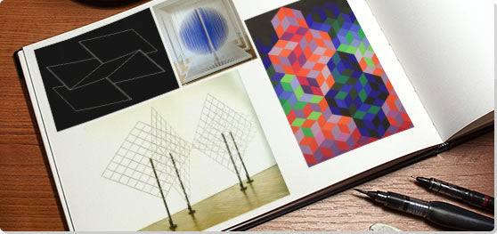


Summary of Op Art
Artists have been intrigued by the nature of perception and by optical effects and illusions for many centuries. They have often been a central concern of art, just as much as themes drawn from history or literature. But in the 1950s these preoccupations, allied to new interests in technology and psychology, blossomed into a movement. Op, or Optical, art typically employs abstract patterns composed with a stark contrast of foreground and background - often in black and white for maximum contrast - to produce effects that confuse and excite the eye. Initially, Op shared the field with Kinetic Art - Op artists being drawn to virtual movement, Kinetic artists attracted by the possibility of real motion. Both styles were launched with Le Mouvement, a group exhibition at Galerie Denise Rene in 1955. It attracted a wide international following, and after it was celebrated with a survey exhibition in 1965, The Responsive Eye, at the Museum of Modern Art in New York, it caught the public's imagination and led to a craze for Op designs in fashion and the media. To many, it seemed the perfect style for an age defined by the onward march of science, by advances in computing, aerospace, and television. But art critics were never so supportive of it, attacking its effects as gimmicks, and today it remains tainted by those dismissals.
Key Ideas & Accomplishments
- The Op art movement was driven by artists who were interested in investigating various perceptual effects. Some did so out of sheer enthusiasm for research and experiment, some with the distant hope that the effects they mastered might find a wide public and hence integrate modern art into society in new ways. Rather like the geometric art from which it had sprung, Op art seemed to supply a style that was highly appropriate to modern society.
- Although Op can be seen as the successor to geometric abstraction, its stress on illusion and perception suggests that it might also have older ancestors. It may descend from effects that were once popular with Old Masters, such as trompe l'oeil (French: "deceive the eye"). Or indeed from anamorphosis, the effect by which images are contorted so that objects are only fully recognizable when viewed from an oblique angle. Or, equally, Op may simply be a child of modern decoration.
- During its years of greatest success in the mid-1960s, the movement was sometimes said to encompass a wide range of artists whose interests in abstraction had little to do with perception. Some, such as Joseph Albers, who were often labeled as Op artists, dismissed it. Yet the fact that the label could seem to apply to so many artists demonstrates how important the nuances of vision have been throughout modern art.
- Long after Op art's demise, its reputation continues to hang in the balance. Some critics continue to characterize its designs as "retinal titillations." But others have recently argued that the style represented a kind of abstract Pop art, one which emulated the dazzle of consumer society but which refused, unlike Pop artists like Andy Warhol, to celebrate its icons.
Key Artists


Overview of Op Art

Saying, “the two creative expressions .. art and science .. form an imaginary construct that is in accord with our sensibility and contemporary knowledge,” Victor Vasarely drew upon his scientific training to create art. The optical effect of his intertwined black and white Zebras (1938) made him the pioneer of Op Art.
Artworks and Artists of Op Art

Structural Constellation
In this optical illusion, Albers experiments with the perception of space by depicting how an arrangement of simple lines can create an ambiguous sense of spatial depth. The black rectangular shapes intersect each other from various angles to disorient the viewer's perception of what is in front and what is behind. Even though the forms are not stylistically rendered, the viewer interprets the image as having unstable dimensions. Albers rejected the label "Op art," and his background in the Bauhaus inclined him to be interested in a very rational investigation of the effects of color, yet he never ruled out the usefulness and interest of tricking the eye.
Machine-engraved vinylite mounted on wood - The Museum of Modern Art, New York

Blaze
The zigzag black and white lines in Blaze create the perception of a circular decent. As the brain interprets the image, the alternating pattern appears to shift back and forth. The interlocking lines add depth to the form as it rhythmically curves around the center of the page. The curator Joe Houston has argued that works such as Blaze "trigger in the viewer an experience equivalent to an atmospheric electric charge; not an illusion, but an "event." Riley herself has said, "My work has developed on the basis of empirical analyses and syntheses, and I have always believed that perception is the medium through which states of being are directly experienced."
Screen print on paper - The Institute of Contemporary Prints

Duo- 2
The contrasting warm and cool shades here create the ambiguous illusion of three-dimensional structures. Are they concave, or convex? The illusion is so effective that we are almost led to forget that it is a painted image, and made to think it is a volumetric construction. Although black and white delivered perhaps the most memorable Op images, color also intrigued many Op artists. The scientific study of color had been central to teaching at the Bauhaus, and Vasarely certainly benefited from his education at what was often called the "Budapest Bauhaus." Bauhaus teachers such as Joseph Albers encouraged students to think not of the associations or symbolism of colors, which had so often been important in art, but simply of the effects they had on the eye.
Gouache and acrylic on board - Private Collection

Physichromie No. 965
Carlos Cruz-Diez was one of a remarkable generation of South American artists, often resident in Paris, who had an important impact on Op art. He began to focus on the physical properties of color after viewing the work of Jesus Rafael Soto. He created a technique called "additive color" that used evenly spaced colored card strips. Each strip was placed parallel to the next to create the impression of softly modulated tones, which changed according to the position of the viewer. Here Cruz-Diez examined Bauhaus teacher Joannes Itten's theory of the simultaneous perception of different colors through parallel line placement, linear shock, and the fusion of tonalities. The totality of effects creates the illusion of a moving image, exemplifying qualities of Op art and Kinetic art.
Mixed media - OAS Art Museum of the Americas, Washington DC

Four Self-Distorting Grids
Four Self-Distorting Grids exemplifies the influence of Kinetic art on Op. Movement was crucial to Op art, and while Op artists generally relied on virtual movement - the illusion of movement - some artists used real motion to create effects. In this piece, Morellet experimented with grid forms. He was fond of the way their pre-given character, their common-sense appearance, allowed him to escape traditional approaches to composition in which one part of a design is balanced against another part. This work demonstrates how he also liked to use them, paradoxically, to produce the effects of curves. He would begin by drawing several overlapping lines to create a bowing effect. Here, he puts the idea to work in a motorized sculpture. The four grids shift on an axis to create an abstracted wave of intersecting squares.
Aluminum grids, iron poles, and motors - Fundacion Museo de Arte Moderno Jesus Soto, Ciudad Bolívar

Sphere bleue de Paris
Soto, a Venezuelan who came to France in 1950, was another of the many South American artists who made such an important contribution to Op and Kinetic art. The globe-like form in Sphere bleue de Paris appears to defy gravity, suggesting an energetic power-source, a world or universe. It is created by thin strands of blue rubber tubing, evenly spaced, and moved with a gentle wind or slight touch. The tubing creates a segmented sphere that appears to dissolve into thin air as the viewer circles it. Soto began making such works in the mid-1960s, and although this piece was created many years after the Op art movement went into decline, it demonstrates the endurance of many of the movement's personalities and their ideas. An optical illusion is conjured in order to depict a motif that speaks softly and mystically of the possibilities of science.
Wood and paint construction with aluminum rods, lamps, and rubber tubing
Beginnings of Op Art
The term "Op art" may have been first used by artist and writer Donald Judd, in a review of an exhibition of "Optical Paintings" by Julian Stanczak. But it was made popular by its use in a 1964 Time magazine article, and its origins date back many years. One could see its roots in 19th-century art and color theory, in Johann Wolfgang von Goethe's writings on color, and particularly in the Neo-impressionist paintings of Georges Seurat.
However, the style we now know as Op emerged from the work of Victor Vasarely, who first explored unusual perceptual effects in some designs from the 1930s. It was given a further boost by the group show Le Mouvement at Galerie Denise Rene in Paris in 1955, and later by a series of international exhibitions exploring what was known for a time as the "New Tendency." Vasarely's work soon attracted followers across the world: Bridget Riley, who, like Vasarely, had worked in advertising, took up the style (soon achieving even more prominence than Vasarely) and many South American artists, mainly residing in Paris, also worked in an Op mode.
The pinnacle of the movement's success was 1965, when the Museum of Modern Art embraced the style with the exhibition The Responsive Eye, which showcased 123 paintings and sculptures by artists such as Victor Vasarely, Bridget Riley, Frank Stella, Carlos Cruz-Diez, Jesus Rafael Soto, and Josef Albers. Many museum attendees were intrigued by the collision of art and science, but critics such as Clement Greenberg were vehemently opposed to the movement. The breadth of exhibitions such as The Responsive Eye also cast doubt on the movement, since by including artists such as Frank Stella, whose interests were so different from those of Vasarely, the label seemed almost too broad to be useful or plausible.
Op Art: Concepts, Styles, and Trends
Op artists were typically concerned with the behavior of the eye, and they developed abstract compositions to explore a variety of optical phenomena. After-images, moire effects, dazzling, and all kinds of other effects resulting from the eye's struggle to read an image were of interest to them. The movement never produced a coherent body of ideas, and the range and scope of its artists' interests made the Op art label seem very flexible. Yet the fact that the label could embrace them shows how important vision and its effects have been throughout modern art.
Typically, Op artists used only black and white in order to produce the greatest contrast in their designs, since this contrast causes the greatest confusion for the eye, which struggles to discern which element of the composition is in the foreground and which in the background. But color was also a focus of attention at times, as in Vasarely's Plastic Alphabet series (1960-1980). The ways in which color suggests space, and the ways colors contrast with one another, proved fertile areas for experiment.
Later Developments - After Op Art
Although the highly complex perceptual effects created by Op artists were embraced by the general public, many art critics considered the phenomena to be a fleeting and somewhat gimmicky trend. Commercial success may have led to the decline of the movement, in particular after some artists discovered that their work designs were borrowed by American clothing manufacturers. Op art elements were also translated into posters, t-shirts and book illustrations. Audiences who initially embraced the movement later denounced it as nothing more than tricks of the eye. Although the movement lost popularity by 1968, the systematic optical effects continue to be explored in visual art and architecture.
Useful Resources on Op Art
- Optic Nerve: Perceptual Art of the 1960sBy Joe Houston, Dave Hickey
- Psychedelic: Optical and Visionary Art since the 1960sOur PickBy David Rubin
- Optical Art: Theory and PracticeBy Rene Parola
- Victor Vasarely: 1906-1997; Pure VisionBy Magdalena Holzhey
- Bridget RileyBy Paul Moorhouse
- Art Since 1900: Modernism, Antimodernism, Postmodernism, Vol. 1: 1900-1944Our PickBy Hal Foster, Rosalind Krauss, Yve-Alain Bois, Benjamin H.D. Buchloh
- Op Art Coloring BookBy Jean Larcher
- Op Art and Visual IllusionsBy Spyros Horemis


