BLOG Category: Popular Culture


The Power of Public Sculpture
La joie de vivre: The Top 10 List
Selling Out?: Six Surprising Artists Who Posed for Product Advertisements
How a NYC Department Store Launched Warhol and Friends

The Power of Public Sculpture

From the pyramids and temples of ancient Egypt to the streets and piazzas of Florence, sculpture in public places has been fundamental in informing the visual consciousness of a society for millennia. Today, there’s even more on show than ever and – the best part is – it’s all free!

Here are a few of the best sculptural works on public display from around the world, including some lesser-known gems:

  1. Jacob Epstein, Sculptures for the British Medical Association Building (1908)

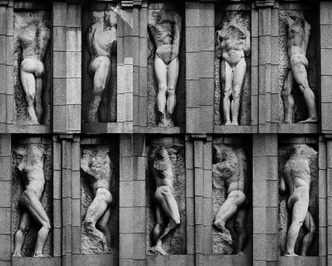
Location: The Strand, London

[More information: http://www.tate.org.uk/context-comment/articles/gallery-lost-art-jacob-epstein]

Just around the corner from London’s Trafalgar Square are these fantastic figures by Epstein, which are placed in niches high atop a building. When they were first proposed, their nudity caused a controversy and public opinion was divided on their appropriateness for display on the street. Thirty years later, when acid rain had made them unstable, some traditionalists relished taking a chisel to these amazing works and reducing them to mere torsos. Even headless and limbless, however, these sculptures remain incredibly powerful.

  1. Dan Flavin, Untitled (1996)

Location: 548 West 22nd Street, New York

Official Site: https://www.diaart.org/collection/collection/flavin-dan-untitled-1996-1996-002

This site-specific artwork by Dan Flavin is managed by the Dia Foundation and is always open to the public. Featuring Flavin’s signature fluorescent lights, the work was completed just before the artist’s death. Understated and slightly eerie, the piece demonstrates Flavin’s sensitivity to the specifics of the architectural space. Tip: it’s particularly atmospheric if you go at night.

  1. Anish Kapoor, Cloud Gate  (2006)

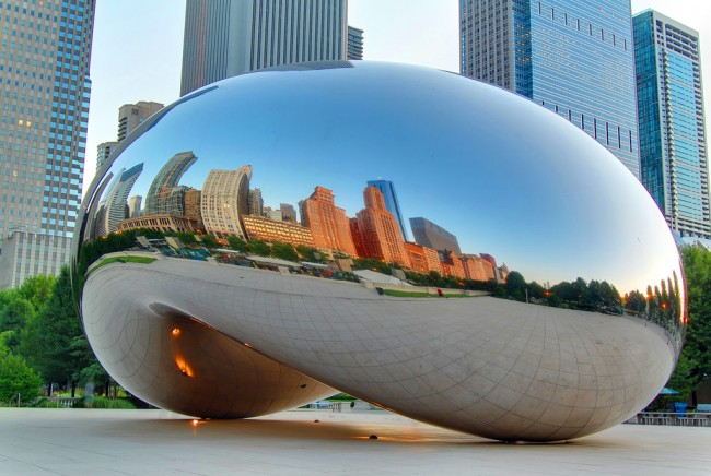
Location: Millennium Park, Chicago

Official site: http://www.cityofchicago.org/city/en/depts/dca/supp_info/millennium_park_-artarchitecture.html#cloud

Cloud Gate is hard to miss. This huge sculpture by Anish Kapoor dominates the plaza at Chicago’s Millennium Park, where it has been affectionately nicknamed “the bean”. The highly polished surface reflects distorted images of the cityscape around it and of the crowds of people who can pass around and under it. It’s like a funhouse mirror on steroids. This mirroring visually dissolves the form of the enormous metal structure, simultaneously blending in with its surroundings and asking the viewer to look again.

  1. Joan Miro, Oiseau Lunaire  (1966)

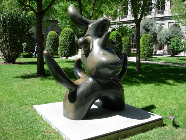
Location: Square Blomet, Paris

This large work by Joan Miro (92 x 82 x 59 inches) stands in a public park in Paris’ Montparnasse area, once home to a plethora of artists living and working there in the 1910s and 20s. Miro’s sculpture, designed as a site-specific work, is intended to be a memorial to those artists who promoted avant-garde forms and theories, and influenced the work of generations of artists to come.

  1. Fernando Botero, The Hand  (1976)

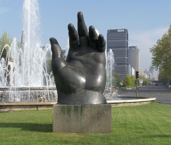
Location: Paseo de la Castellana, Madrid

If you’re looking for public sculpture, Madrid should be high on your list of destinations. It even boasts a little-known (but enormous) Museum of Public Art, which contains sculptures by Miro and Julio Gonzalez. Elsewhere in the city, you’ll find this huge sculpture of a hand by Columbian artist Fernando Botero. The work is characteristic of Botero’s voluminous style and was produced soon after the artist suffered a hand injury in a car accident.

include ‘share2.htm’;

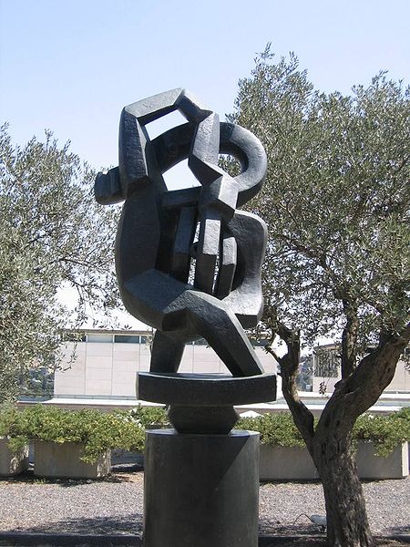
  1. Jacques Lipchitz, Prometheus Strangling the Vulture  (1943)

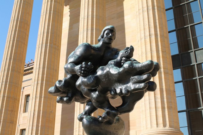
Location: Philadelphia Museum of Art, Philadelphia

Official site: http://www.philamuseum.org/collections/permanent/54047.html

This late work by sculptor Jacques Lipchitz is positioned outside the Philadelphia Museum of Art in a city that boasts more than its fair share of incredible works of art on public display. One of his lesser-known pieces, Lipchitz’ sculpture depicts the myth of Prometheus breaking free of his bonds and strangling the vulture who has been pecking at his entrails for an eternity. Lipchitz saw this as symbolic of the human race fighting against the atrocities of Nazi Germany.

  1. Lynn Chadwick, Couple on Seat  (1986)

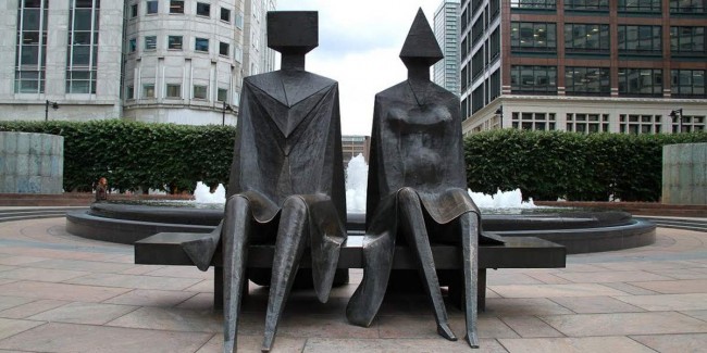
Location: Canary Wharf, London

Official site: http://canarywharf.com/artwork/lynn-chadwick-couple-on-seat/

Canary Wharf is home to London’s tallest, shiniest buildings and to crowds of harassed-looking people in suits. It might not sound like an obvious place to go looking for modern art, but Canary Wharf is also home to Lynn Chadwick’s Couple on Seat, positioned with its back to a large fountain. It’s a powerful work, taking inspiration from Henry Moore, and is well worth seeking out.

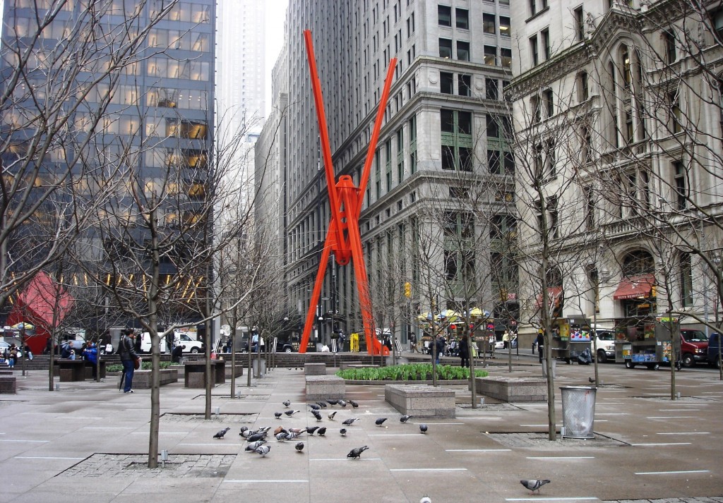
  1. Jeff Koons, Balloon Flower (Red)  (2006)

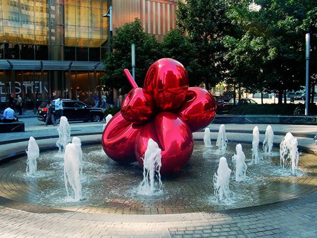
Location: 7 World Trade Center, New York

Official site: http://www.jeffkoons.com/exhibitions/solo/balloon-flower-red

Koons created his Balloon Flower (Red) as a memorial to those who survived 9/11. It exhibits the highly polished style that can be found in several of his sculptures. Its bright color and shiny surface make it feel distinctly upbeat, a celebration of moving forwards as well as looking back. Its resemblance to a giant balloon confuses the viewer’s eye; you almost expect it to start floating up into the air.

The Background Info:

Public sculpture in the United States saw a revival under the Federal Art Program in the 1930s, designed by the government to help the country out of the Depression and to promote a connection between art and the public. In the UK, public art was similarly encouraged by the post-War Labour government in the 1950s, who chose sculpture as a tool for promoting socialist values across the country.

This strong tradition continues today, and there is consequently a wealth of fantastic twentieth-century and contemporary sculpture on public view around the world. Unfortunately, these works can become sidelined, missed by pedestrians who don’t stop to think about the work of art that they are hurrying past. Nevertheless, seeking out public sculpture can be highly rewarding; you’ll be surprised what’s just around the corner.

include ‘share2.htm’;

La joie de vivre: The Top 10 List

The notion of joy in life has inspired philosophers, artists, and other thinkers since antiquity.

According to the nineteenth century French historian Jules Michelet la joie de vivre is a harmonious state, a peaceful existence within nature. In English, “the joy of living” is associated with all those things that make life worthwhile. Here are the best of those joyous depictions:

Joie de Vivre (Antipolis), Pablo Picasso, 1946.

In the year the Cubist Pablo Picasso painted this work, there was not much joy in postwar Europe. The artist himself was holed up in a tiny house on the French Riviera, but his time spent in the nearby museum-turned-studio Chateau Grimaldi spurred his creativity, resulting in a proliferation of works, including his “Joie de Vivre (Antipolis).”

Because his own reality was rather dreary, Picasso used his art to recall the mythical past, painting his lover Francoise Gilot in a dance with the fauns and satyrs, the half-horse, half-men of ancient Greek mythology.

Bonheur de Vivre, Henri Matisse, 1906.

Considered a cornerstone of early modernism, Henri Matisse’s “Bonheur de Vivre” celebrates life the Fauvist way: through brilliant color. The shifting scale of the nude subjects’ pastoral scene begs a closer look and reveals a radical experiment, in which the figures are painted as viewed by each other.

The painting was shocking to the art community for its style and to the general public for its content. Each figure is enjoying its life: nude, in nature, and wildly sensually. In 1908, Matisse said this depiction of hedonistic joy represented his dream for “an art of balance, of purity and serenity, devoid of troubling or depressing subject matter” – a sentiment that was mocked by Picasso for its bourgeois attitude.

Joie de Vivre, Max Ernst, 1936.

Evoking the Northern Renaissance heritage of detailed foliage imagery, deep shadows, and woodcut-like forms, Max Ernst’s 1936 painting “Joie de Vivre” is titled ironically. A tangle of supersized vegetation dwarfs a statue and a fantastical animal, forming an eerie jungle rather than the expected pleasant and harmonious depiction of nature .

include ‘share2.htm’;

La Joie de Vivre, Paul Delvaux, 1937.

One of the most provocative Surrealists of his time, who was even ousted by his Belgian contemporaries for painting too dreamily, Paul Delvaux creates a spirit in this work that in not particularly joyful. His uncanny scene is rooted in real images, though the relationship between figures is not easily defined, but obviously complex. The painting evokes a more psychological reflection on life’s joys.

Rythme, Joie de vivre, Robert Delaunay, 1930.

He may not have a household name, but Robert Delaunay is a star of modern art. His work celebrates both form and color, highlighting his dual influences from Cubism and Fauvism. His works were such a singular achievement that they were given their own art historical style, Orphism, and admired by many, including Paul Klee, August Macke, and Franz Marc of Der Blaue Reiter. His vibrant abstract works like this “Rythme, Joie de Vivre” from 1930 show a mix of cool and warm colors in a dynamic geometric arrangement.

Au Temps d’Harmonie (La Joie de Vivre – Dimanche au Bord de la Mer), Paul Signac, 1895-96.

This idyllic image by one of the founders of Pointillism (another is Georges Seurat) is an unironic depiction of scenes of the good life by the sea. Signac describes the work in a 1893 letter to fellow Neo-Impressionist Henri-Edmound Cross:

“Great news! On your advice, I’m going to try a large canvas!… In the foreground, a group at rest… man, woman, child… under a large pine an old man tells stories to the young kids… on a hillside… the harvest: the machines smoke, work, lessen the drudgery: and around the haystacks… a farandole of harvesters… in the center, a young couple: free love!”

Joie de Vivre, Mark di Suervo, 1998.

Mark di Suervo’s New York City sculpture from 1998 proves that the original concept of the joy of living still inspires in the contemporary era. The 70-foot-tall work is made of two interlocking, red L-beams, which both reach up to the sky and down to the ground. In 2011, the sculpture was famously adopted by the Occupy Wall Street movement as a symbol of the proletariat protests in the plaza where it stands.

Joie de Vivre, Kees van Dongen, 1922.

Kees van Dongen depicts life at its fullest during the happening scenes of a social gathering. Using Fauvist color to denote sensual details – the green of a woman’s eyes and cleavage, the blush of a couple getting close – the Dutch-French painter was no stranger to the controversy his paintings caused. He along with Henri Matisse and others, exhibited at the provocative 1905 Salon d’Automne, which was a counter-exhibit to the official Paris Salon.

Joie de Vivre, Jacques Lipchitz, 1927.

A Cubist sculptor who ran in the same circle as Pablo Picasso, Jacques Lipchitz created his “Joie de Vivre” as a pivotal point in his artistic career. The bronze work from 1927 is looser, more curvaceous that the typical tight angles of Cubism and marks a changing style in its exploration of joy through more organic forms.

Oleanders, Vincent van Gogh, 1888.

Vincent van Gogh’s “Oleanders” is little more than a brightly colored floral still life at first glace. But a surprise is hidden in plain sight. On the table the artist has painted Émile Zola’s novel La joie de vivre (1883). The novel is ironically titled as its bleak story revolves around a child who has lost her parents. For van Gogh, oleander flowers with their hearty nature and plentiful blooms were the physical juxtaposition of Zola’s idea of life – a joyless entity driven by undeserved fate.

include ‘share2.htm’;

Selling Out?: Six Surprising Artists Who Posed for Product Advertisements

The simple life of the starving artist is much more than a Romantic literary and painterly trope – for many artists, measly living is reality. With the fame they garner now it’s hard to imagine that modern figures like Andy Warhol or Salvador Dalí would have needed to supplement to their artistic incomes. But, we’ve found the advertisements that prove these side ventures.

Salvador Dalí for Old Angus scotch whisky, 1951.

Surrealist artist Salvador Dalí who once declared, “I myself am Surrealism,” made another bold statement in 1951: that Old Angus brand scotch whisky is “really tops.” Dalí lends his image and endorsement to the liquor, however it wasn’t the first time he had delved into the world of advertising. The artist had worked as an illustrator in the 1940s and ran his own print publication, Dalí News, around the same time.

This color magazine ad ran in American publications when the artist was living in Spain but writing articles about modern art theory for prominent United States titles like Vogue and Herald American. He had a long-running relationship with Vogue, designing several Surrealist covers for the fashion magazine.

Marcel Broodthaers for van Laack, 1971.

Belgian artist Marcel Broodthaers gained fame for his conceptual artistic stagings critiquing the art world bureaucracy of the late 1960s and early 1970s. In a particular example from 1968, the artist creates a mock American modern art museum with himself as director of the department of eagles.

Just a few years later while living in Berlin, Germany, he agrees to pose as another figure, this one farther from the artistic world. In this banal German advertisement for men’s shirts, the Belgian artist becomes the model, in a starched, patterned dress shirt.

But, the caption beneath Broodthaers’ image contains a hint of his wit. Translated, it reads: “The Director of the Museum of Modern Art, Department of Eagles, refused to wear the van Laack monocle.”

Left: Andy Warhol for Pioneer, 1975; Right: Andy Warhol for Sony Beta Tapes, 1981.

Also working the 1960s and 1970s, Andy Warhol’s artwork is heavily influenced by the commercial advertising he encountered as every day, and by his background as an illustrator. From repeating soup cans or Coca-Cola bottles, his art took the popular image and inundated its viewer.

However, a few times Warhol did in fact lend his own image to a commercial advertisement. Above are two ads for audio and visual recording products. Considering the artist’s obsession with consumerism, there is surely a subversive message behind his endorsements.

Helen Frankenthaler for Rolex, 1990.

Quite the opposite of a subversive message, however, is found in this advertisement for Rolex watches. Artist Helen Frankenthaler gives a poetic endorsement of the luxury wrist wares, surprisingly in the same year – 1990 – that she was given a solo retrospective exhibition of her Color Field paintings at New York’s Museum of Modern Art. The ad ran in Art & Antiques magazine, possibly alongside a review of her show!

Ed Ruscha (left) and son, Eddie Ruscha (right), for Gap, 2002. Image via Ad Forum.

An artist known for creating advertisements becomes an advertisement himself in the above image. For Gap clothing, Pop Art graphic designer Ed Ruscha models with his son Eddie Ruscha in the baggy styles of the early millennium. It is 2002, after all.

The American retail brand has a history of working with celebrities for their advertising campaigns but Ruscha Senior seems an interesting choice. Rather than a well-known face, he has a famous name – one that he passed on to his son, too – and was known for re-creating and creating logos like this one:

Trademark #5, Ed Ruscha, 1962. Image via Tate Museum.

Fast-forward to even more recent times and another modern artist is lending her image to product. In 2011, Cindy Sherman launched a line of M.A.C. cosmetics and posed for the campaign wearing her consumer goods.

Sherman is known for her photography and styling work – for transforming herself into physical versions of female tropes. Here, she subverts the typical glamor of a makeup advertisement, even including an image of herself as a clown in her new line: a true take on the sexist phrase “clown makeup,” when an outside viewer believes a woman has painted too much product on her face.

Images via thefineartblog. Photographs by Cindy Sherman.

The visual link between art and advertising has inspired interesting explorations across media. There modern artists’ deviations into the creation of advertisements or the endorsements of consumer products may have been fiscally motivated; however, those who partook were often of the avant-garde variety. Perhaps, these ads could be seen as another kind of cultural commentary?

Let us know what you think in the comments below.

The Los Angeles Times questioned Helen Frankenthaler’s career because of her Rolex advertisement. Their critiques and praises, here: articles.latimes.com/1990-02-08/entertainment/ca-641_1_frankenthaler-retrospective

Want to know more about these artists? Read these pages on The Art Story: Salvador DalíAndy WarholHelen FrankenthalerCindy Sherman

How a NYC Department Store Launched Warhol and Friends

Around the winter holidays, families, fashionistas, and ordinary Joes alike flock to the impressively-decorated department store windows on New York’s Fifth Avenue. Lush fabrics and mechanized displays delight viewers, and lure them inside to shop.

From 1929 to 1980, Bonwit Teller was one of those dazzling wintertime stops, a high style ladies’ retailer on Fifth Avenue.

But, Bonwit Teller’s window displays were much more than glitter and women’s wear. In 1929, the store hired their first artist as window display designer: the eccentric Salvador Dalí. And a fascinating history of creative collaborations was born.

Salvador Dali in Bonwit Teller window display, 1939. Image via Europa Star.

1939: Salvador Dalí

Surrealist Salvador Dali, who once declared “I myself am surrealism” designed two themed windows for the store in 1939 – one representing Day and the other Night.

In the Day window, Narcissus is personified. Three wax hands holding mirrors reached out of a bathtub lined with black lambskin and filled with water. A mannequin entered the tub in a scant outfit of green feathers. For the Night window, the feet of a poster bed are replaced by buffalo legs and the canopy is topped by its pigeon-eating head. A wax mannequin sat nearby on a bed of coals.

Neither was the most appealing to 5th Avenue shoppers and soon the store censored Dalí’s “crazed” display, replacing it with regular store mannequins in suits. In a rage, the artist jumped into the window display and attempted to pull his bathtub from the floor. It slipped. Both artist and tub crashed through the front window!

Jasper Johns’ Flag on Orange Field behind a Bonwit Teller mannequin, 1957.

1955: Jasper Johns & Robert Rauschenberg

Jasper Johns and Robert Rauschenberg were already artists when they began working as freelance window dressers at Bonwit Teller in 1955; however, they were still fairly unknown in the mainstream art world. Using the pseudonym “Matson Jones,” the collaborative pair exhibited their modern artworks behind fashionable mannequins regularly through the 1950s.

Jasper Johns Blue Ceiling, Matson Jones, 1955. Image via Poster Museum.

In this year, Johns and Rauschenberg collaborated on a few rare works, including a cyanotype photography print Jasper Johns Blue Ceiling in 1955. Images of these cyanotypes, which Rauschenberg began creating with his wife four years earlier, had been reprinted in the April 1951 issue of Life magazine. At Bonwit Teller, the collaborative Matson Jones photography creations were given new life in display as commercial backdrop.

But, many of the artworks shown at Bonwit Teller would follow an opposite pattern: later becoming the artists’ most famous in galleries. Johns’ first flag painting White Flag on Orange Field was hung in the shop’s window in 1957. And Rauschenberg displayed an altered Untitled (Red Combine Painting) there in 1957.

James Rosenquist with his Brunette Billboard, Vertical, 1964. Image by Dennis Hopper, via The Genealogy of Style.

1959: James Rosenquist

Before he “joined” Pop art, James Rosenquist was a commercial artist. He was employed as a billboard painter for a number of years and in 1959, he also began designing display windows for Bonwit Teller. Robert Rauschenberg helped get him the gig.

Rosenquist describes the experience in his 2009 memoir, Painting Below Zero: “By the late 1950s I’d begun to lead a double life. In the daytime I painted billboards and designed display windows for Bonwit Teller, Tiffany, and Bloomingdale’s; at night and on weekends I hung out with artists and painted.”

Andy Warhol’s Bonwit Teller display, 1961. Image via Art21.

1961: Andy Warhol

Warhol, like Rosenquist, had been a commercial artists for many years – an illustrator specifically. In 1951, Bonwit Teller display director Gene Moore hired Warhol to provide artwork for the shop’s windows, as an extension of his work as a commercial artist. As an avant-garde Pop artist, Warhol’s work was not being taken seriously in New York at the time; the New York School painting style still ruled the mainstream art world.

But 1961 brought his big break. The artist hung five paintings behind department store models and announced the significance of his own artwork – lowbrow subjects with a cheeky take on consumerism. The paintings were based on comic book strips and newspaper advertisements, and the stylishly dressed mannequins in front played directly with the idea of art as advertising.

Left: Bonwit Teller, New York City. Right: Entrance and display windows. Images via The Department Store Museum.

For more than 50 years, Bonwit Teller had an eye for the New York avant-garde art scene; but, it seems that all good things must come to an end. In 1979 the shop was shuttered and acquired by magnate investor Donald Trump. By 1983 a tall, shiny skyscraper had replaced it ­­– the infamous mixed-use Trump Tower, home to both rapper Jay-Z and the Gucci flagship store.

Trump Tower rises from the Fifth Avenue site today but its art history significance is nothing compared to that of the late Bonwit Teller department store. Under Moore’s direction in the midcentury, Bonwit Teller gave many modern artists their starts in the world of art and design. With free creative reign, avant-garde artists experimented in the department store window, turning a glass case into an alternative art space, and introducing the public to new and exciting styles.

Today, we see these kinds of collaborations between artist and fashion houses frequently. Perhaps they, too, have Bonwit Teller to thank!

The New York Times ran an obituary-like commemoration of the ladies’ department store in 2014. For more facts and figures on Bonwit Teller, read it here: http://www.nytimes.com/2014/10/05/realestate/fifth-avenue-bonwit-teller-opulence-lost.html